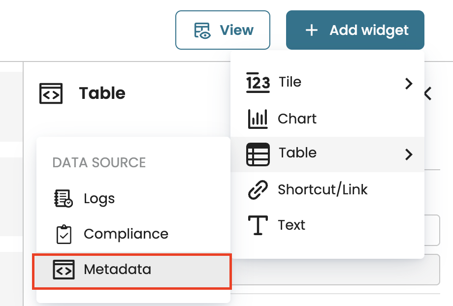
Add a table widget
To view process data in a structured format, we can add a table to a dashboard. When adding a table, we select its data source. A table can be based on either of the following:
Log: Displays data from a log.
Compliance check: Displays data from a compliance check result.
Metadata: Displays data from a metadata source.
Add a table from a log
When adding a table from a log, we can display the following types of tables:
Cases table: Displays the start time, end time, duration, and other performance statistics for each case in the process.
Case variant table: Displays the performance statistics for each grouped case variant in the process.
Case attribute table: Displays the performance statistics for each case attribute in the process.
Event attribute table: Displays the performance statistics for each event attribute in the process.
First touch statistics table: Displays the performance of the process based on who first handled a case and what activity was first performed.
To create a table in the new dashboard, click Add widgets and select Table > Logs.

Cases table
Let’s imagine in our loan origination log, we wish to display a case table that shows which individual loans took the most time to complete.
Select the loan origination log and click Select logs.

This displays the Cases table.

We can add or remove columns from the displayed table. To specify the columns to display, click Add.

Select the columns.

We can also specify how the columns should be arranged. To sort the columns in order, click Sort by.

A to Z: Arrange the columns in alphabetical order
Z to A: Arrange the columns in reverse alphabetical order
Statistics first: Displays the statistics columns first before the case attribute columns.
Case attribute first: Displays the case attribute columns before statistics.
Once done, click Add to confirm the table columns.

At any point, we can remove a column by clicking the delete icon.

To display more rows or columns, increase the size of the table widget.

When in view mode, we can sort the table rows based on a column. In our case, we wish to display the longest cases first. Click View to exit edit mode.

To sort by duration, click the Duration column. Click Z to A to sort in descending order, displaying the longest cases first. We can also adjust the width of each column.

Case variants table
A case variants table groups cases by similar pathways and displays the metrics for each variant. Imagine we wish to display the most frequent pathways in the process and review their aggregated performance; we use the case variants table. In the Types dropdown, click Case variants.

This displays each case variant and its corresponding number of activity instances, cases, and average duration.

We can display more columns by clicking Add.

Select the columns to add and click Add.

To view the case variants with the most number of cases, go to the view mode and sort by Cases.

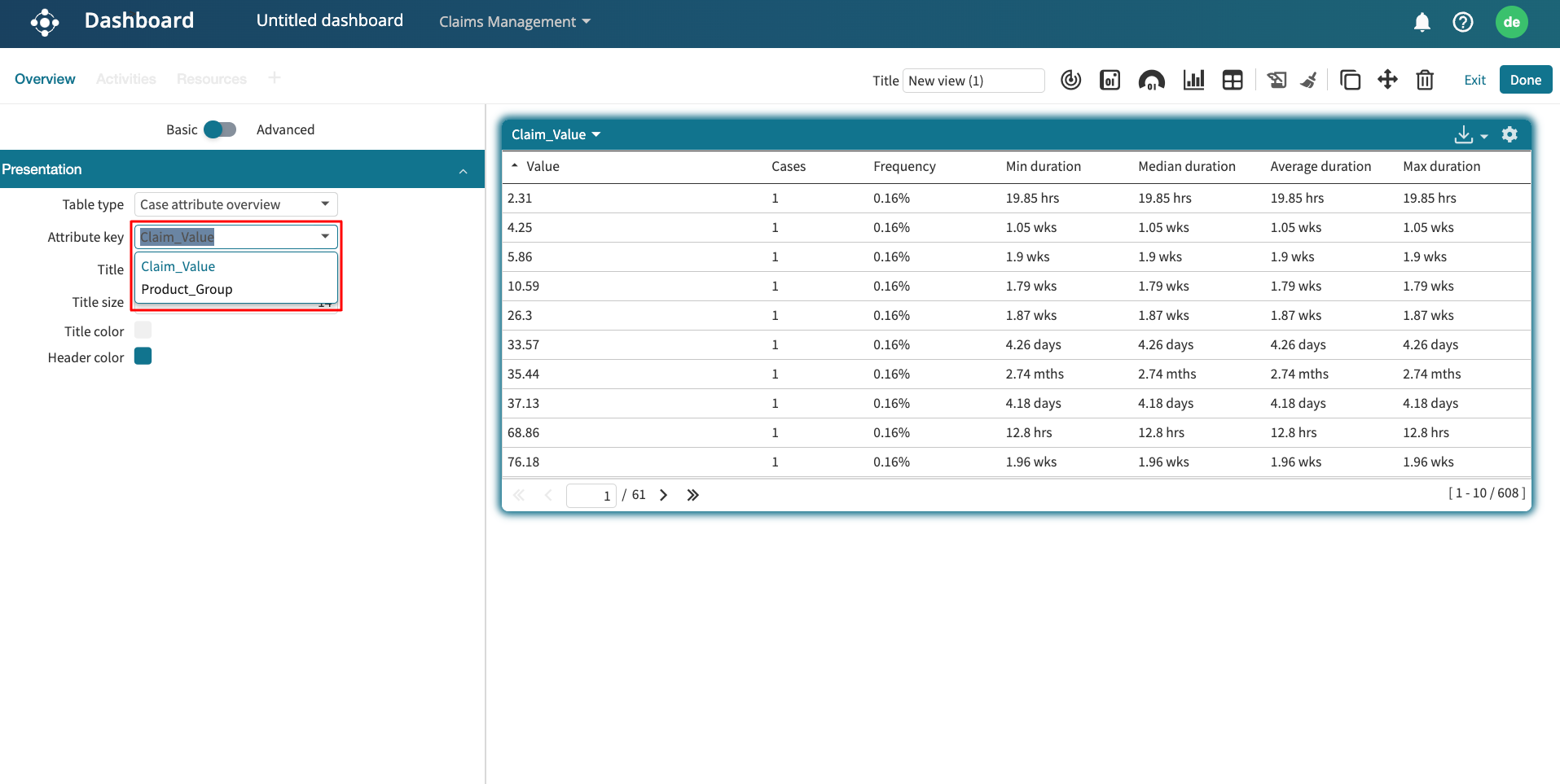
Case attribute table
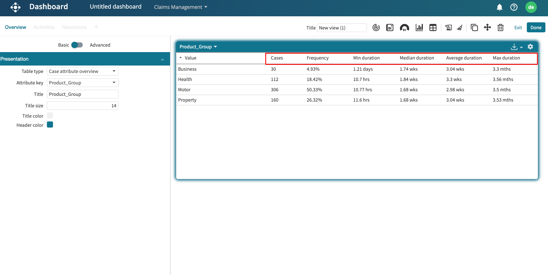
A case attribute table displays the performance statistics of attributes in the process. Imagine we wish to display the percentage distribution of brokers used across all cases. Since “Broker” is a case attribute, click Case attribute as the table type.

In the Attribute dropdown, select the case attribute to display. In our case, we select Broker.

This displays the statistics of each broker, including the percentage of cases they appear in.

We can click Add to specify the statistics to display in the columns.

Select the statistics and click Add.

The table columns get updated based on what is selected.

Event attribute table
An event attribute table displays the performance statistics of event attributes in the process. Imagine we wish to create a table that displays which role performs the first activity in the loan process. Given that “Role” is an event attribute, select Event attribute as the table type.

In the Attribute dropdown, select the attribute to display. In our case, we select Role.

Since we only want to focus on the first event in the process, click the Data set dropdown.

All event values: All event instances are considered for computing the table statistics.
First event value: Only the first event instance is considered to compute the table statistics.
Last event value: Only the last event instance is considered to compute the table statistics.
To display the roles that perform the first activity, select First event values.

First touch statistics table
The first touch statistics table allows us to understand the process performance based on the first-touch activities and first-touch resources. We can add a first touch statistics table to the new dashboard. To add a first touch statistics table, add a table widget. In the Types dropdown, click First touch statistics.

This displays the table.

We can configure how the table is displayed.
All activities: Displays the performance statistics for each first-touch resource, separated by individual first-touch activities.
Aggregate: Displays the overall performance statistics for each first-touch resource, aggregating all their first-touch activities into a single row.
Both: Displays both the detailed activity-level statistics and the aggregated view together.

We can also select up to five first-touch activities. Click Add in the Activities component.

Select the first touch activities and click Add.

Click Update to update the table.

The table statistics are updated based on the first touch activities selected. Also, we can edit the table to include more columns. In the Columns component, click Add.

Select the columns to include and click Add.

Click Update to update the table. The table gets updated to include the added columns.

Add a compliance table
We can also add compliance results in the dashboard as tables. Compliance tables display violations and allow us to view results from either a case or control perspective.
Click Add widget and Select Table > Compliance.
Select the control(s) whose results we want to display as a table. Click Add.
The table lists violations for the selected control(s).
In the Settings panel, we can adjust how compliance data is displayed.
In the Data tab, we can choose whether the table displays results by case or by control, depending on the insight we need:
By case: Lists individual cases that violated one or more controls.
By control: Summarizes violations grouped under each control. This is useful for monitoring rule performance at a higher level.
To see all violating cases, select By case in the Perspective dropdown.
The table updates to list every case that violated the selected control.
We may also want to narrow the view to focus on violation statuses or specific timeframes.
To enrich the table with additional details, we can add more data columns. In the Columns section, click Add.
We can add the Violated control name and the Violation date. Click Add to confirm.
The table gets updated to display the new columns.
Add a metadata table
We can use the metadata table to display process view details in a dashboard. With a metadata table, we can:
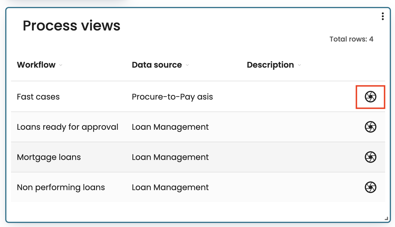
Display a table listing all process views, showing the workflow, data source, and description.
Add more columns, such as creator, created date, last edited date, and any custom properties defined on our process views.
Create filters to narrow down which views are displayed, based on view properties.
To add a metadata table, click Add widget > Table > Metadata.
This displays all the process views as a table. We can click any process view to open the view in Process Discoverer.
We can also create filters to specify the views to display. Click Filters and create the filter.
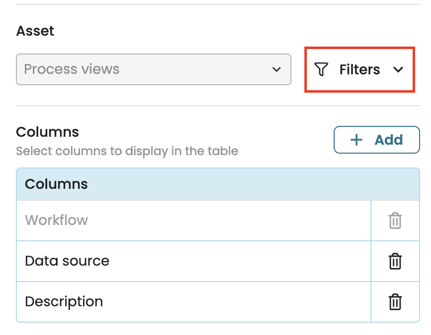
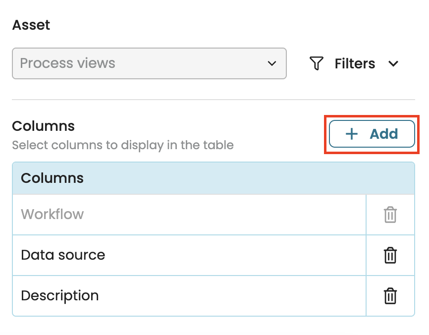
In the displayed table, we can add other columns such as the date created, date last edited, the creator or other custom properties. Click Add and specify the column to add.
Design a table widget
We can design a table widget to include colors. To add colors, go to the Design tab.

We can decide whether to add the color to either the table header or its border. To add a color to both, select Header and Border.

Finally, select the color to use from the displayed colors.

We can also custom colors by entering its hex code.
