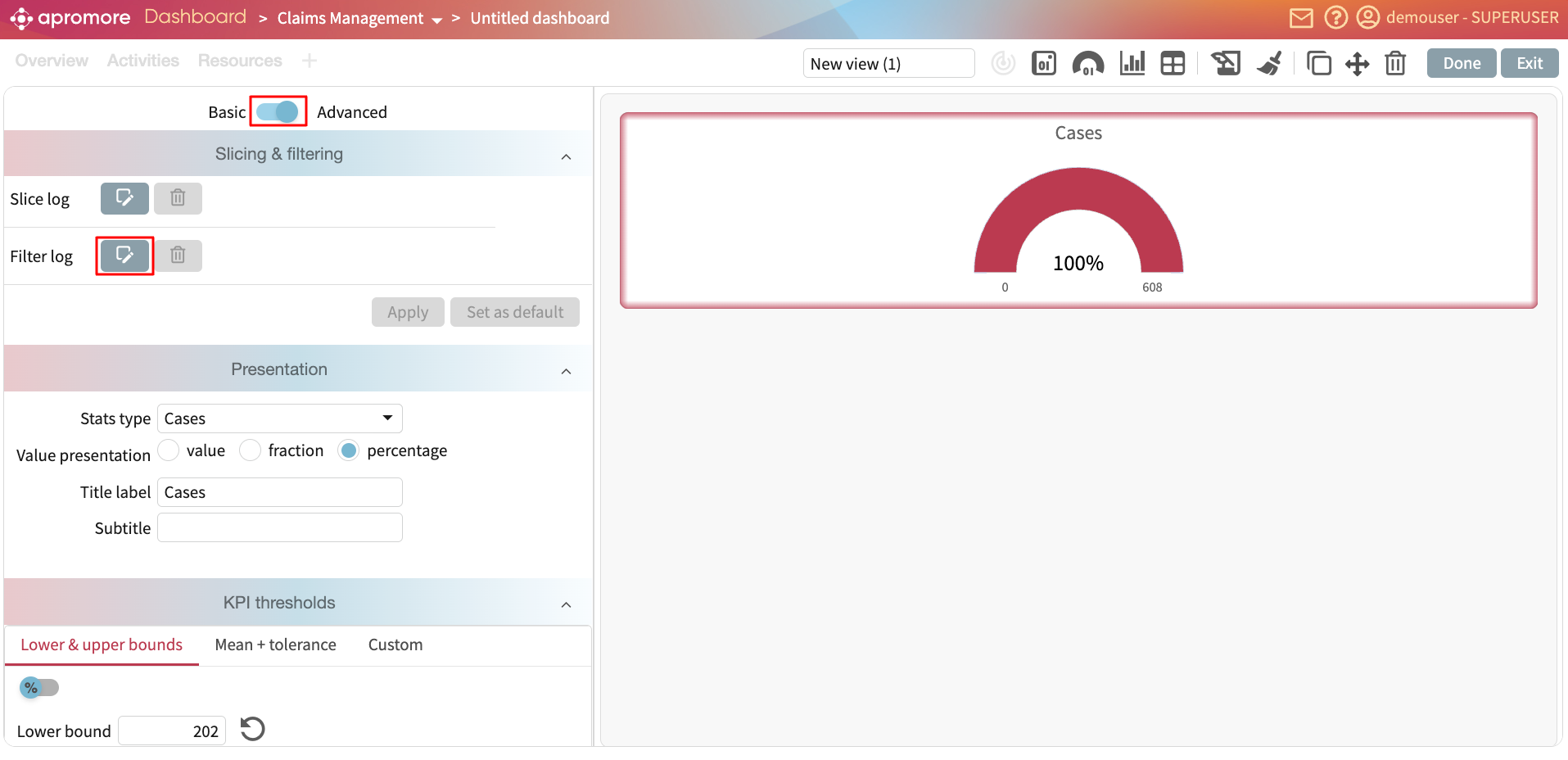
Add a chart widget
We can add charts to display various performance metrics in the process. We can create the following charts.
Case analysis chart: We can display the case variants, case lengths, case utilization, case duration, case processing time, and case waiting time charts.
Work in progress chart: We can display the work in progress chart based on number of activity instances, number of active cases, number of cases in the queue and queuing time.
Other charts: We can display the case attribute chart, event attribute chart, and performance trend chart.
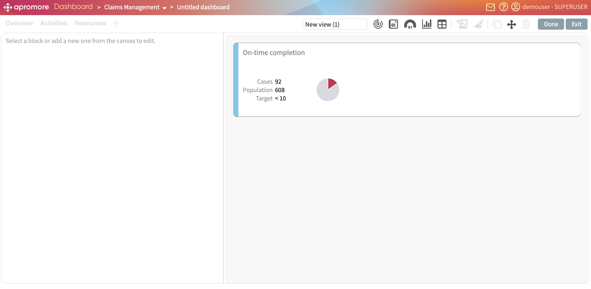
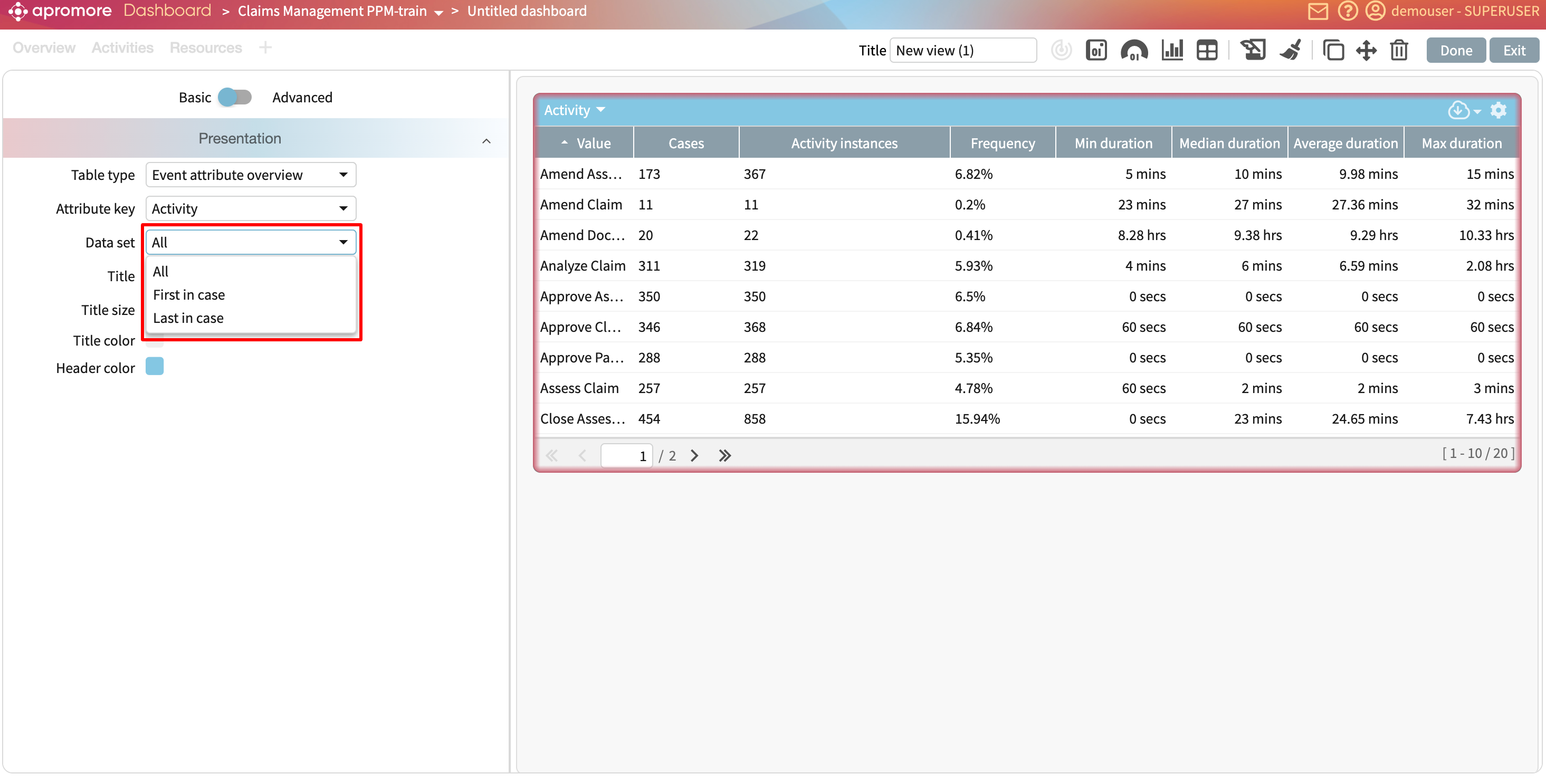
To create a chart as a widget, click Add widget > Chart.
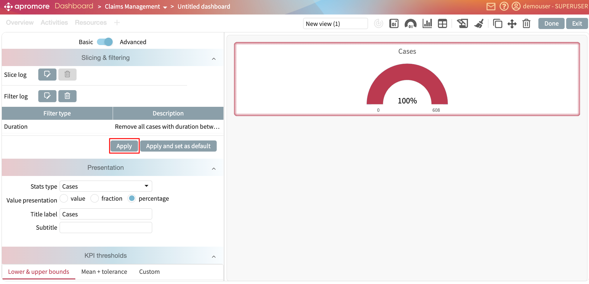
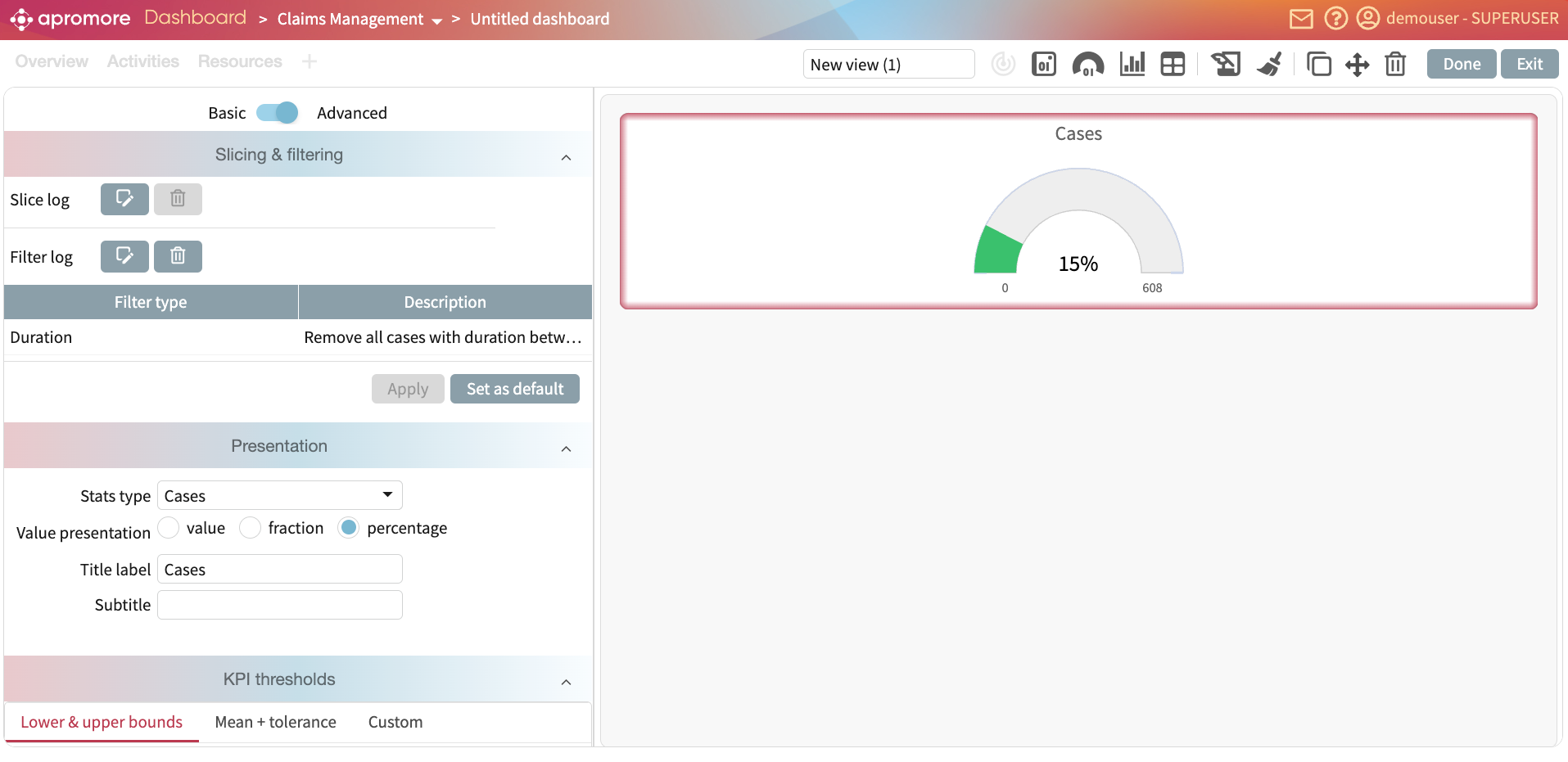
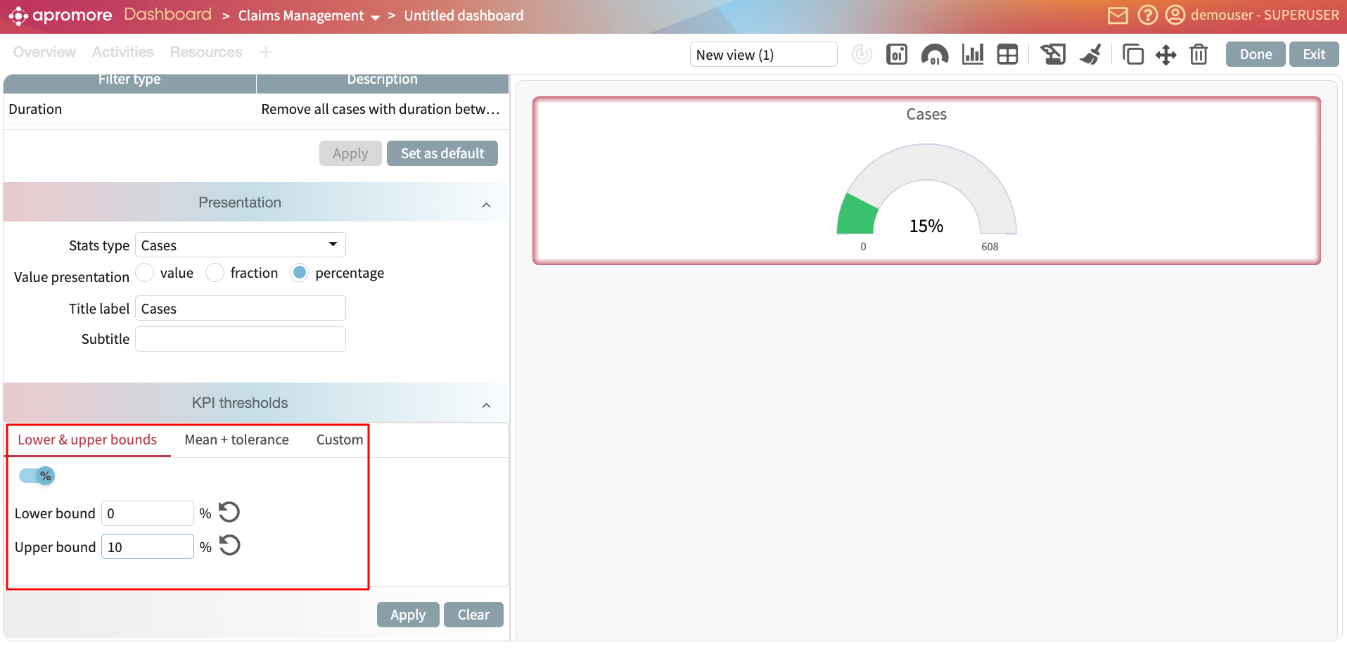
Select the log.
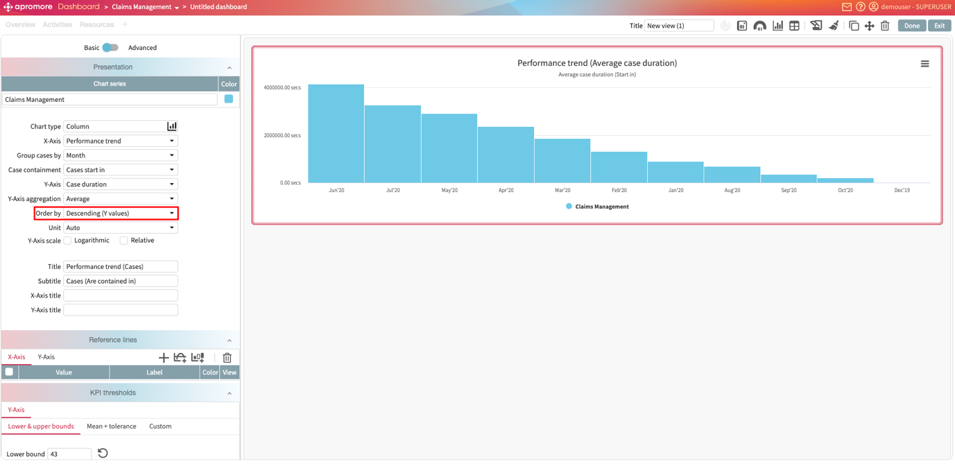
This creates a performance trend chart as the default.
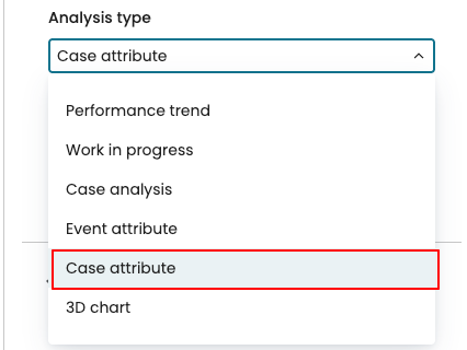
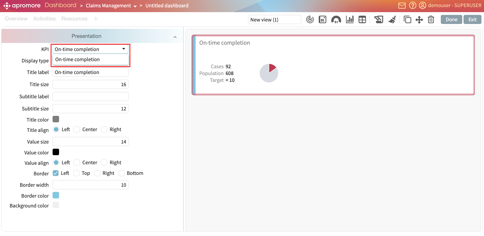
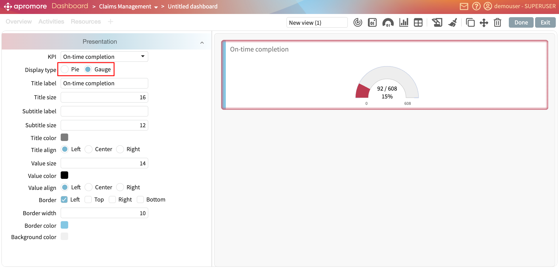
To change the chart type, click the Analysis type dropdown.
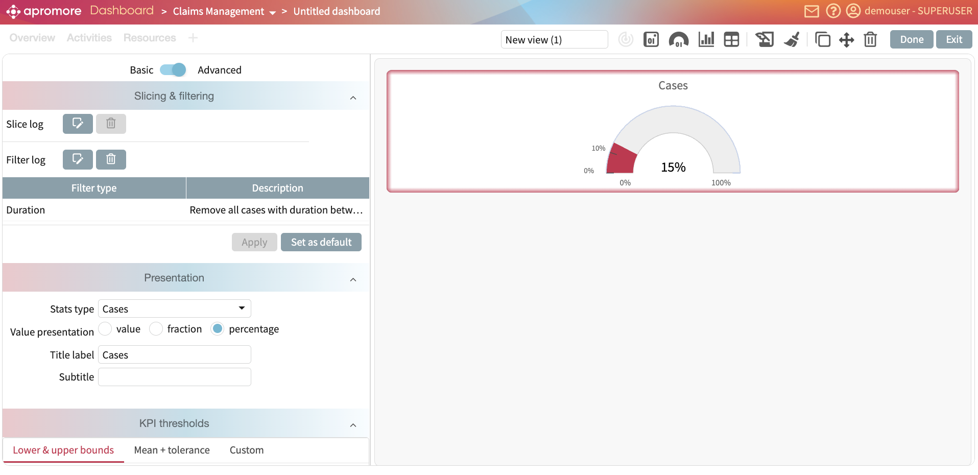
We can, for instance, display the case duration chart. Select Case analysis as the Analysis type.
Select the attribute to display its metric by clicking the X-Axis drop-down menu. For example, select Channel.
We can also specify the aggregation function to display on the Y-axis.
We can also scale the chart either using the logarithmic or relative scale.
We can also change the chart visualization chart. Let’s say we want to add a performance trend chart as a line chart. In the visualization type dropdown, click Line.
In the same vein, we can plot a spline chart.
Or an area chart.
Add a donut chart
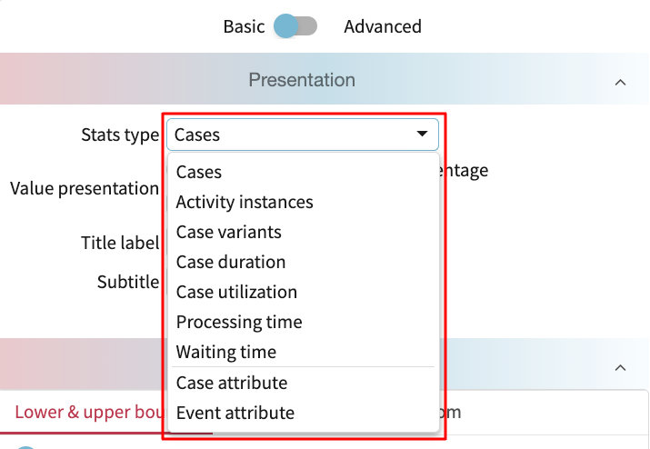
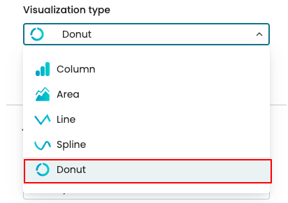
We can add donut charts, allowing us to visualize the proportion of attribute values within a process. A donut chart can be plotted when using either an event attribute or a case attribute.
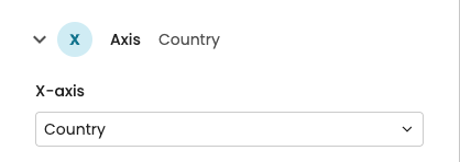
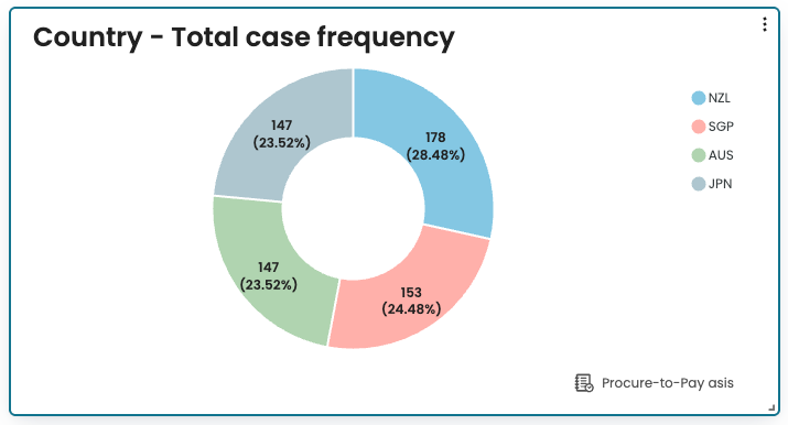
For example, we may want to show the total number of cases for each Country. Since “Country” is a case attribute, in the Analysis type dropdown, we select “Case attribute”.
In the Visualization type, click Donut.
In the X-axis, select Country.
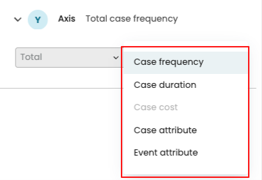
In the Y-axis, we specify how the values should be aggregated. We can aggregate based on:
Case frequency – counts how many cases fall under each attribute value.
Case duration – shows the total/min/median/average/max duration of cases per attribute value.
Case cost – calculates the total/min/median/average/max cost of cases per attribute value. It is available if the cost center is defined on the log.
Case attribute – allows us to select another case attribute for aggregation. For example, if Country is selected on the X-axis and Channel on the Y-axis, the chart shows how many cases belong to each channel within each country.
Event attribute – allows us to select an event attribute for aggregation, showing how often each event attribute value occurs within each X-axis attribute.
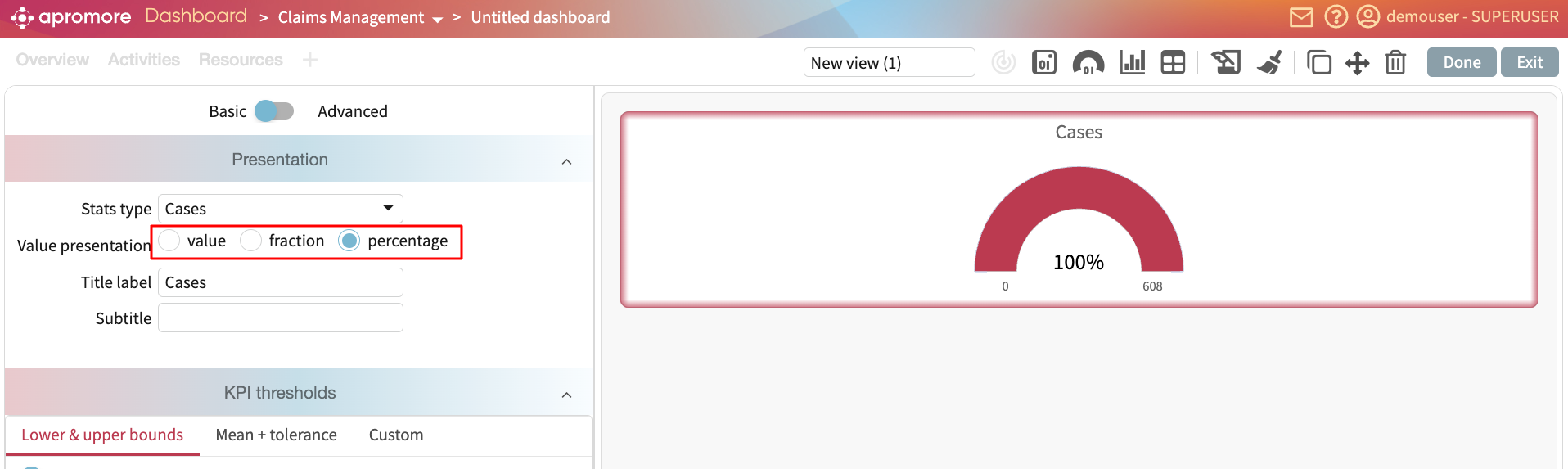
In our case, to display the number of cases per region, select Case frequency. The donut chart displays the values.
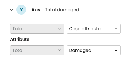
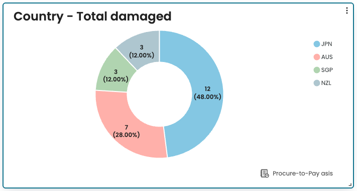
If we wish to display the total number of damaged cases in each country, we can set up the Y-axis to display the Case attribute and select the Damaged attribute.
The donut chart now displays the number of damaged cases in each country.
Note
Donut charts are not available for multi-data source charts.
A donut chart can show a maximum of 15 values. If the attribute contains more than 15 values, the top 14 values appear in the chart and the remaining values are aggregated into “Others”.
Add a 3D chart
In many process analyses, it is important to understand how two attributes interact and how that relationship affects performance. For example, in a procure-to-pay process that spans multiple countries, we may want to determine how frequently specific activities are performed in each country. This helps reveal which activities occur more frequently in certain regions. To enable the creation of such charts in a single view, the New Dashboard supports 3D charts.
3D charts allow us to plot two attributes on the X and Y axes and apply an aggregation (such as total, minimum, median, average, or maximum) on the Z axis to display their relationship. 3D charts can be any of the following charts:
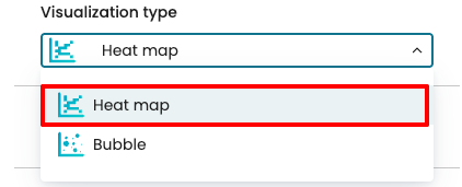
Heat map
Bubble
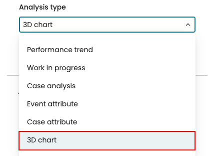
To display a 3D chart, create a chart widget. In Analysis Type, select 3D chart.
From the Visualization type dropdown, select the 3D chart. For example, to display a heat map, click Heat map.
We can then specify the X, Y, and Z axes, where the X and Y represent case or event attributes, and the Z axis defines the aggregation function to apply.
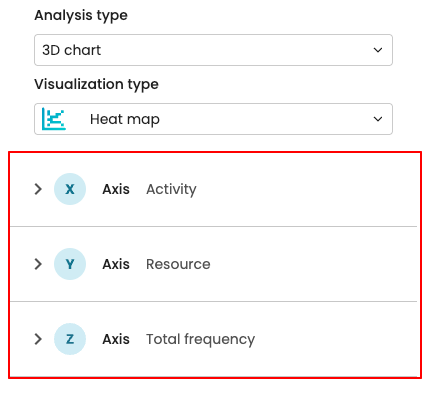
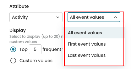
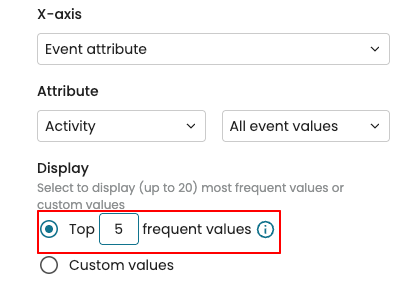
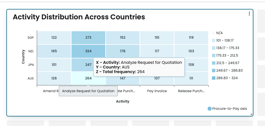
Imagine we want to display how often key activities are performed in different countries. “Activity” is an event attribute, and “Country” is a case attribute. In the X-axis dropdown, select Event attribute, then choose Activity in the Attribute dropdown.
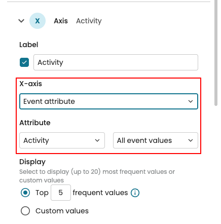
We can also specify which events are included in the count:
All event values: Counts all occurrences of the event attribute (default).
First event values: Counts only the attribute values from the first event in each case.
Last event values: Counts only the attribute values from the last event in each case.
If the selected attribute has more than five values, the chart displays the most frequent ones by default. The top five values are displayed, but this can be adjusted as needed.
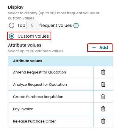
However, we can choose specific attribute values to display. Select Custom values, then click Add to choose the values to include.
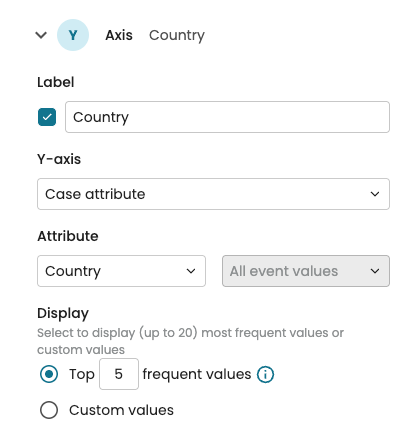
Next, in the Y-axis dropdown, select Case attribute, then choose Country in the Attribute dropdown.
In the Z-axis dropdown, select the aggregation to be used. We may also select Percentage to display the results as percentages instead of absolute values.

The chart now displays a heat map that shows how frequently each activity occurs in each country, making it easy to compare process behavior across regions.
Note
3D charts are interactive. When we hover the mouse over a data point, it displays the intersecting values of the X and Y axes along with the aggregated value from the Z axis.
To display a bubble chart, select Bubble as the Visualization type.
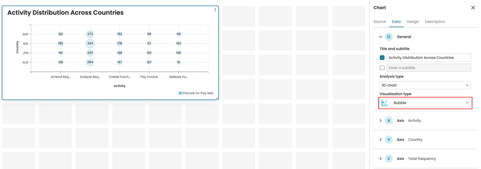
As with heat maps, we can adjust the bubble chart settings along the X, Y, and Z axes.
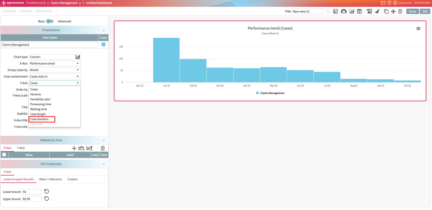
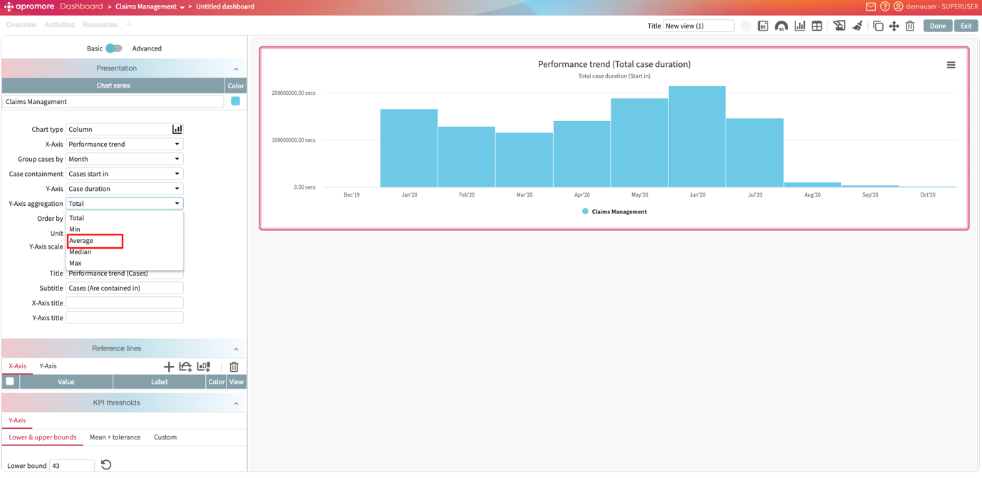
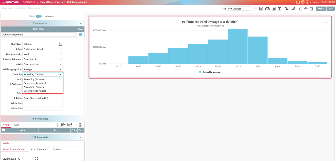
Add multiple y-axes in performance trend charts
Analyzing multiple performance metrics over time is essential for identifying process trends and bottlenecks. To support this, performance trend charts in the new dashboard can display multiple Y-axes, allowing us to visualize several metrics at a glance.
Imagine that we wish to track how many cases are in our process, the average case duration of our process, and the average waiting time of cases in our process every quarter. We begin by creating a performance trend chart displaying the number of cases per quarter.
To include the average case duration per quarter, we add this metric to a new Y-axis. To do so, click Add Y-axis in the settings pane.
This displays a new Y-axis setting called Y-axis 2. Click the dropdown to change the displayed metric.
Change the metric to display the average case duration.
We can also change the unit of this new Y-axis. For instance, we can display the duration per day. In the Unit dropdown, click Day.
We can also change the visualization type and scale of this Y-axis using the respective dropdown. For instance, now, we display the average case duration as a line chart.
We can add up to 3 Y-axes. Say, we want to include the average waiting time quarter. Click Add Y-axis.
This creates Y-axis 3. We can click the dropdown and configure it to display the average waiting time as an area chart.
We see that the average waiting time follows a similar trend as the average case duration. This suggests that waiting time is a major contributor to the overall duration of cases. By reducing delays in the process, we can reduce the duration of cases in the process.
Design a chart widget
We can customize the design of a chart. Specifically, we can add a border color, turn on data point labels, and turn on grid lines.
To customize a chart, go to Design.
We can display a border color by selecting the color of choice.
To see critical points in the chart, we can turn on data point labels. Toggle Datapoint labels.
Lastly, we can also turn on grid lines. Toggle on Grid.