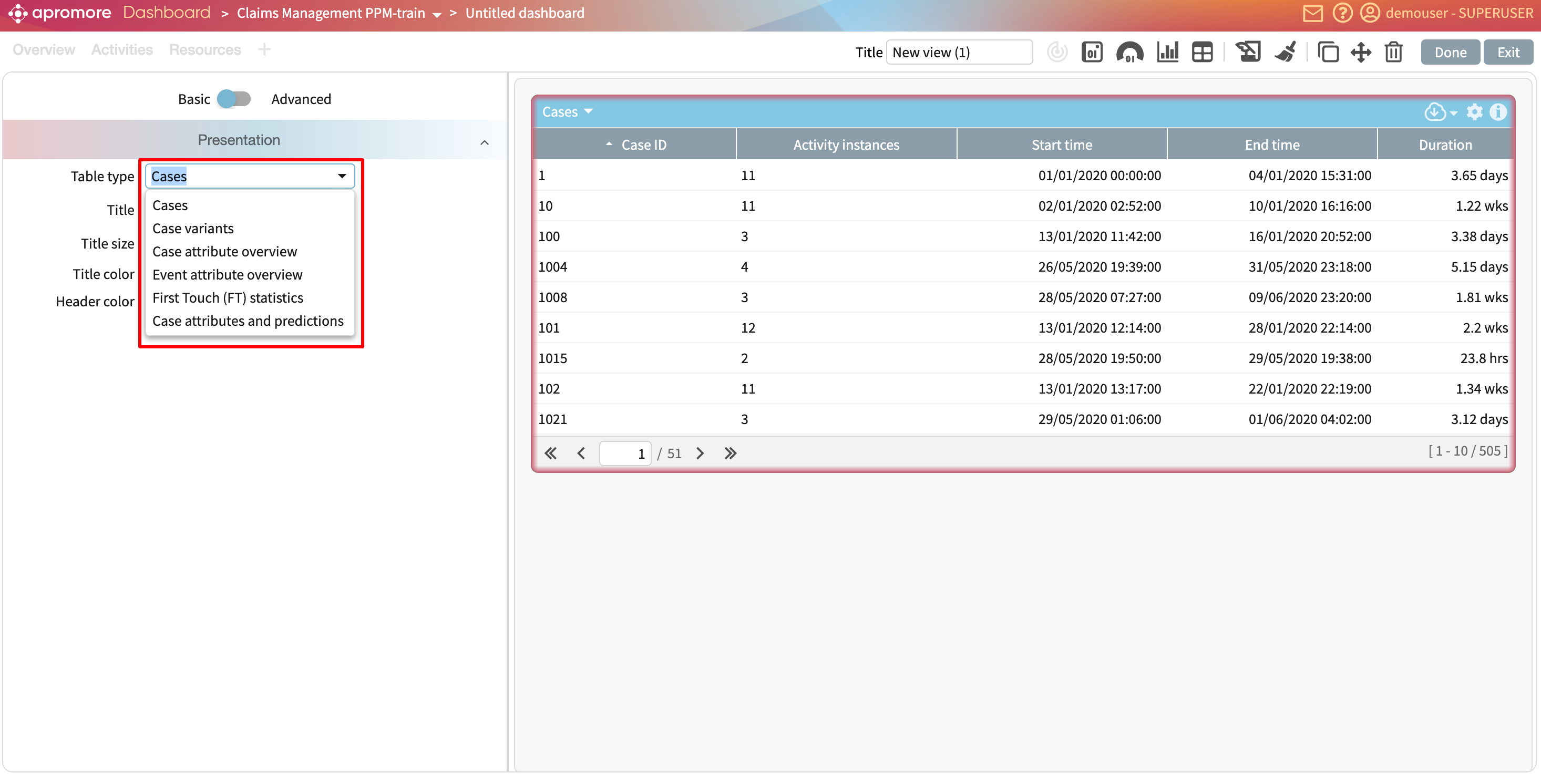
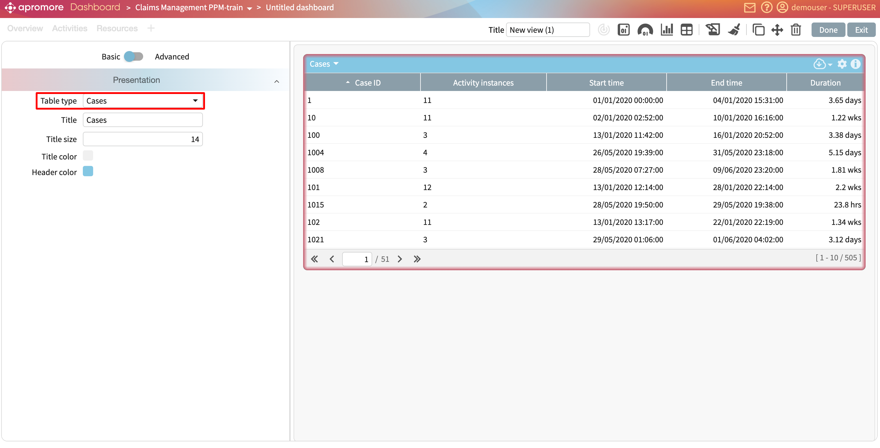
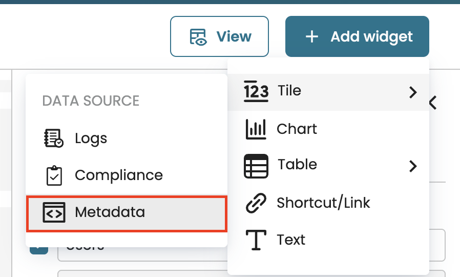
Add a tile widget
To track key metrics in a process, we can add a tile to a dashboard. When adding a tile, we choose its data source. A tile can be based on either of the following:
A log: Displays the KPIs and metrics defined for a log.
A compliance check: Displays the results from a compliance check.
Metadata: Displays the number of process views or active users.
Add a KPI or metric
To gain quick insights into existing KPIs and metrics within a process, we can add a tile that displays specific KPIs and metrics. This helps us quickly identify whether a KPI is breached or met over time. To add a KPI or metric, click Add widget and select KPI/Metric > Logs.
Select the log where the KPI or metric was saved.
This creates a blank KPI/Metric widget where we can configure the specific data to display, select a data source, and customize its appearance.
KPIs and metrics on the dashboard are organized into two categories:
Unnamed KPIs/metrics: These are automatically computed by applying predefined statistical functions provided by Apromore to the log data. For instance, counting the number of cases in the log.
Named KPIs/metrics: These are explicitly defined in the KPIs & Metrics Center, allowing us to fetch and display their values directly on the dashboard.
To add a KPI or metric to display, select a KPI or metric from the KPI/Metric dropdown.
To display an unnamed KPI or metric, we can select the following:
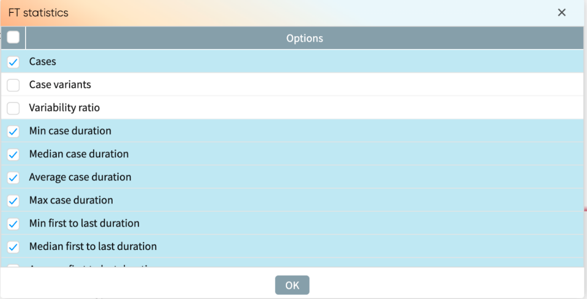
Log statistics: To display the activity instances, cases, case variants, variability ratio, and log timeframe.
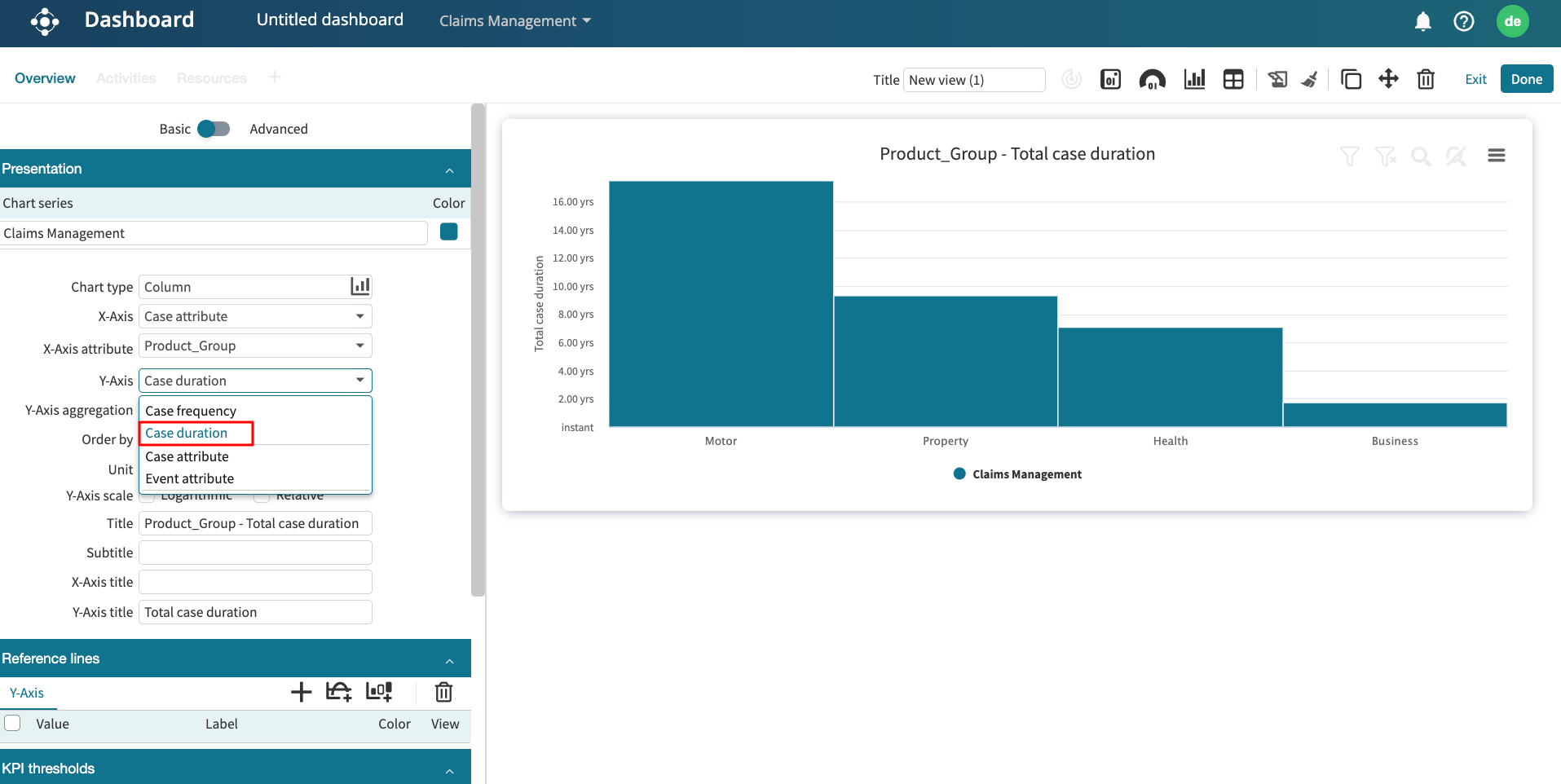
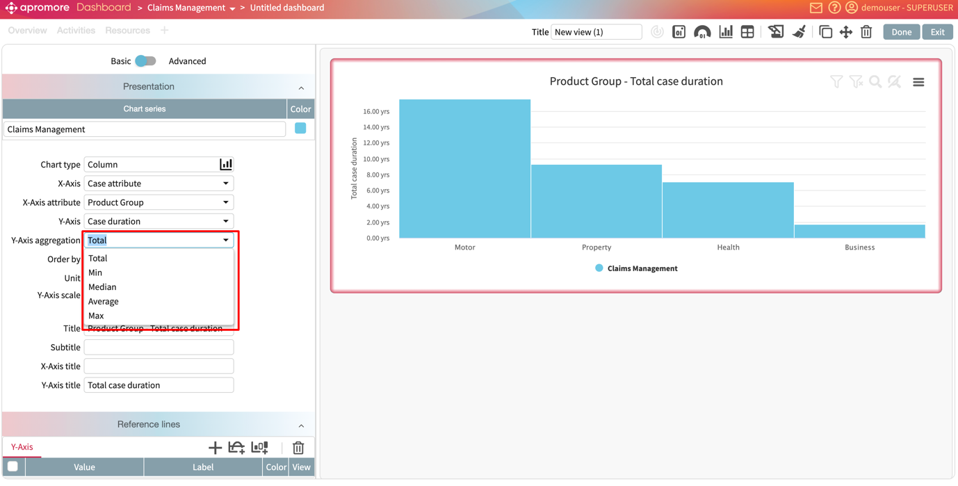
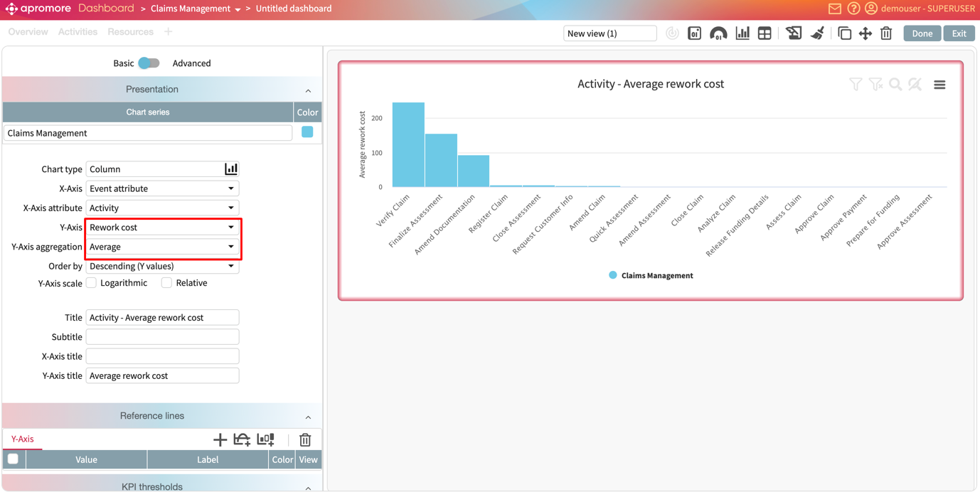
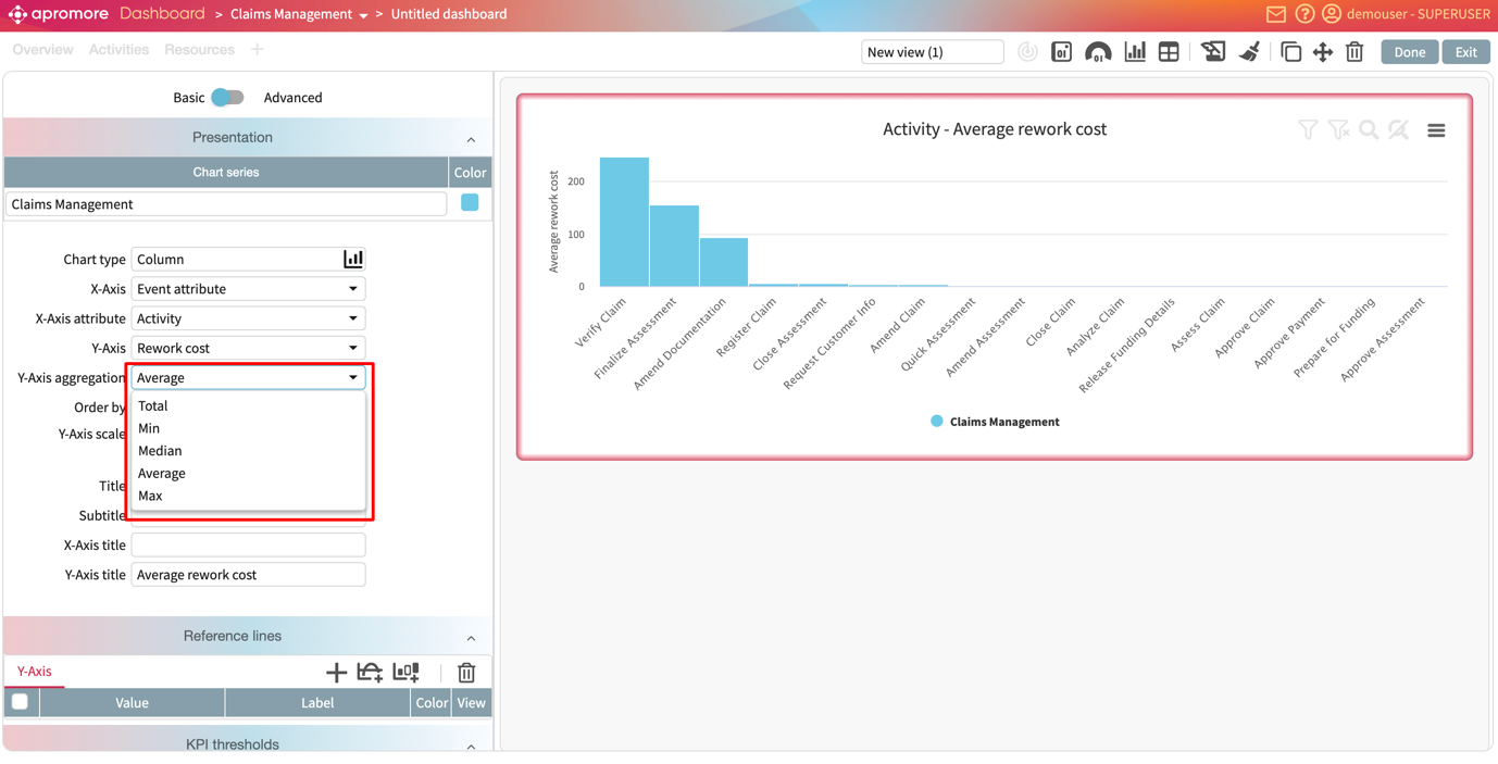
Case metrics: To display the case length, case duration, case cost, case rework, case utilization, case processing time, and case waiting time.
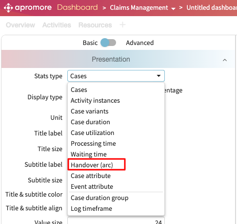
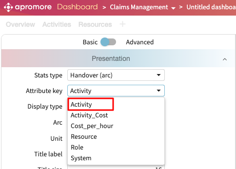
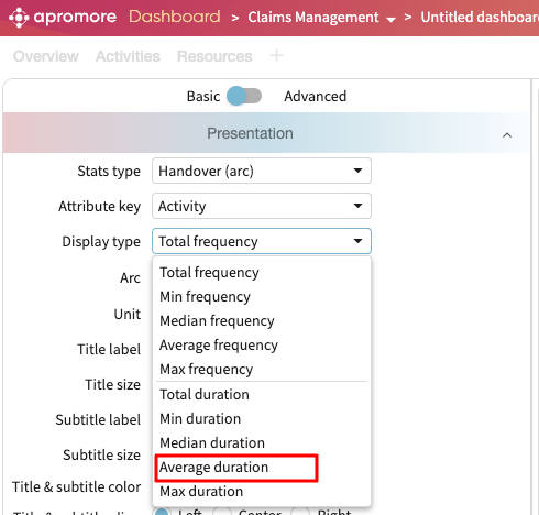
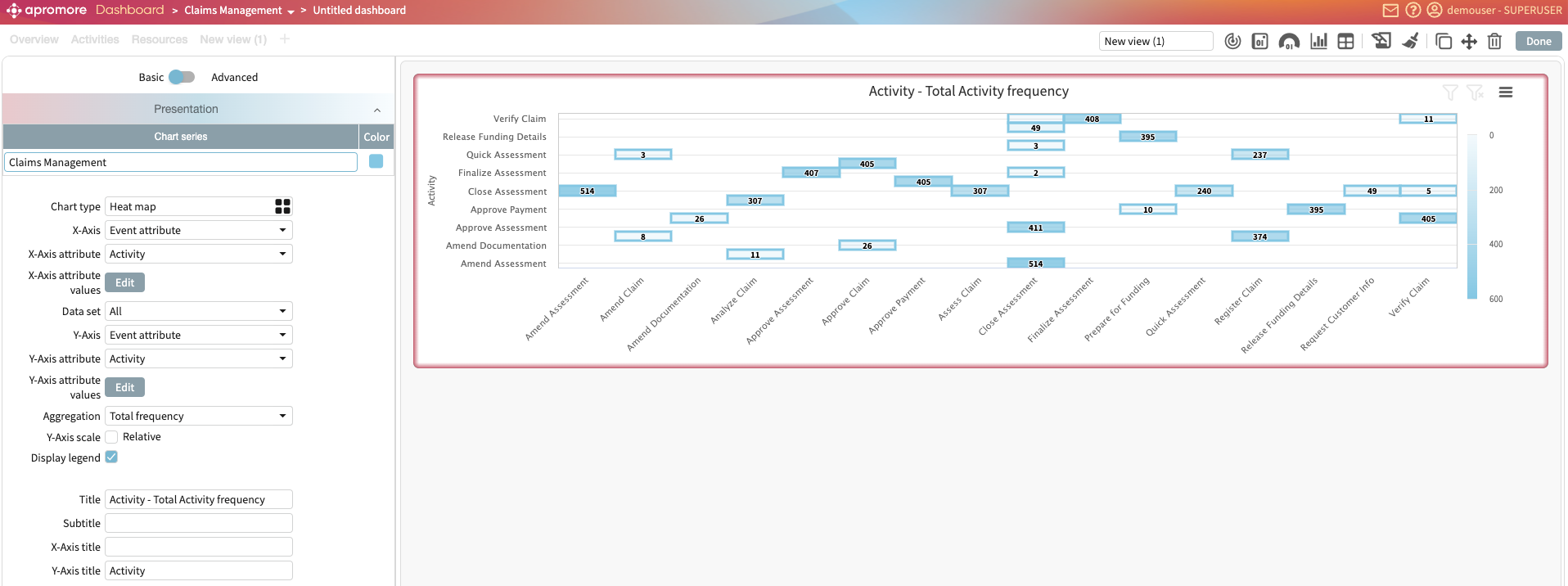
Handover (arc) metrics: To display the handover performance between activities, resources, or roles. Handover performance that can be displayed are frequency, duration, and rework.
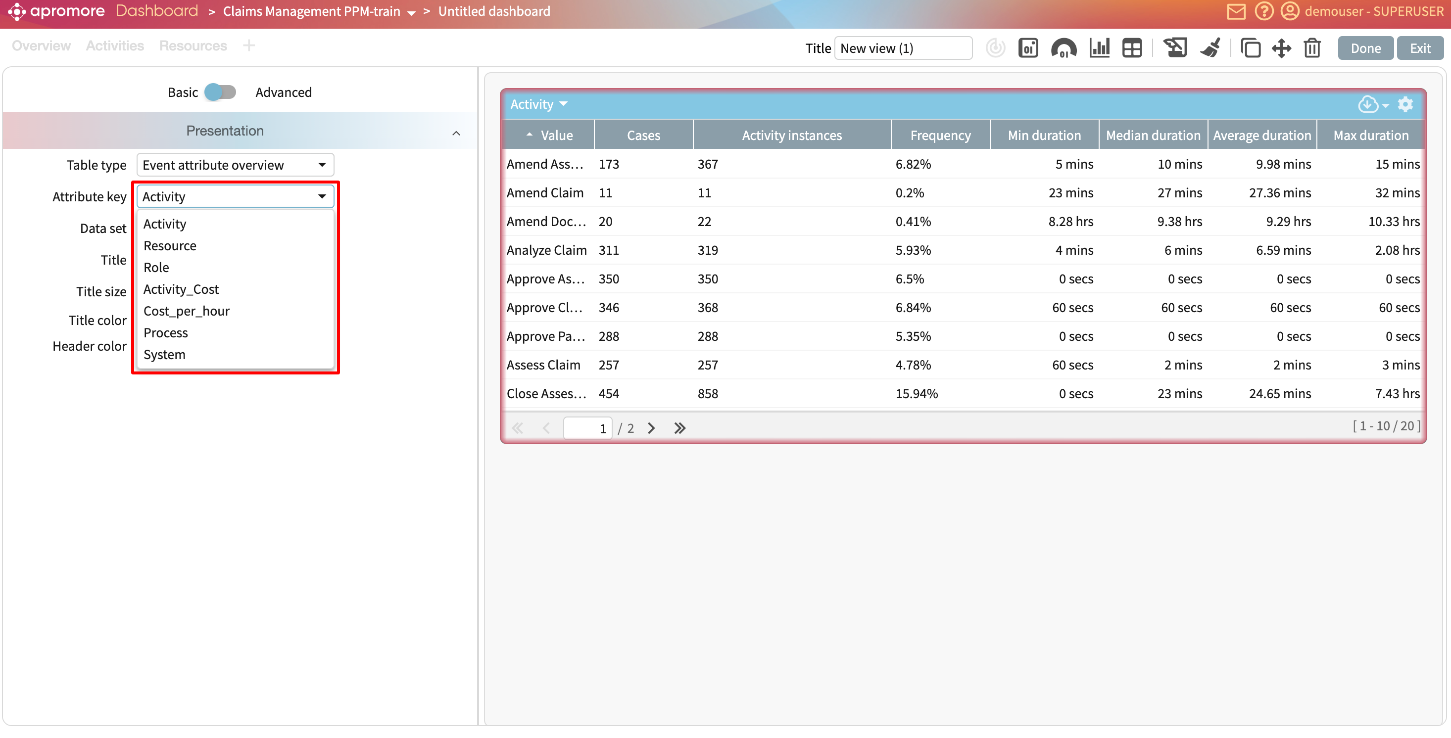
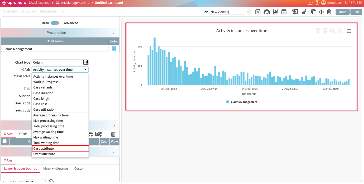
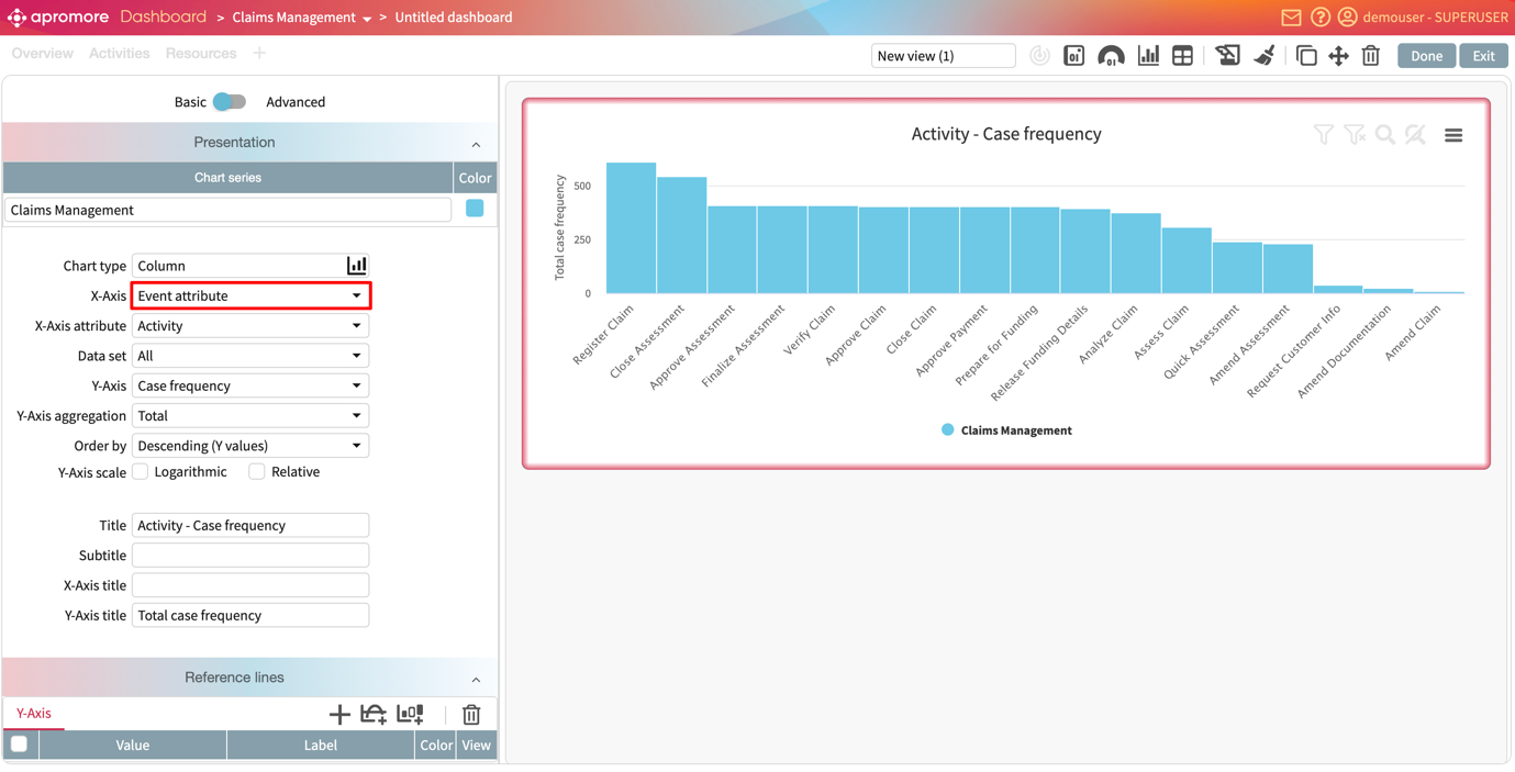
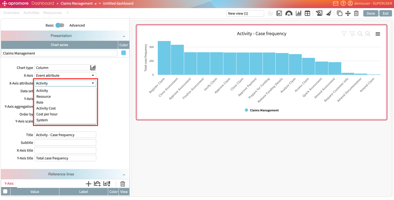
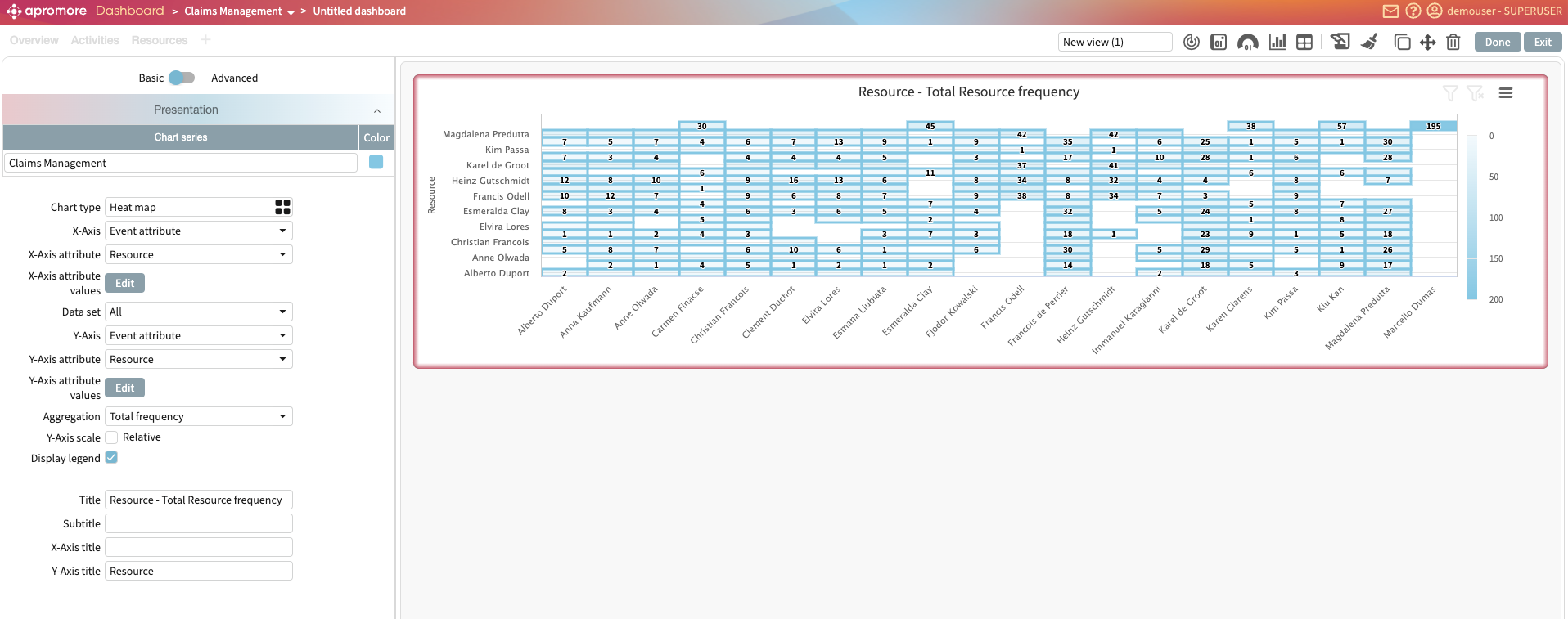
Event attribute: To display the frequency, duration, rework, and cost of event attributes in the log.
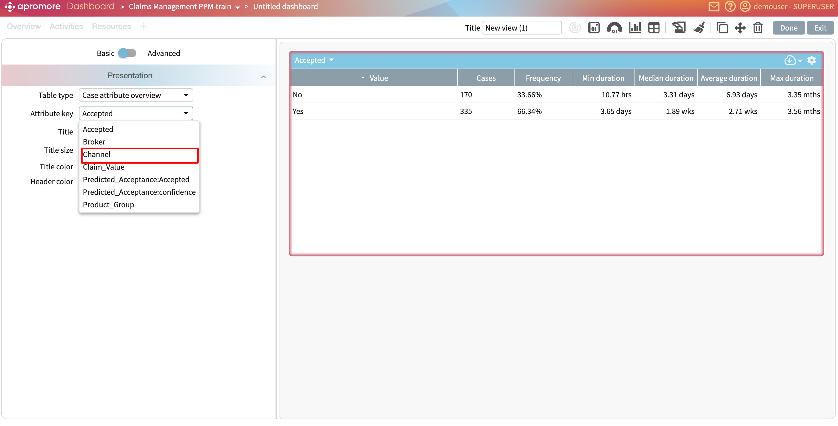
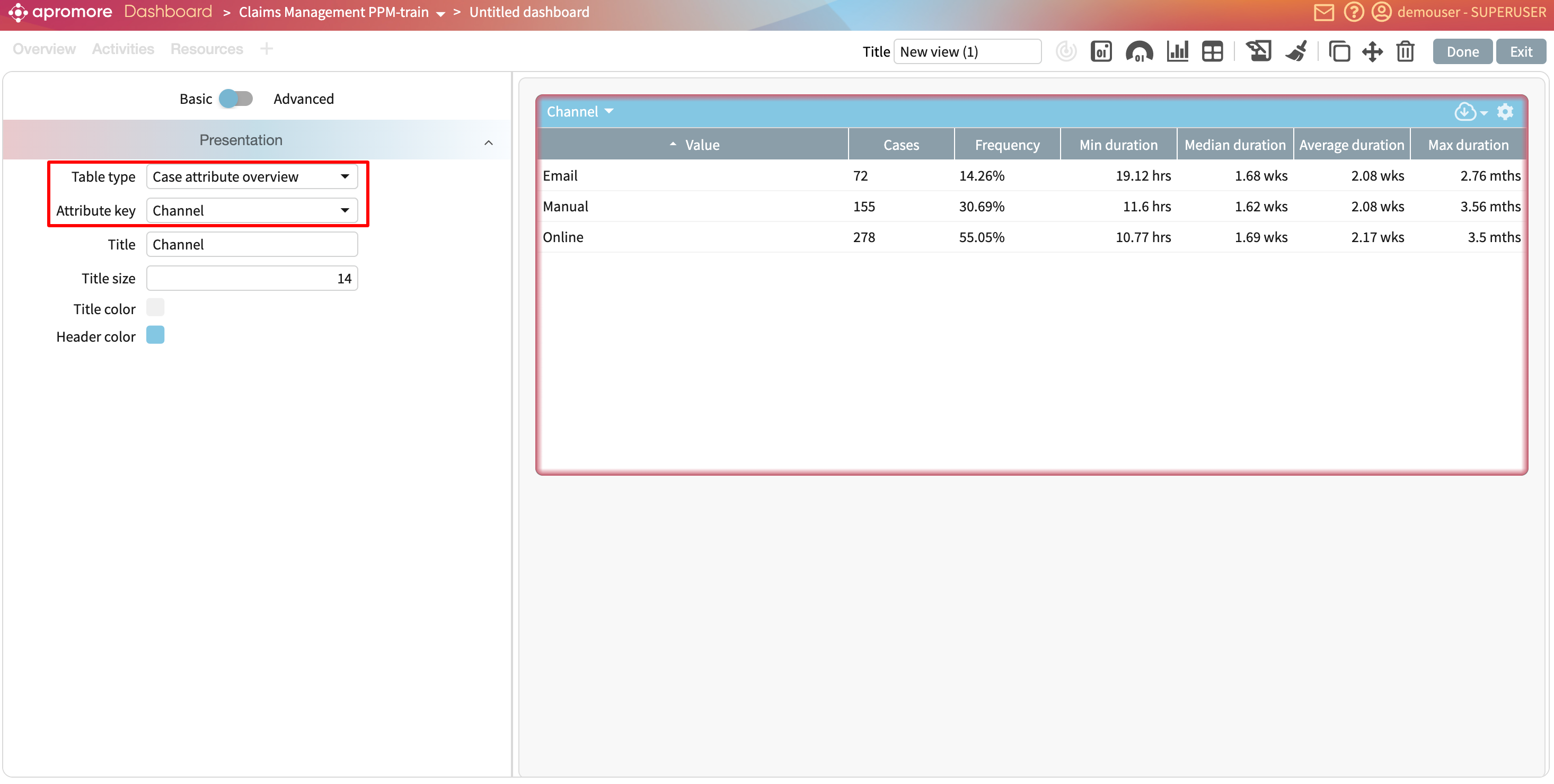
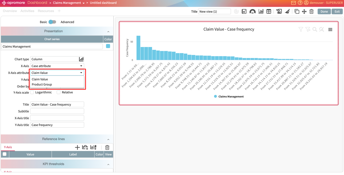
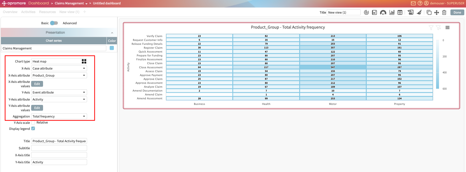
Case attribute: To display the frequency and unique values of case attributes in the log.
To select a named KPI, however, select KPIs and metrics from the list of options.
Note
The new dashboards allow us to create widgets from different logs.
Imagine we wish to display the following KPI and metrics on the dashboard from the claims management log:
Number of cases.
On-time delivery KPI.
Resource utilization KPI.
And the following from the loan origination log:
Log timeframe in the loan origination log.
Number of activity instances in the log.
To display the number of cases metric, select Log statistics in the KPI/Metric dropdown.
In the drop-down below, select Cases.
This displays the metric value.
If the metric is not a whole number, we can specify whether to display a fraction or a percentage.
We can display a title or subtitle for the metric. Simply check the title and subtitle boxes.
The title and subtitle are automatically prefilled based on the data displayed but can be changed to any other text.
One benefit of the new Dashboards is that we can create widgets from different logs. Let’s say we want to display the log timeframe for the loan origination log. To add a new widget, click Add widget.
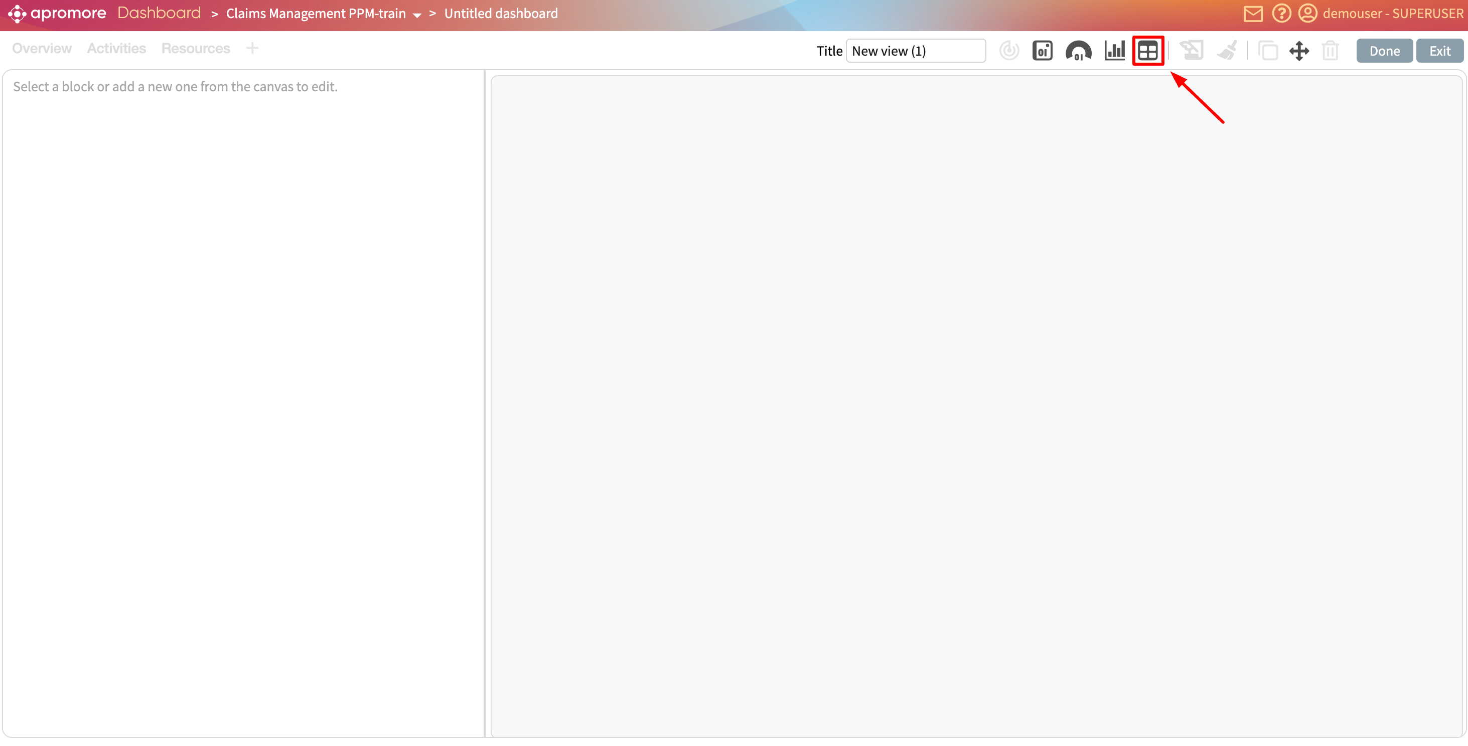
Select the kind of widget.In our case, we select Tile > Logs. Select the data for the widget. This time, we select “Loan Origination”. Click Select.
The new blank widget is displayed.
We can drag and drop a widget to dynamically change its position.
In the KPI/Metric dropdown, click Log statistics and select Log timeframe in the sub drop-down.
We can add other metrics. Let us add the activity instances in the loan origination log.
Now, let’s add named metrics and KPIs. A KPI called “On-time delivery” has been created in the KPI and metric center.
To display this KPI in the new dashboard, create a new widget. In the KPI/Metric dropdown, select KPIs and metrics.
We can either select a KPI or a metric. In this case, let’s select KPIs.

In the sub-drop-down, Apromore lists all saved KPIs for the selected log. Select the On-time delivery KPI.
We can also display a named metric. Select Metrics and the metric of interest.
If a process-level KPI has been created from this metric, we can rather display the KPI and see whether or not the KPI is fulfilled.
We see that because the target is set to <35, a value of 30.4 meets the KPI.
Add a compliance tile
Compliance tiles aggregate compliance results for one or more controls. We can display compliant cases, non-compliant cases, or violation counts over a given period.
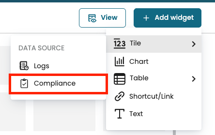
In the dashboard, click Add widget and select Tile > Compliance.
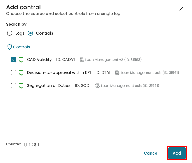
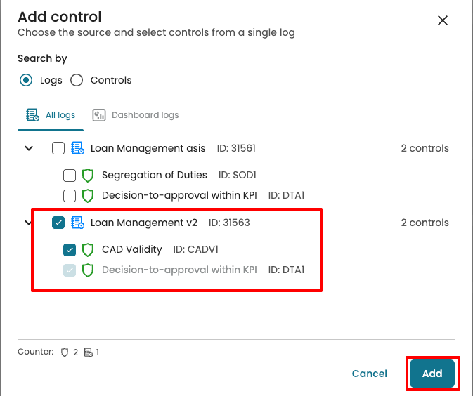
When selecting a control, we can search in two ways:
Logs: Lists all logs that have at least one control. When we select a log, all its controls are selected. We can then keep or remove specific controls.
Controls: Lists all available controls regardless of the log.
Select the control(s), then click Add.
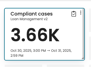
By default, the tile displays the number of compliant cases (for the selected control set).
In the settings panel, we can edit what data is displayed.
In the Source tab, we can add or remove controls from the same Log. Click Add.
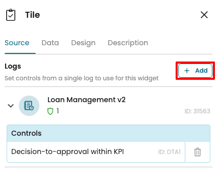
Select the additional controls and click Add.
The tile aggregates across all selected controls. If multiple controls are included, the displayed metric reflects the combined result for those controls.
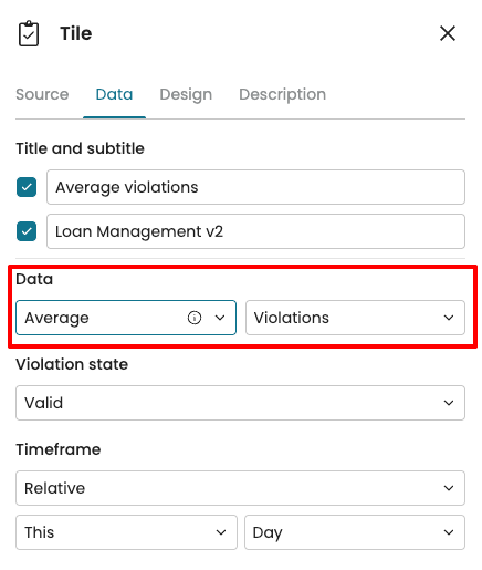
In the Data tab, we can edit the title and subtitle of the tile.

We can change the tile data to display:
Compliant cases: Total cases that did not violate the control(s).
Non-compliant cases: Total cases that violated the control(s).
Violations: Count of violations across the process, with aggregation options: total, minimum, median, average, or maximum.
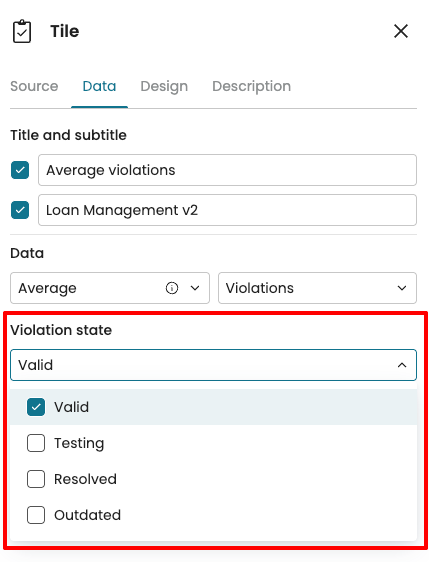
We may want to focus on a specific stage of the compliance lifecycle. To do this, we can specify which Violation states to include in the tile. Click the Violation state dropdown and select the states that should contribute to the tile value.
Over time, logs are updated, and compliance checks may be executed multiple times.
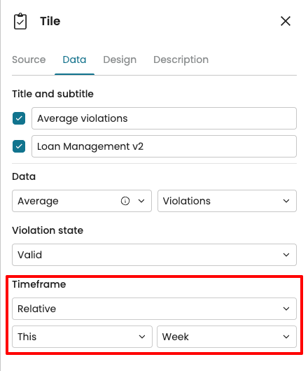
To enable us to view results from a time window, we can define a timeframe for the data shown in the tile.
Relative: Use this when we want results that automatically adjust with the current date, such as this week or last month.
User-defined: Use this when we want to analyze results for a fixed period, such as 1–15 August 2025.
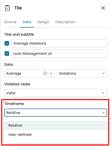
For instance, if we want results for the last week only, we select Relative, then choose This Week from the dropdown.
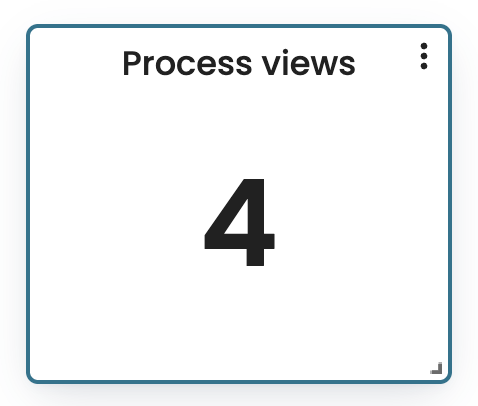
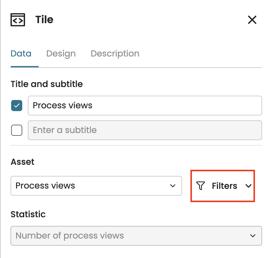
Add a metadata tile
When managing a growing number of process views across teams, it is useful to have a single place to track process view details and user activity across the organization.
A metadata tile serves this purpose by using Metadata as the data source. It can display the following statistics:
The number of process views
The total number of users
The number of active users in the last 3 months
The number of inactive users in the last 3 months
Imagine we want to display the number of process views we have as a tile, click Add widget > Tile > Metadata.
This displays the number of process views by default.
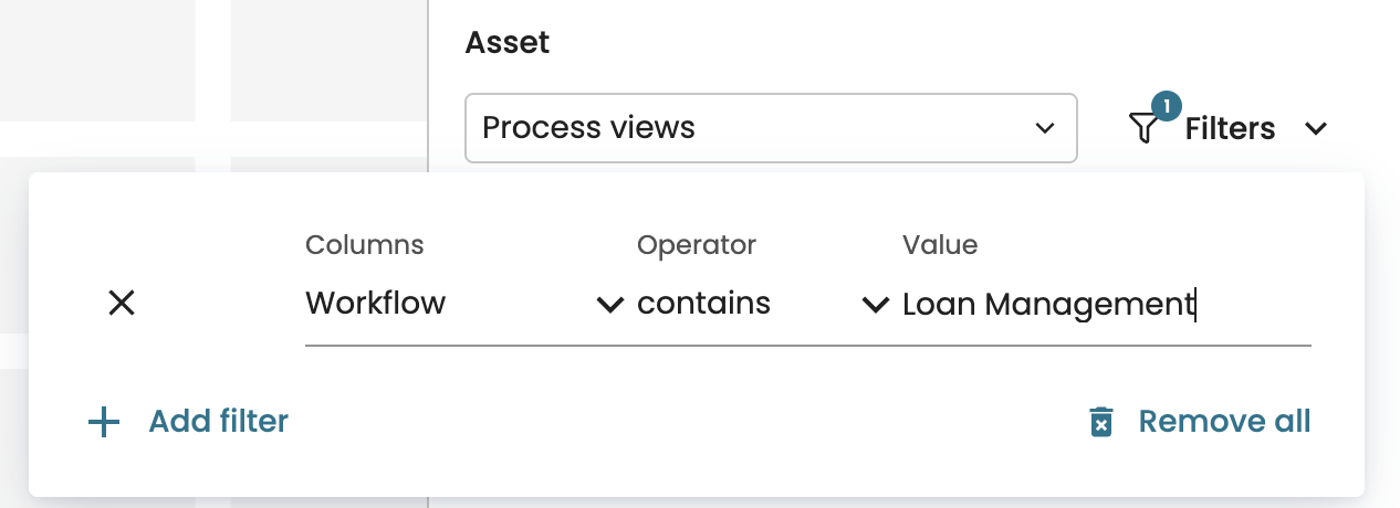
In the Data source tab, we can limit the views to be counter by creating filters. Click Filters.
Click Add new to add a new filter. Specify the filter based on the workflow name, source, description or custom properties. For instance, to focus on views from the loan management process, create a filter that specifies the source as “Loan Management.”
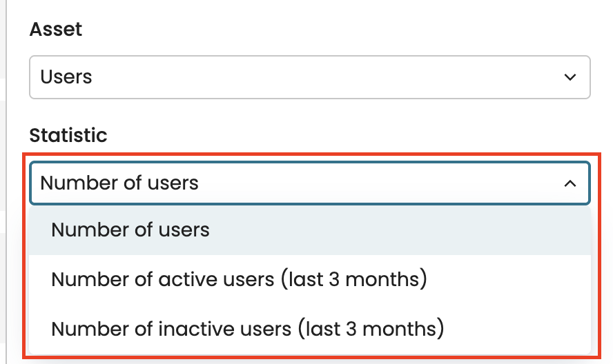
We can also view the number of users as a tile. In the Asset dropdown, select Users.
With the Statistic dropdown, we can specify whether to display the number of active or inactive users in the last three months.
Design a tile
We can design a tile to suit our visual preferences. To do that, go to the Design tab.
We can add border colors from the default colors or by entering a hex color code.
We can also change the font size of the data. In the Font drop-down, select Small, Medium, or Large.
We can change the text alignment to the center, justified to the left or right.
We can also define the number of decimal points to be displayed, up to 3 decimal points. Enter a value between 0 to 3 in Decimal digits.
For case-level KPIs, we can change the visualization type to display a chart.
We can also change the type of chart.