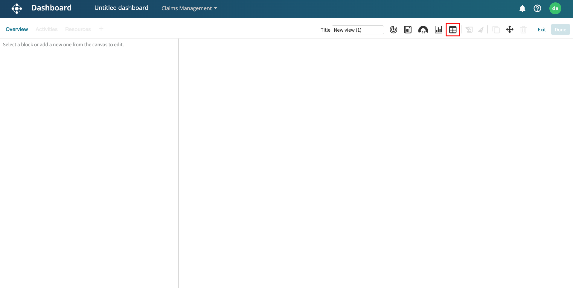
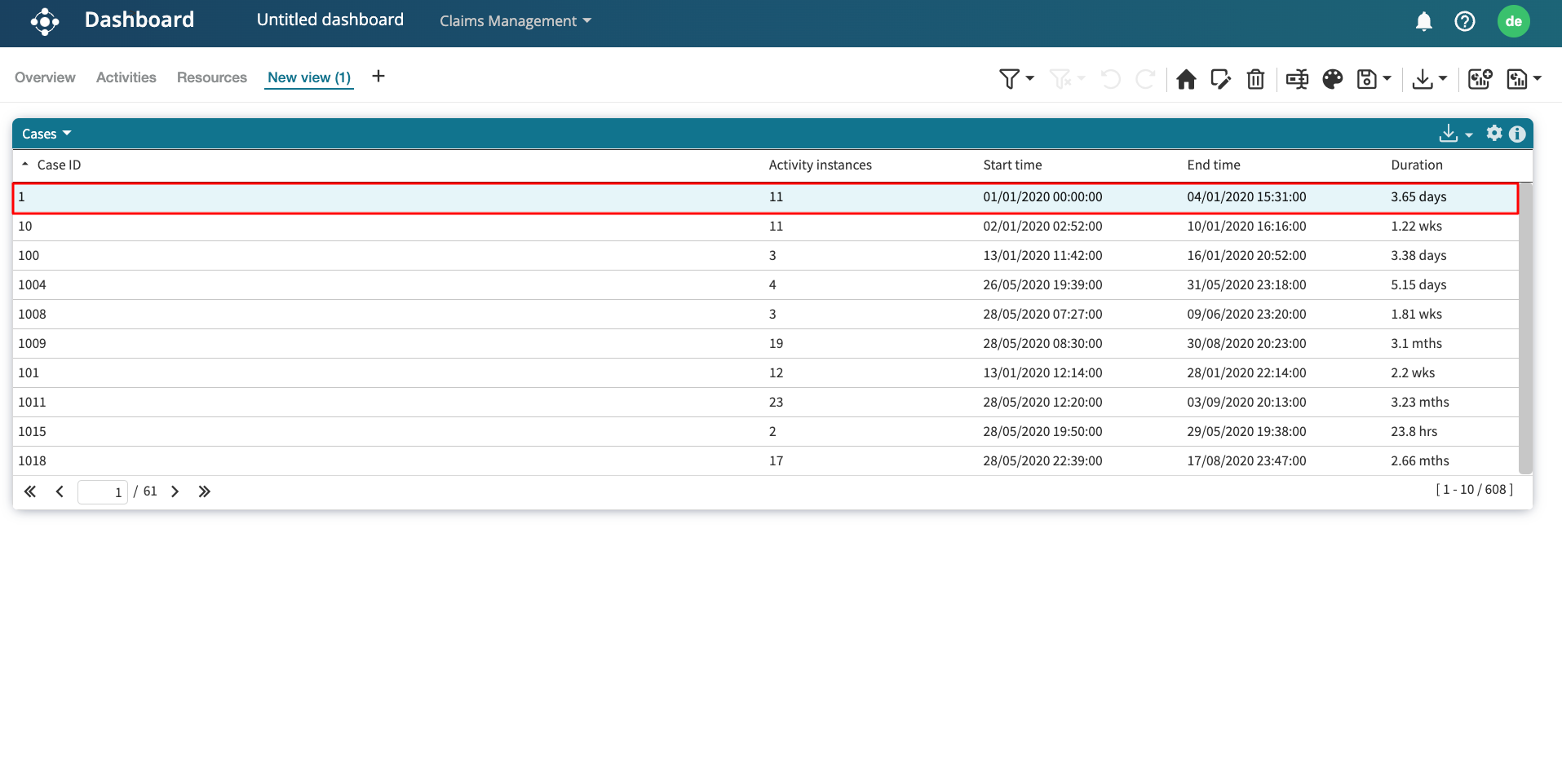
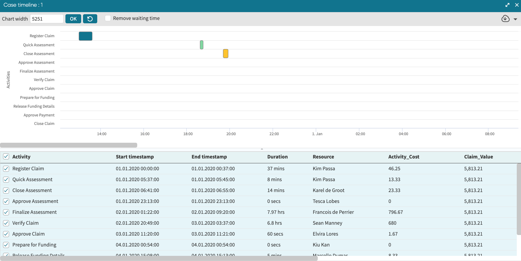
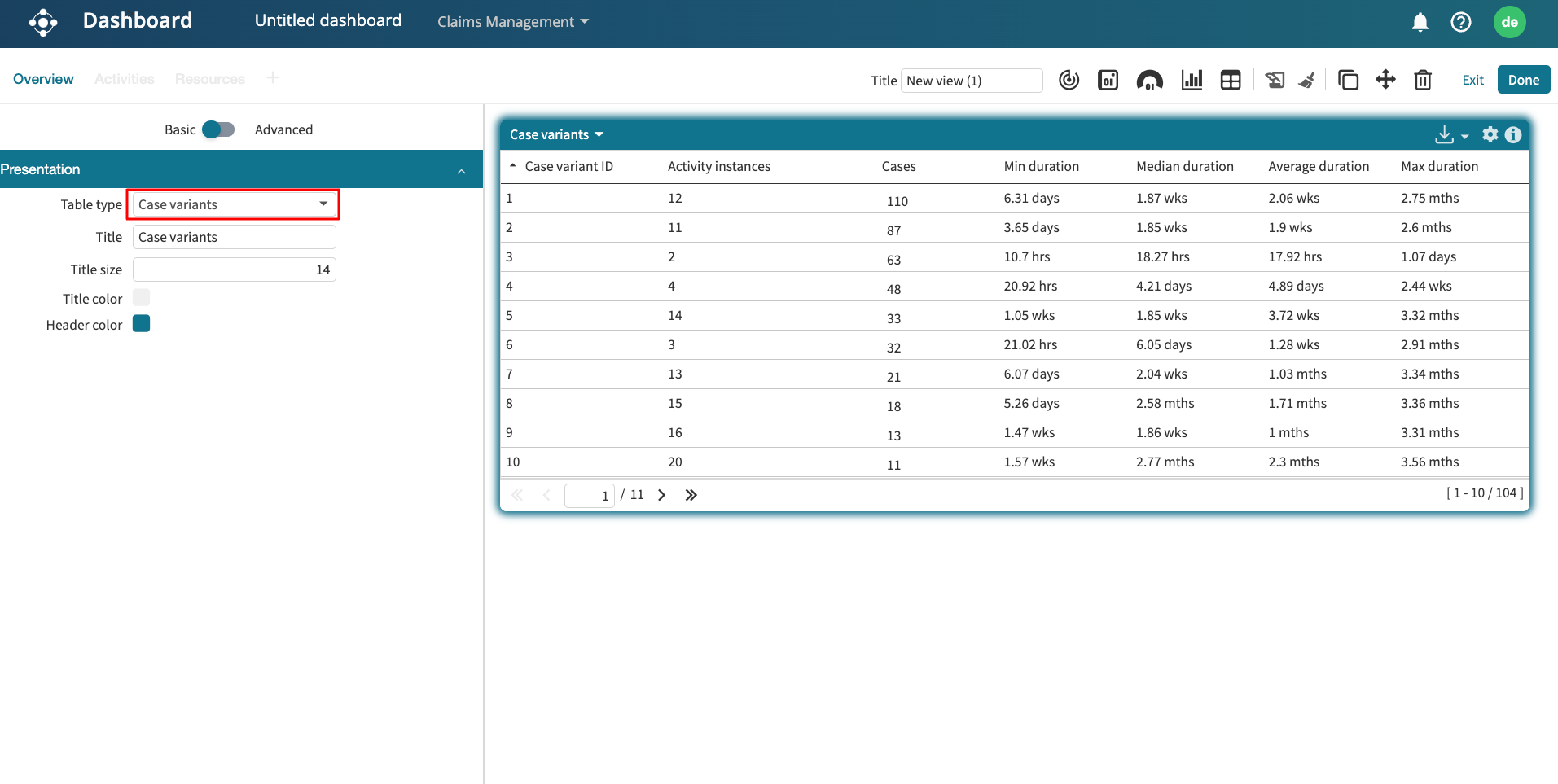
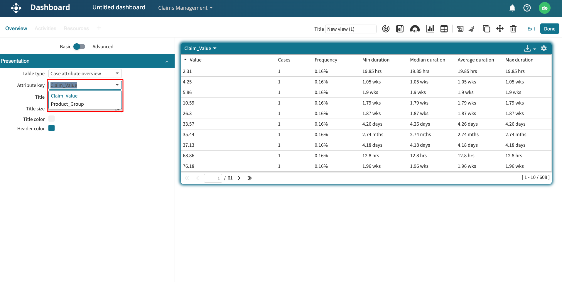
Add gauges to dashboard
A gauge is similar to a tile, but it differs in three ways:
Visual appearance: A gauge does not directly display a number but instead displays the value using a semi-radial visual representation.
Treatment of filters: If a filter is attached to a widget of type gauge, then the gauge will display the statistics of the log both before and after applying the widget’s filter. For example, if we apply a filter to retain only cases such that the case duration is > four weeks, then the gauge will display the statistics (e.g., the number of cases) of the log that takes > four weeks and the number of all cases.
KPI thresholds: Unlike a title, a gauge allows us to set KPI thresholds, which determine the color of the statistics of the filtered log.
To display a gauge, click on the Add new gauge icon.
Click on the gauge to edit it. We can display different metrics from the Stats type drop-down.
We can use Value presentation to change the presented value to a fraction or a percentage.
To apply a filter on a gauge, toggle on the Advanced setting and click the filter log icon.
If we wish to display the percentage of cases that take less than ten weeks, add the required performance filter in the Filter log window. Click Apply.
The gauge now displays the percentage of cases that fulfill the filter criteria.
We can also add a KPI to a gauge. The gauge colour depends on whether the KPI threshold is surpassed or not. For instance, we can create a KPI that triggers amber when the percentage of cases that take more than ten weeks is less than 90%. Otherwise, yellow.
In the KPI thresholds section, specify the lower and upper bounds.
Click Apply.
We can change the color code by specifying a custom KPI.