Add charts to dashboard
Apromore’s Performance Dashboard allows users to visually analyze a business process from a performance measurement perspective. The Performance Dashboard displays various aggregate statistics as charts and allows us to analyze one process in isolation or to compare multiple process variants. For example, we can use the Performance Dashboard to compare how a given process is executed across multiple regions or compare the variant of a process consisting of slow cases versus faster cases.
To open the dashboard, right-click an event log and click on Dashboards > New dashboard.
Note
We can also compare multiple process variants in a dashboard. Select the event logs, right-click and click Dashboards > New dashboard.
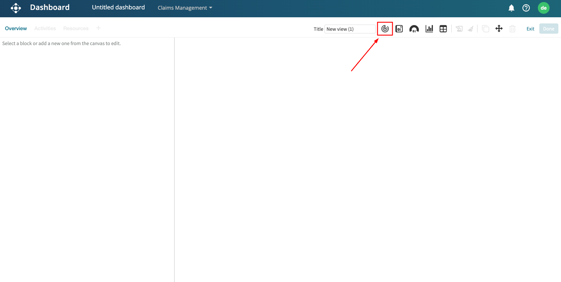
We can add different types of charts by clicking on the Add a new chart button
Apromore supports the following types of charts.
Spline
Line
Column
Area
Bar
Scatter
Pie
Scatter
Polar spline
Polar line
Polar column
Polar area
Heat map
Tree map
Bubble.
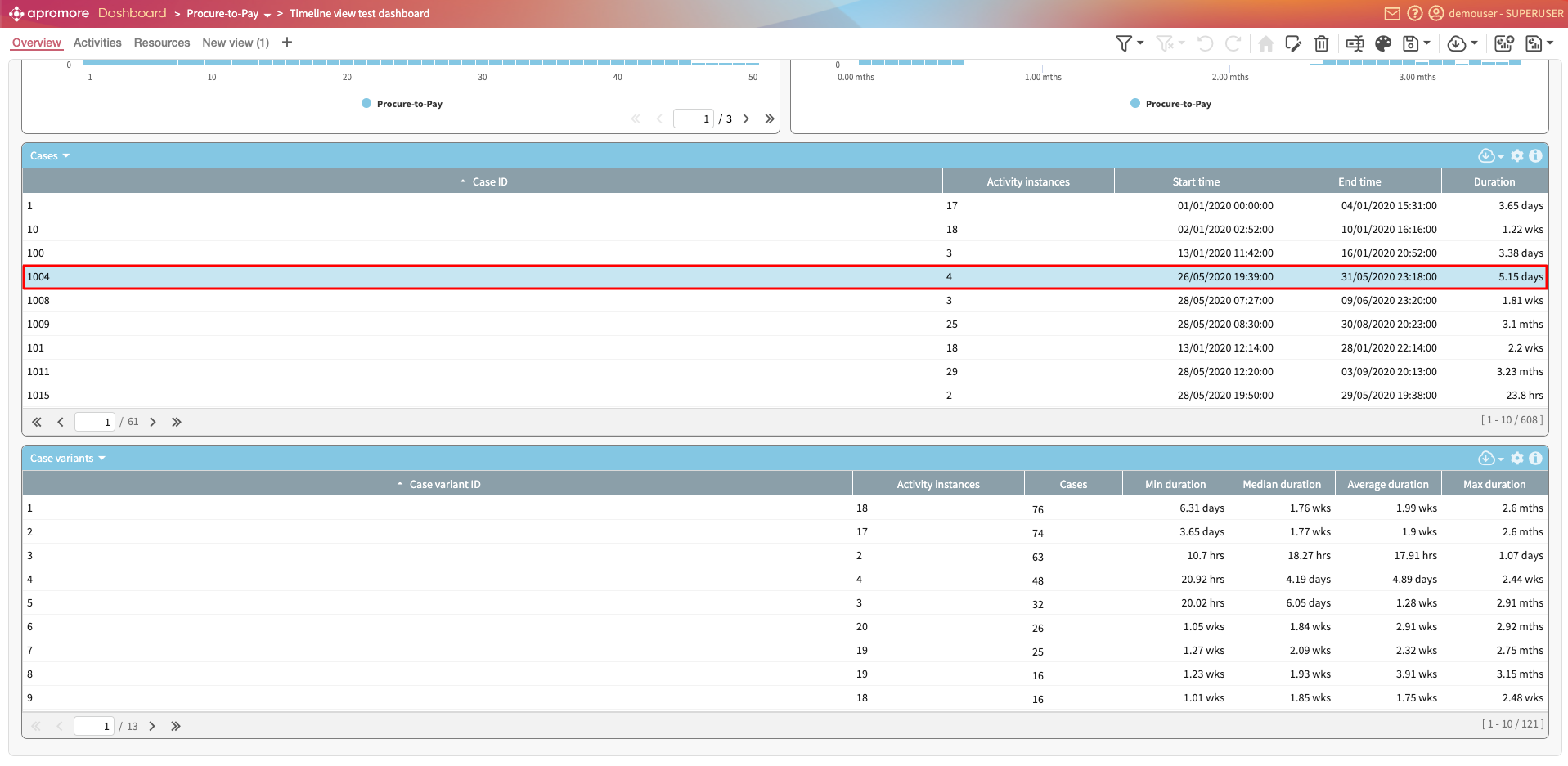
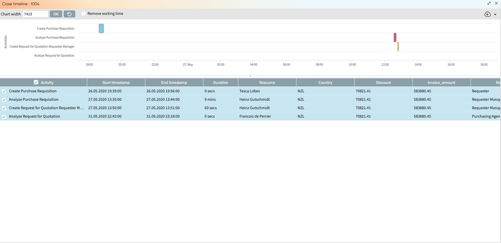
Activity instances over time chart
The Activity instances over time chart displays how many activity instances occur during the time frame of the entire event log. The X-axis shows the timestamp. The Y-axis shows the activity instance. This chart can help us to identify various patterns, such as the periodicity of the process. We can observe, for example, that in certain months of the year or certain days of the week, there is more activity than in others.
Work-in-Progress (Cases) chart
The Work-in-Progress (Cases) chart displays the active cases over time over the entire timeframe of the log. To understand and view the work-in-progress over a period of time, select Work-in-Progress (Cases) in the X-Axis dropdown.
Work-in-Progress (Activity Queue) chart
For business monitoring purposes, managers may be interested in knowing the number of cases waiting in a queue after a given activity was complete, or the amount of time spent by such cases in the queue. This may be useful for planning resource allocation or expected turnover rate.
In the dashboard, we can use the Work-in-Progress (Activity Queue) chart to display such information. To create the Work-in-Progress (Activity Queue) chart, open a dashboard and add a chart.
We can select the Column Chart type. On the X-Axis, select Work-in-Progress (Activity Queue).
Suppose we wish to display the number of cases in a queue (i.e., waiting to be processed) after the activity “Approve Payment” is completed, and that we want to aggregate these cases by quarter. In X-Axis intervals, click Quarter.
The X-Axis intervals options are:
Hours: Each X-axis interval represents one hour. This option will be available only if the log has a total duration (i.e., end timestamp - start timestamp of the log) less than 7 days.
Days: Each X-axis interval represents one day. This option will be available only if the log has a total duration (i.e., end timestamp - start timestamp of the log) less than 93 days.
Week: Each X-axis interval represents one week.
Month: Each X-axis interval represents one month.
Quarter: Each X-axis interval represents one quarter.
Semester: Each X-axis interval represents one semester.
Year: Each X-axis interval represents one year.
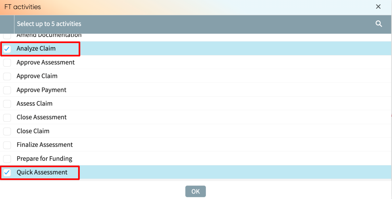
In the Queue dropdown, select After activity. Click Edit to select the activity whose output queue will be displayed.
In our case, we select Approve Payment.
In the Y-Axis, we can specify the cases to be counted. The Y-Axis options are.
Cases in the queue: Counts the number of cases in the queue within the time interval (i.e., x-axis interval). This is the default option.
Unique cases in the queue: Counts the number of unique cases in the queue within the time interval.
Time in the queue: Measures the total, minimum, median, average or maximum time of cases spent in the queue. When this option is selected, the Y-Axis aggregation appears, where we can select the time aggregation to display.
In our case, we select Cases in the queue.
We can also select the metric to display. The Display options are:
WIP: Counts only cases that have not yet exited the queue within the time interval.
Throughput: Counts only cases that have exited the queue within the time interval.
Both: The count considers both type of metric: WIP and throughput.
In our example, we select Throughput to obtain the resulting chart.
Case variants chart
A case variant is a sequence of activities followed by one or more cases, i.e., a distinct pathway. For example, if A, B, C, and D represent activities, then ABCD, ACBD, and ABC represent three case variants. Typically, multiple cases in a log follow the same case variant. For example, it may be that 10 cases follow the case variant ABCD, while 5 cases follow the case variant ACBD. The Case variants chart displays the number of cases that follow each variant. The variants are sorted from most frequent to least frequent.
Performance histogram chart
We can define a chart that displays a histogram of any performance metric supported in Apromore. The supported performance metrics include:
Case duration: The case duration is the total time taken from the start to the end of a case.
Case length: The Case length is the number of activity instances in each case.
Case cost (available if a cost center has been defined): The Case cost is the total cost associated with executing a case.
If the log has the start and end time stamps, the following additional performance metrics become available:
Case utilization: Case utilization is the ratio of the processing time of a case and the case duration. The processing time of a case is the time during which someone was actively working on an activity in the case (i.e., the case duration excluding waiting times).
Role utilization: Role utilization is the percentage of time a role is involved in an activity with respect to their total working hours. For instance, a 100% role utilization indicates that the role has no idle time, which necessitates the need for more resource allocation.
Processing time (Average/Max/Total): The Processing time of a case is the amount of time during which someone was actively working on an activity in the case (i.e., the case duration excluding idle times).
Waiting time (Average/Max/Total): The Waiting time of a case is the amount of time during which nobody was actively working on an activity in the case.
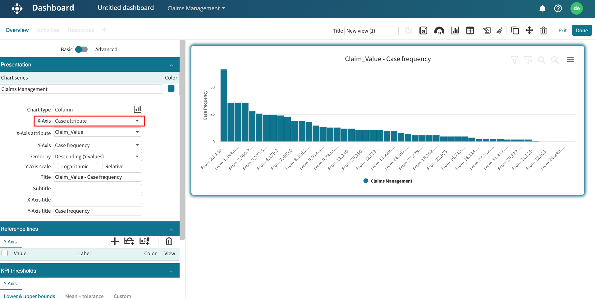
For example, if we wish to visualize the histogram of the case duration of the process, select the Column chart type and Case duration on the X-Axis. The X-axis displays different bins corresponding to different ranges of case durations in the log, whereas the Y-Axis displays the number of cases that fall within each bin.
The screenshot below shows that many cases were under 20 days, but a few lasted between 70 and 108 days.
We may also be interested in displaying the histogram of case utilizations in the log. Select the Column chart type and Case utilization on the X-Axis. Each bar in the chart shows the number of cases (Y-axis) with a given case utilization (X-axis). If we see one bar only, there may be two reasons: either all cases have the same value of case utilization, or the other bars are tiny. If that is the case, press the “Log scale” button on the chart’s top left corner to make the other bars visible.
When displaying the histogram of processing times or waiting times of cases in the log, we can choose between average, total, or maximum values. For example, we can display a histogram showing the total waiting time in the process. Select the Column chart type and Total waiting time on the X-Axis.
Performance trend chart
When analyzing a business process, it is useful to understand how certain process performance metrics change over time. This helps us detect performance improvements or degradations, for example, degradations in average case duration over time.
A performance trend chart helps us visualize how performance evolves. An example of a performance trend chart is a chart that displays the “average case duration over time” or the “active cases over time”.
To create a Performance trend chart, launch a dashboard, open the dashboard editor, and create a new chart (or edit an existing chart). In the chart type, select any two-dimensional chart type (e.g., Column chart). In the X-Axis, select Performance trend.
In the Group cases by field, select the time unit to be used in the X-axis: Week, Month, Quarter, Semester, or Year. For example, if we wish to visualize the monthly performance, select Month. This will result in a chart with one bin per month within the log timeframe.
We can then specify the condition that determines if a case is included in a bin (e.g., the condition that determines if a case is counted in the bin of August 2023). This criterion condition is called the case containment type. The case containment types are:
“Cases are contained in”: The start and end events of a case fall within the period covered by the bin.
“Cases are active in”: There exists at least one event of the case falling within the period covered by the bin.
“Cases start in”: The start event of a case falls within the period covered by the bin.
“Cases end in”: The end event of a case falls within the period covered by the bin.
In the above example, if we want to count in a bin all cases that start in the month corresponding to the bin, then select “Cases start in” as the case containment type.
In the Y-Axis, select the performance metric we wish to visualize. The metrics are:
Cases: Number of cases falling in the bin
Variants: Number of case variants (distinct pathways) of the cases falling in the bin.
Variability ratio: Ratio between Variants and Cases.
Processing time: Aggregated processing time of the cases falling in the bin.
Waiting time: Waiting time for the cases falling in the bin
Case length: Number of activity instances in the falling in the bin.
Case duration: Case duration of the cases falling in the bin.
Case cost: Cost of the cases falling in the bin. This option is only available if we have attached a cost center to the event log.
For example, to display the monthly case duration, select Case duration in the Y-axis dropdown.
We can then change the Y-axis aggregation. By default, the “Total” aggregation is selected, but we can also specify to use Min, Average, Median, or Max aggregation.
For example, if we wish to display the average case duration per quarter chart, select Average in the Y-Axis aggregation drop down.
The Order by option specifies the order of the bins. The options are:
Ascending (X values): Sorts from oldest to newest time.
Descending (X values): Sorts from newest to oldest time.
Ascending (Y values): Sorts from the lowest to highest performance metric.
Descending (Y values): Sorts from the highest to lowest performance metric.
If we want to sort from the lowest average duration to the highest average duration, select Descending (Y values).
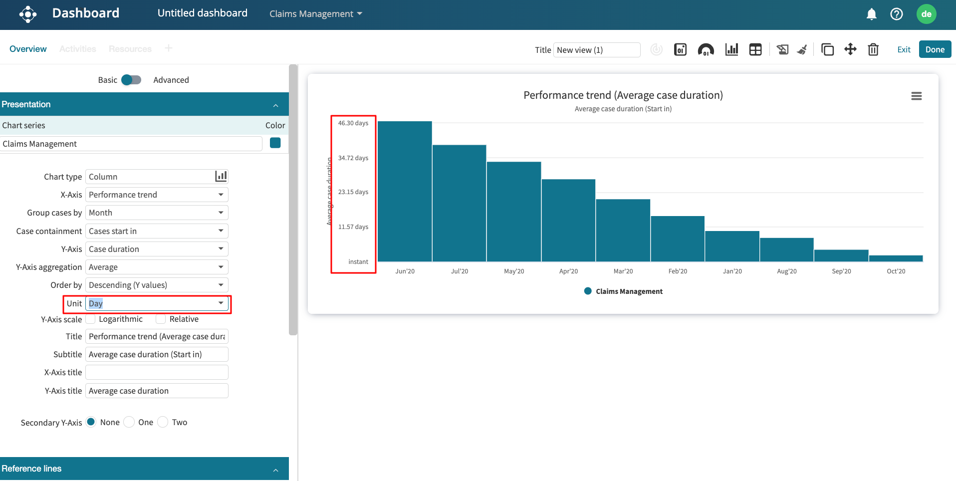
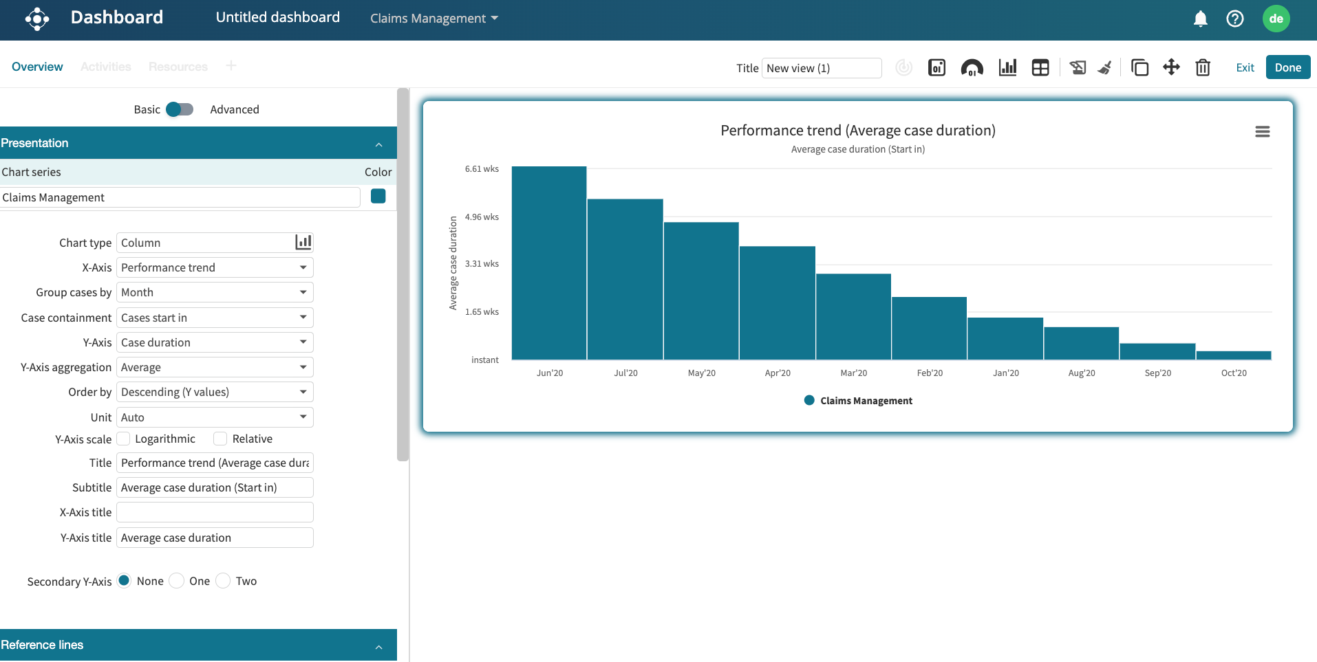
We can also specify the unit of the Y-axis. By default, it is set to “Auto”. However, we can change this to “Year”, “Month”, “Week”, “Day”, “Hour”, “Minute,” or “Second”.
To change the Y-axis unit to appear in days, select Day in the Unit dropdown.
When creating a performance trend chart, it is often necessary to display multiple performance metrics simultaneously over a period of time. This allows us to see how these metrics evolve together.
We can add multiple Y-axis in a performance trend chart. For instance, we can have a primary Y-axis that displays the average case duration over a period and, in the same chart, a secondary Y-axis that displays the waiting time over the time period. We can add up to two additional Y-axis (called secondary Y-axis).
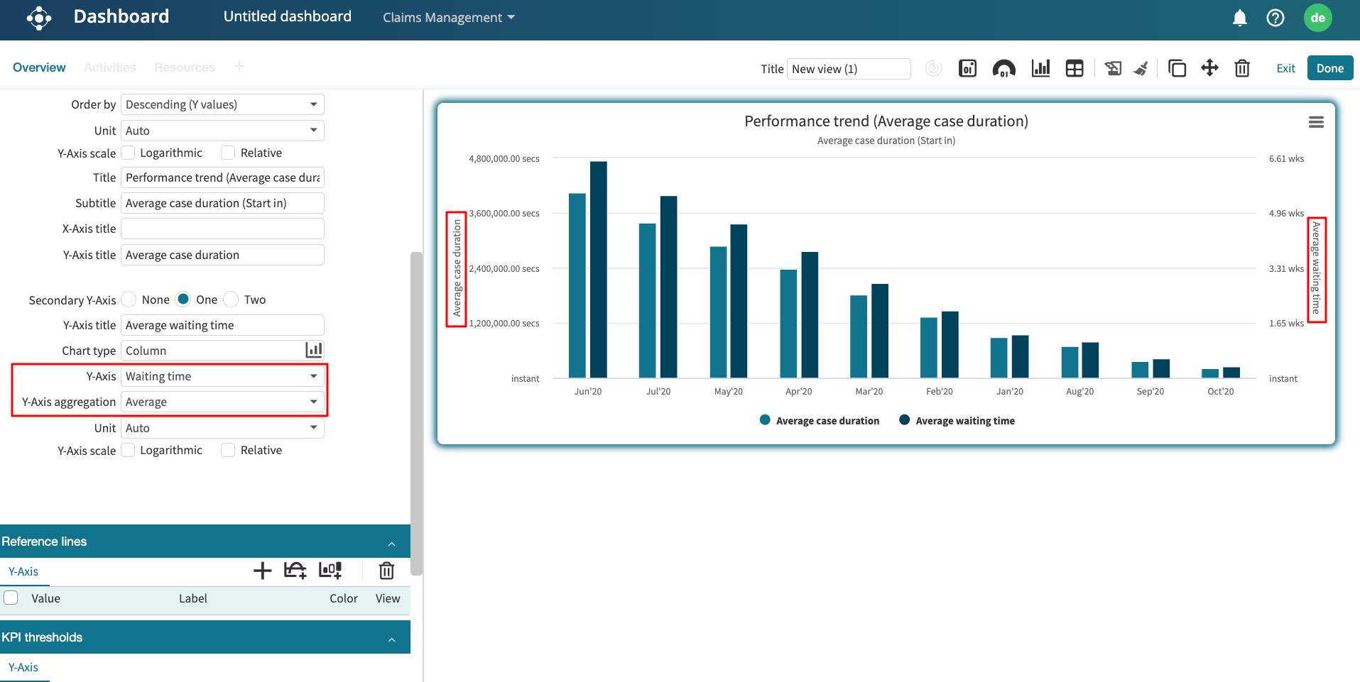
If we want to create a monthly performance trend charts that displays the average case duration and average waiting time, go to the dashboard and add a chart.
Create a performance trend with “Case duration” Y-axis and “Average” Y-Axis aggregation.
In Secondary Y-Axis, None is selected by default. To add one more Y-axis, select One.
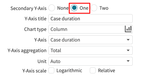
This creates a list of options to define the additional metric to be displayed in the secondary Y-axis. Since we want to add the average waiting time as the secondary Y-Axis, in Y-Axis, select Waiting time from the drop down. In Y-Axis aggregation, select Average. The graph now displays each month’s average case duration and average waiting time.
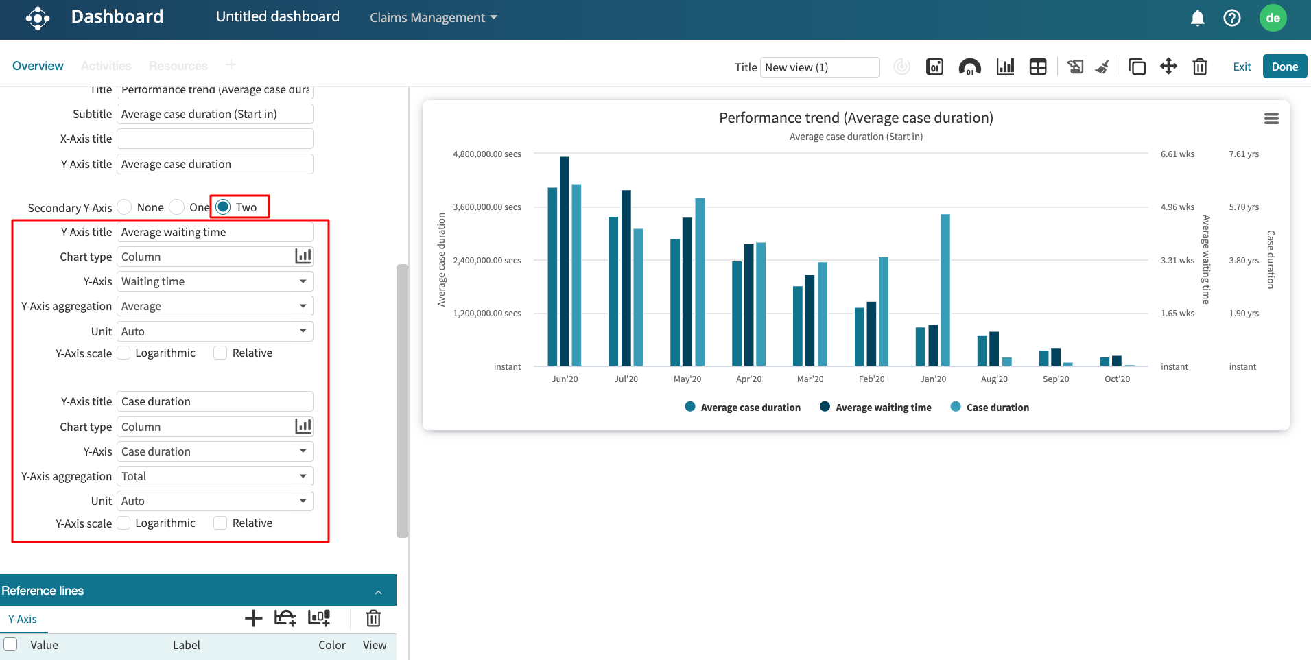
To add two additional Y-axis, in Secondary Y-Axis, select Two.
This creates two additional Y-axis options where we can specify the performance metric to display. Let us assume we want to add the average waiting time and average processing time. Specify these metrics in the additional two Y-axis options. The performance trend chart is displayed with both secondary y-axes, as shown below.
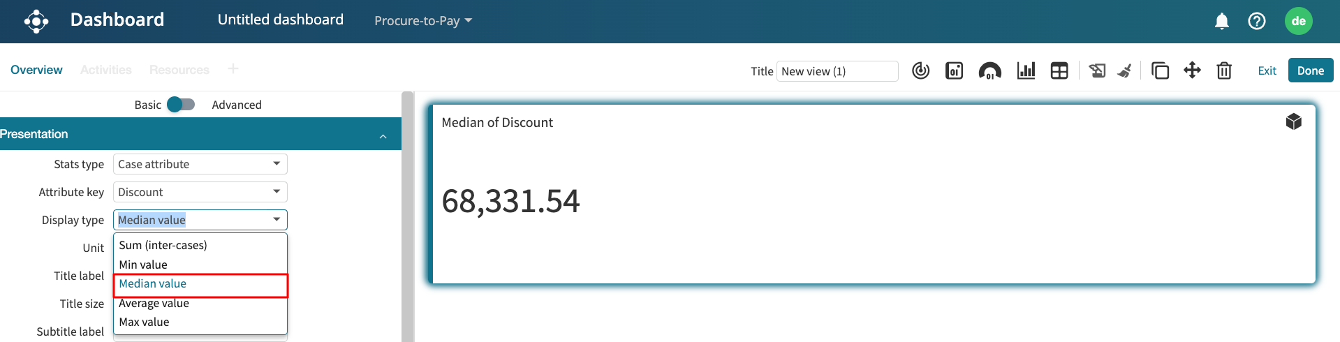
Case attribute chart
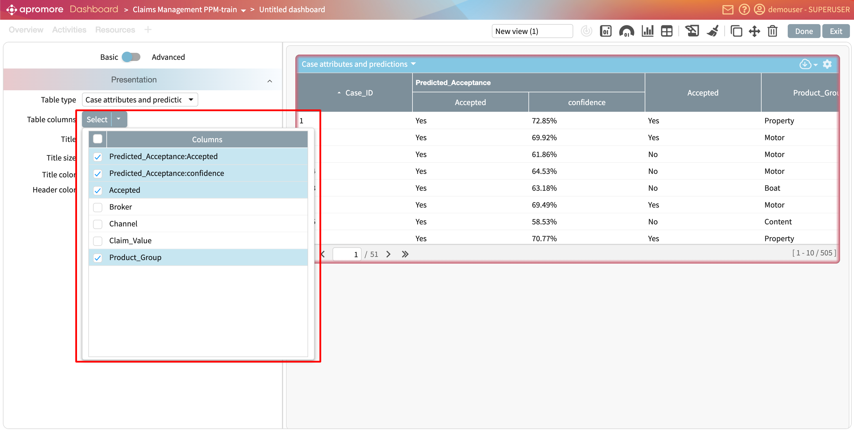
A case attribute is the attribute of a case that adds further information about the case. For instance, a “Claims management” event log may have cases based on the “Product group” attribute or “Claim value” attribute. “Product group” and “Claim value” are thus case attributes of such event log. The case attribute chart displays the case attribute against other case/event attributes.
Note
To create a case attribute chart, the event log must have at least one case attribute. If the event log has no case attribute, Case attribute will not appear as a possible chart to create.
When Case attribute is selected as the X-Axis, we are required to select the X-Axis attribute — the specific case attribute to display. Click the dropdown beside the X-Axis attribute to select the case attribute to display.
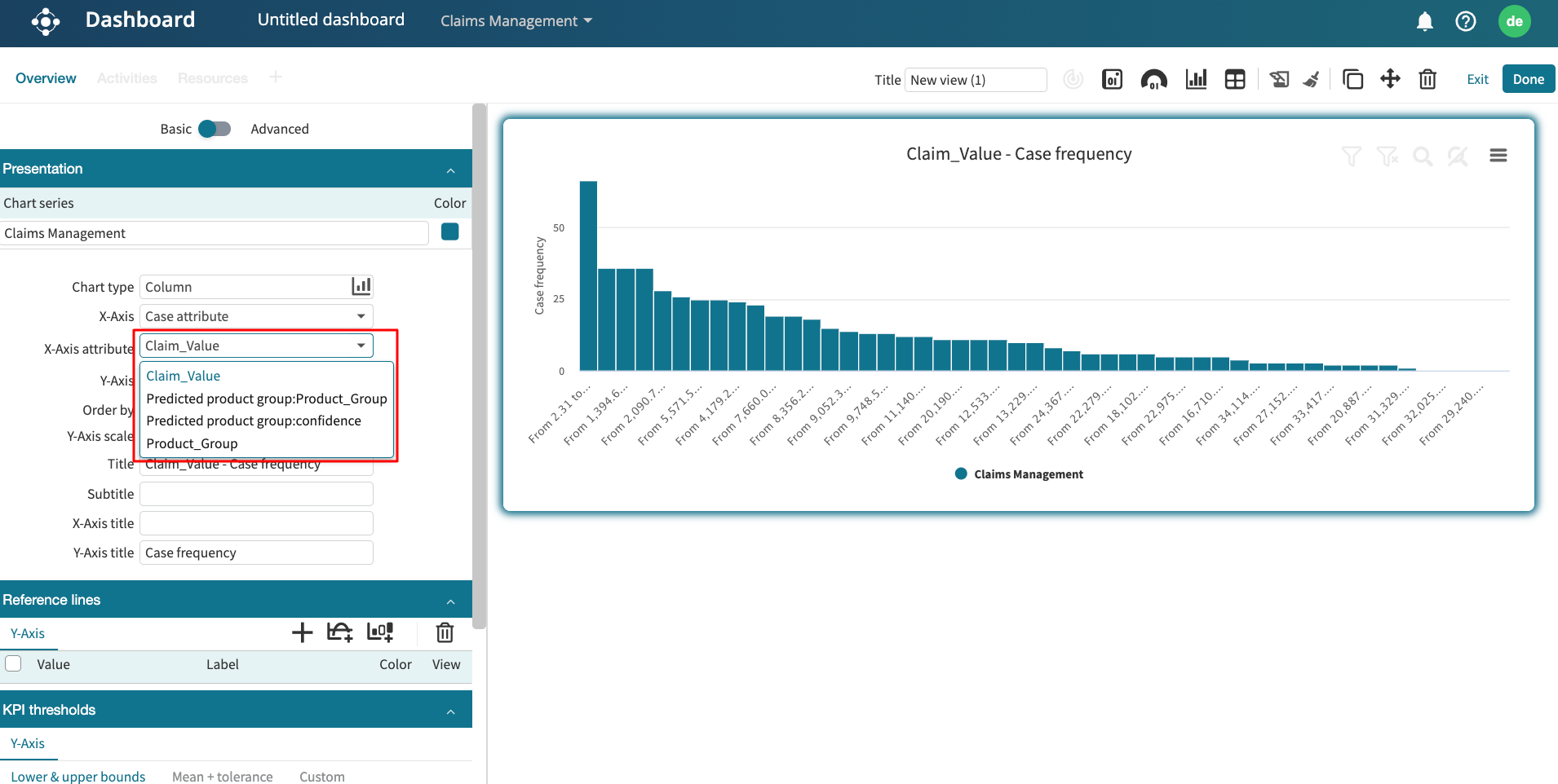
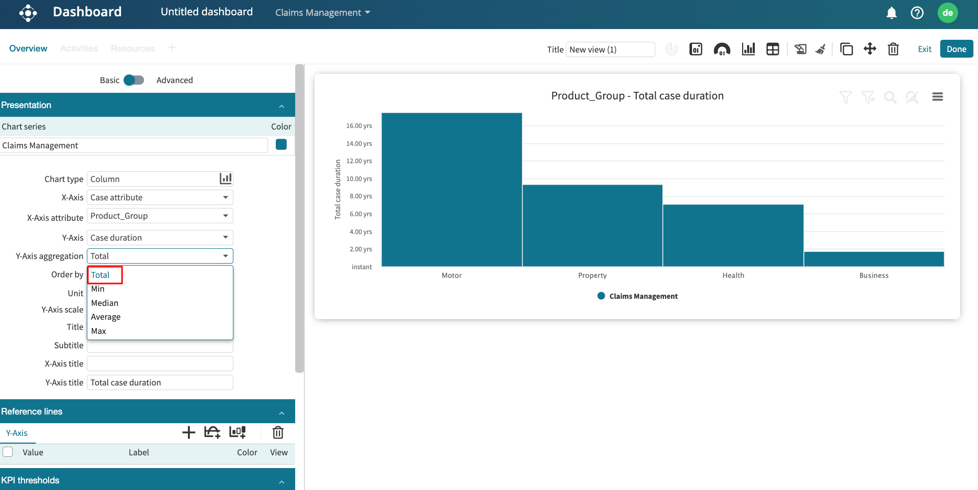
We can plot a case attribute against another property on the Y-Axis. The Y-Axis can be the case frequency, case duration, case cost, an event attribute, or a case attribute.
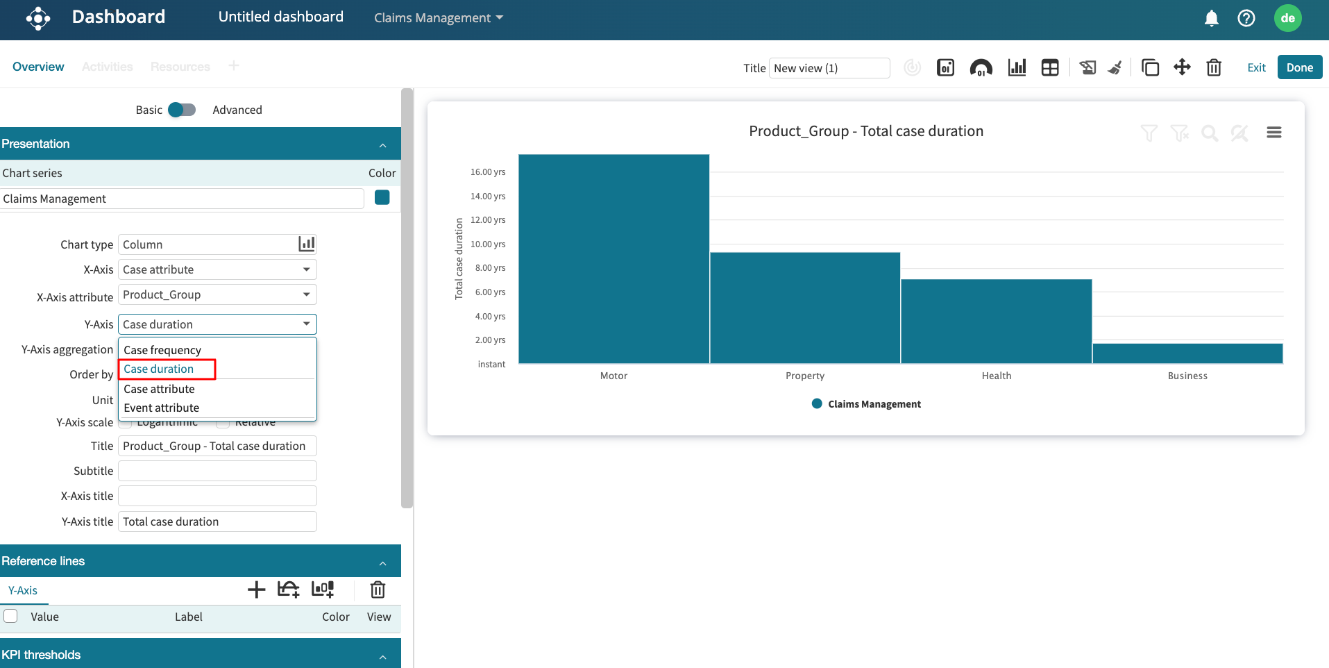
If case duration, case cost, or another case attribute is selected on the Y-axis, a default Y-Axis aggregation is set to Total, indicating the chart displays the total specified attribute. We can, however, change the aggregation function to others, such as Min, Median, Average, and Max.
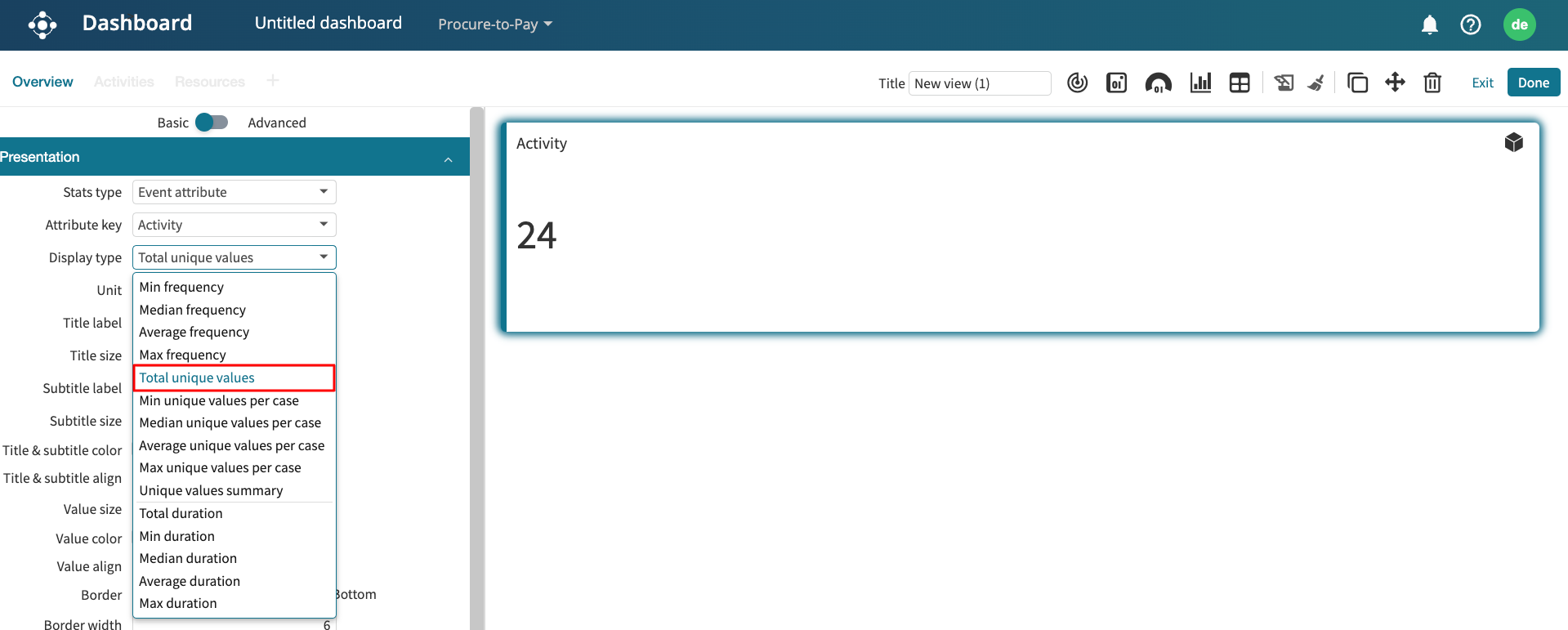
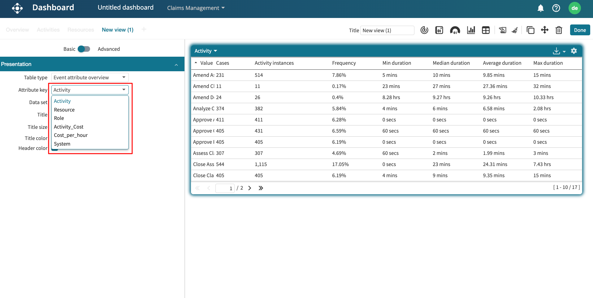
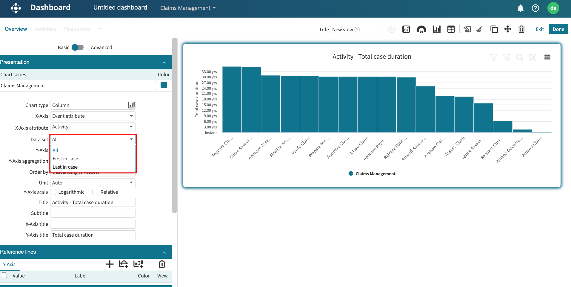
Event attribute chart
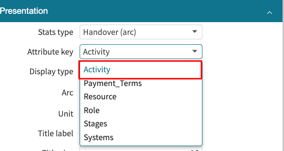
Event attributes are unique properties of an event. It could be an activity, the role, the resource performing the activity, etc. The Event attribute chart allows us to display an event attribute against another case/event property. To create an event attribute chart, select Event attribute from the X-Axis dropdown.
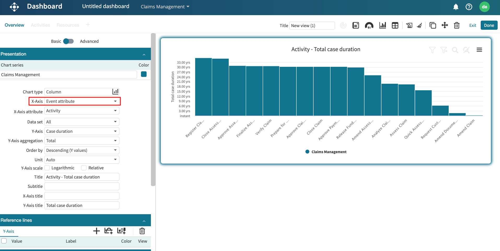
By default, the X-Axis attribute is set to Activity. However, we can change it to another event attribute in the event log. Click the X-Axis attribute dropdown and select an event attribute.

We can also define the Data set the chart will be generated from. There are three options:
All: The chart is generated from the entire event log. This is the default.
First in case: The chart is generated from the first activity of all cases in the event log.
Last in case: The chart is generated from the last activity of all cases in the event log.
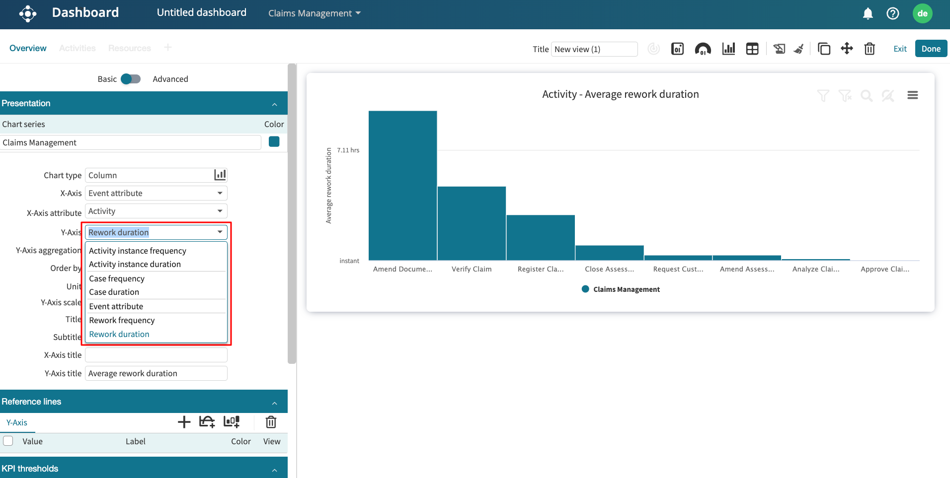
In the Y-Axis, we can also create the chart using frequency, duration activity instance cost, case cost, an event attribute, or a rework metric. Reworks metrics in Apromore include:
Total rework: Total number of times an activity has been repeated after being executed once in a case.
Rework duration: Total duration of the reworked activity instances.
Rework cost: Total cost of the reworked activity instances. Appears if the cost center has been added to the log.
To do so, select the Activity attribute on the X-axis of the chart and then select one of the rework metrics on the Y-axis, for example, the rework duration. We can then select the aggregation function, for example, “average” to display the average rework of each activity. The average rework is the number of times, on average, that an activity is reworked in a case.
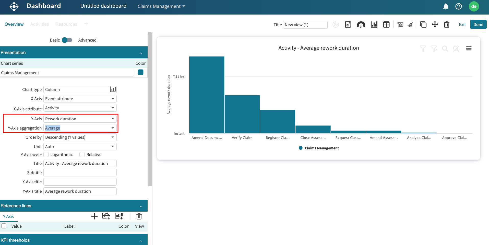
We can also visualize the rework frequency or any other metric by selecting the corresponding item from the Y-Axis dropdown.
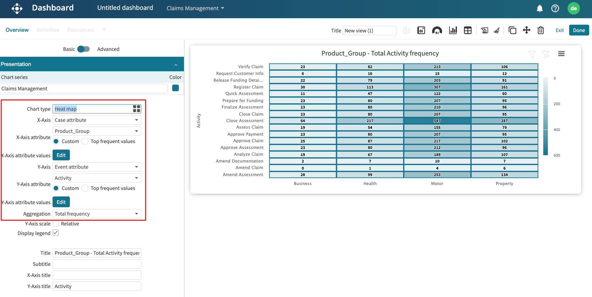
3D chart
A 3D chart displays three metrics, allowing us view complex data interrelationships within a single chart. Apromore supports three types of three-dimensional charts: heat map, tree map and bubble charts.
To view any of these 3D charts, we must select Case attribute or Event attribute in both the X and Y-axis.
For instance, we can create a heatmap that displays the total frequency of activities across product groups. On the X-Axis, select Case attribute. On the Y-axis, select Event attribute. Since we have selected a case or event attribute in both the X and Y-axis, we will see heatmap as a chart type. In Chart-type, select Heat map.
Next, we need to select the specific attribute to display on both axes. Since we are interested in the total frequency of activities across product groups, select Product_Group on the X-Axis attribute and Activity on the Y-Axis attribute.
Lastly, we need to select an aggregation function to display. In our case, we select Total frequency from the Aggregation dropdown.
3D charts can also display the number of times or any other measure, where an activity instance with one value is followed by an activity instance with the other value. The same attribute must be selected on the X-Axis attribute and Y-Axis attribute.
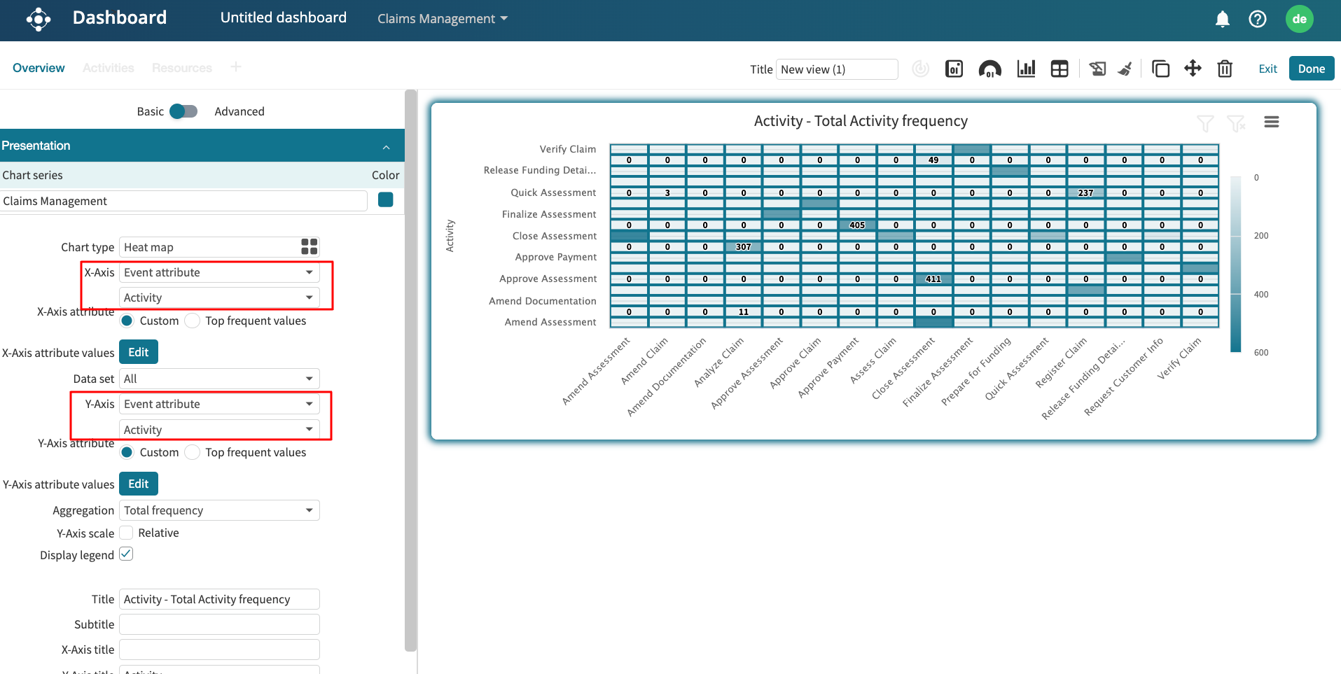
For example, we can display the number of times an activity directly-follows another activity. On the X-Axis and Y-Axis, select Event attribute. On both the X-Axis attribute and Y-Axis attribute, select Activity. Select Total frequency as the Aggregation.
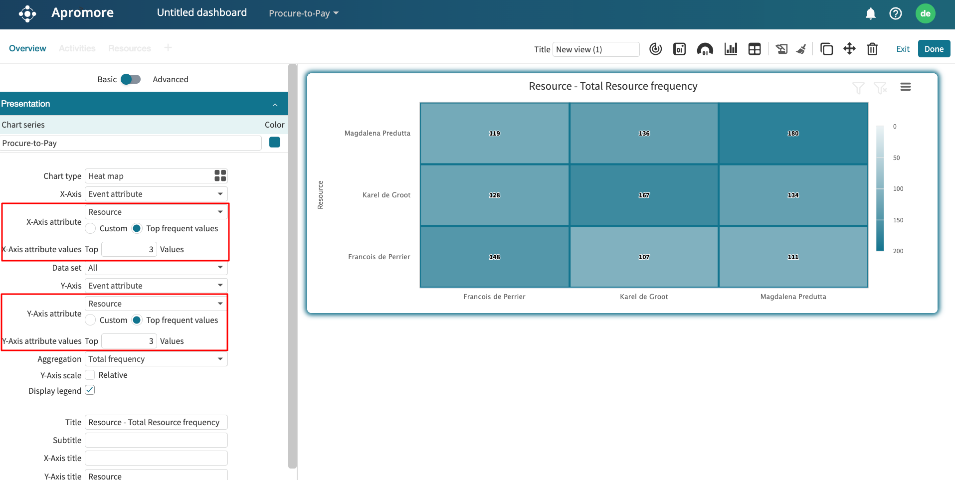
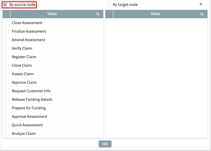
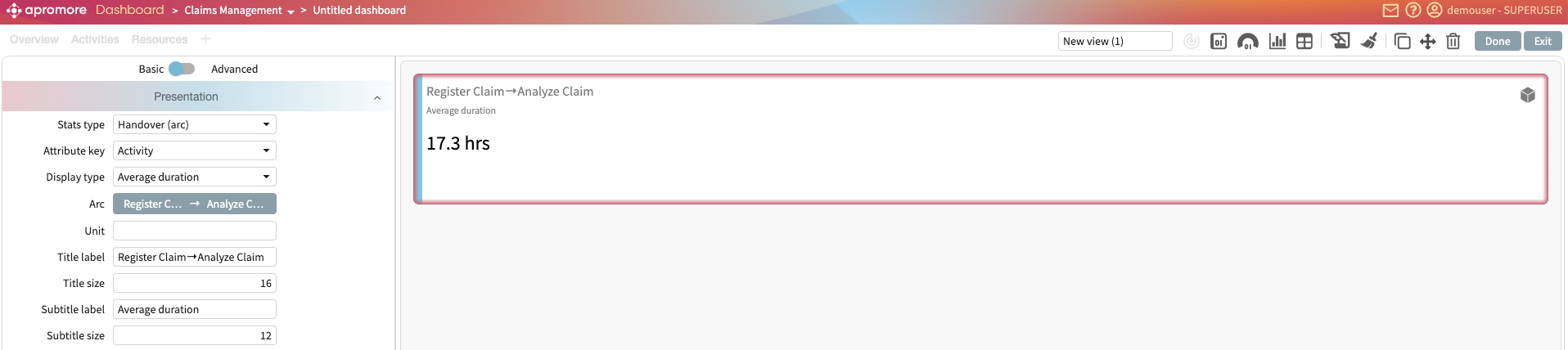
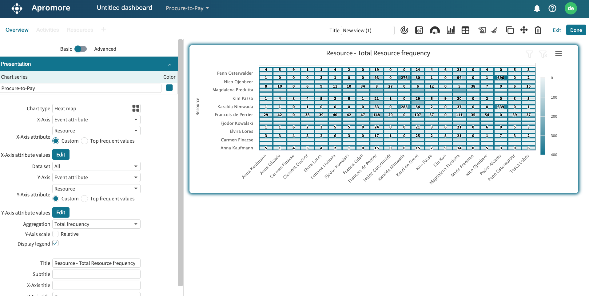
We can also display the total handoffs between resources in the process. Select Heat map as the Chart type. On the X-Axis and Y-Axis, select Event attribute. On both the X-Axis attribute and Y-Axis attribute, select Resource. Select Total frequency as the Aggregation. A heatmap is displayed showing the total handoffs between resources. The screenshot below shows that the total handoff between “Penn Osterwalder” and “Ann Olawada” is 3.

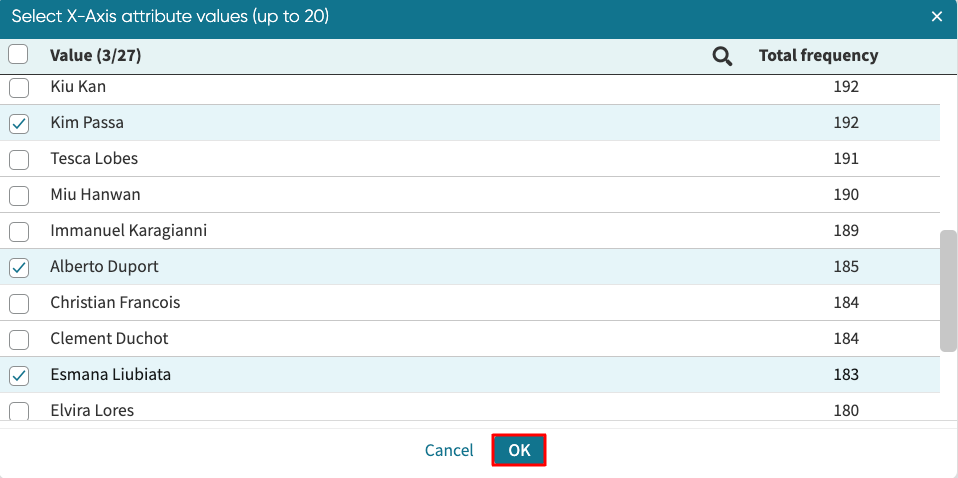
We may be interested in displaying specific attribute values or the most frequent values. For instance, if there are 50 resources, we may be interested in display handoffs between specific resources. On the other hand, we may also be interested in displaying handoffs from the top 5 most frequent resources. We can specify the attribute values to retain or the most frequent values to retain when we create a heatmap or bubble chart.
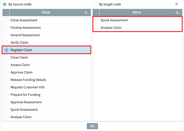
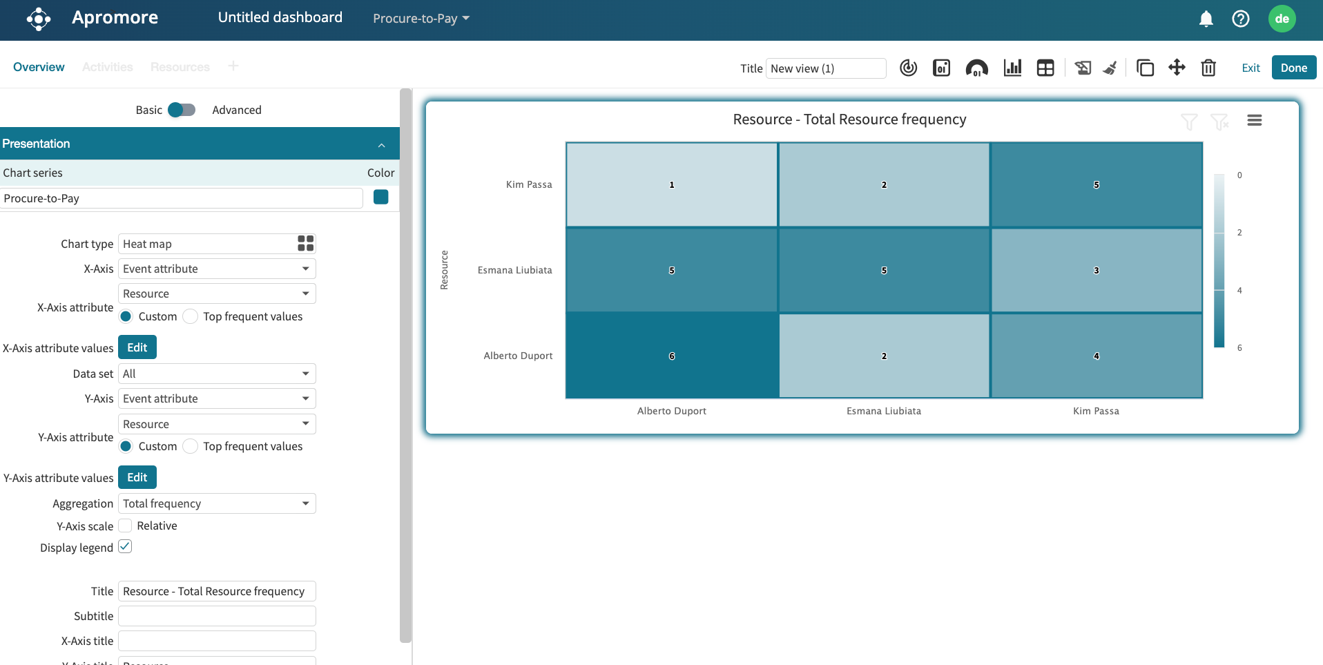
For illustration, let us imagine we want to display handoffs between “Esmana Liubiata”, “Kiu Passa”, and “Alberto Duport”. Create a heat map with “Resource” as the X and Y-axis attribute. By default, Custom is selected. This displays the top 20 resources.
We can, however, change this. To specify the customer resource to retain, click Edit.

Specify the resources to retain and click OK.
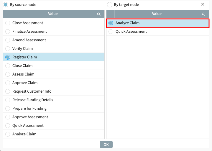
We see that only the three specified resources are displayed on the X-axis.
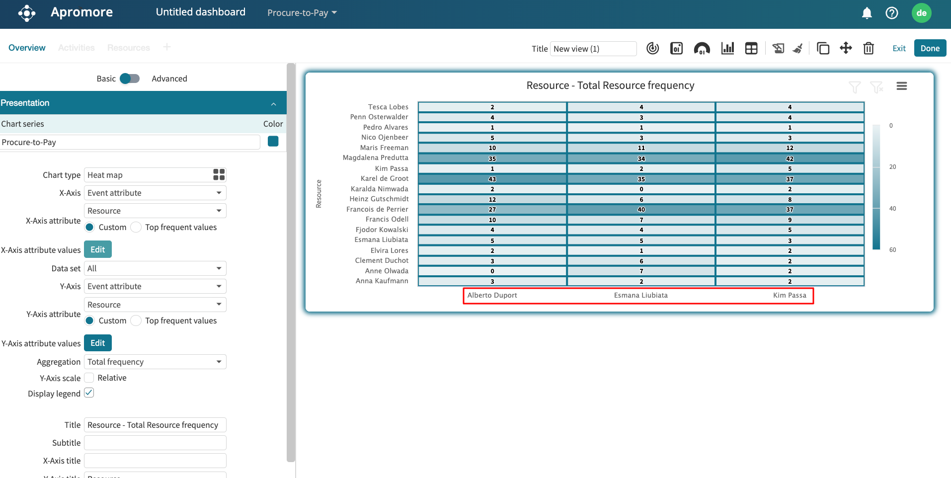
We can repeat the same procedure on the Y-axis attribute. The heatmap will display the handoffs between the three specified resources.
As a second use case, we can also specify the top frequent values to be retained. For instance, let us say we wish to display the handoffs between the top 3 resources in the process. Select Top frequent values and enter the top number of values to retain. In our case, we enter 3.
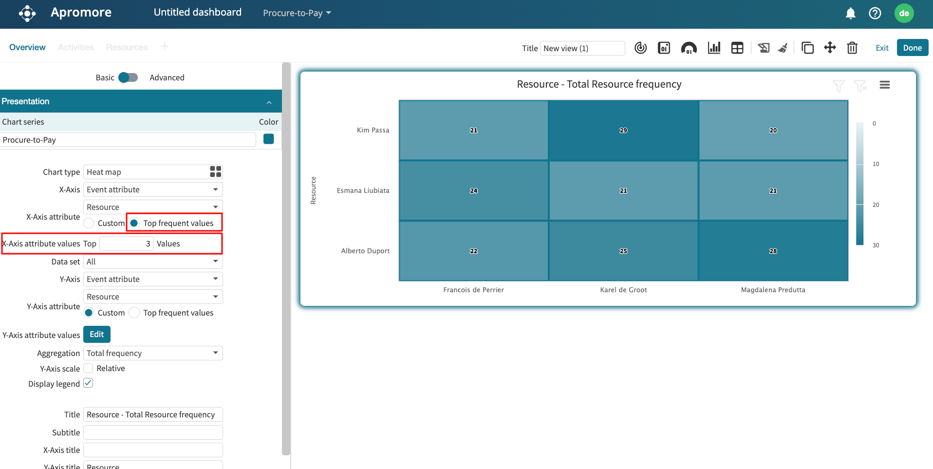
We can also repeat this step on the Y-axis attribute. This displays the handoff between the top 3 resources in the process.