Discover model
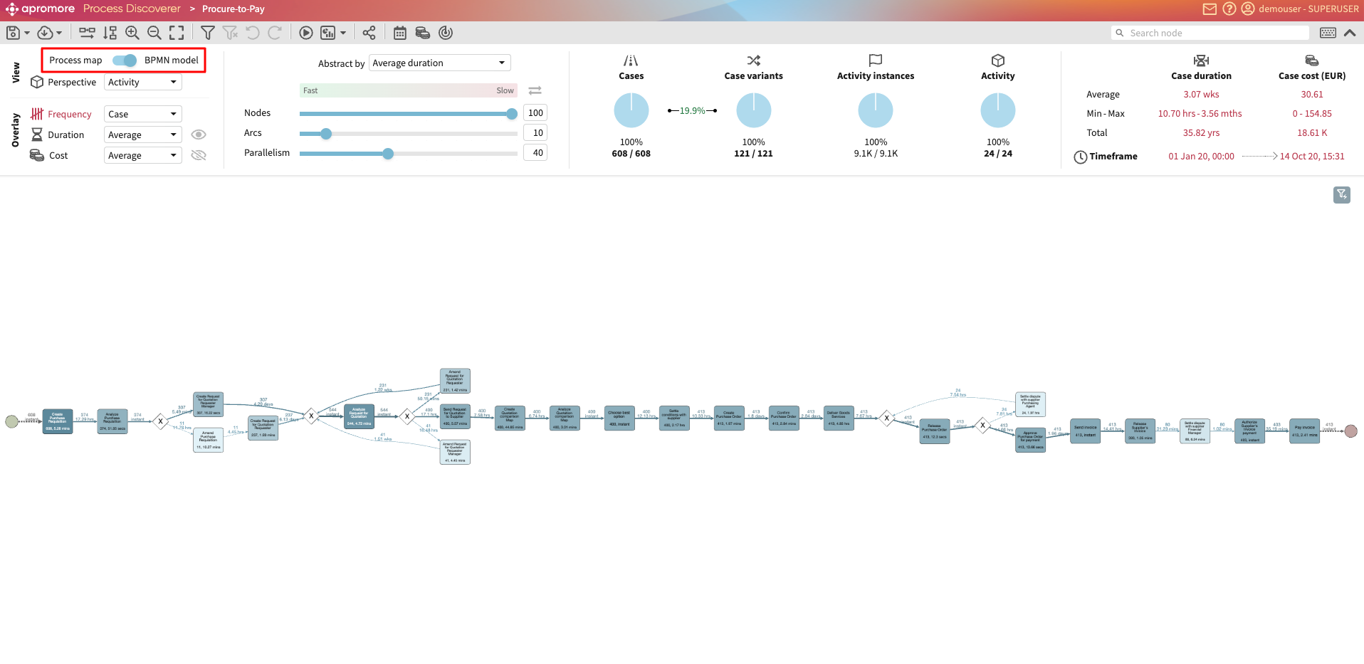
Apromore allows us to discover a process map or a BPMN model from an event log. A process map (a.k.a. directly-follows graph) is a visual representation of the log as a graph where nodes capture process activities and directed arcs between them capture sequential order relations between the activities. For example, an arc going from activity Accept order to activity Check order indicates that in the log, we can observe that process cases flow from Accept order to Check order. Process maps are a simple yet effective means to understand the basic order of relationships between process activities. As such, they are the most common type of model discovered by commercial process mining tools.
View process map
To view the process map, double-click on a log. Alternatively, we can right-click the log Discover model > From full log.
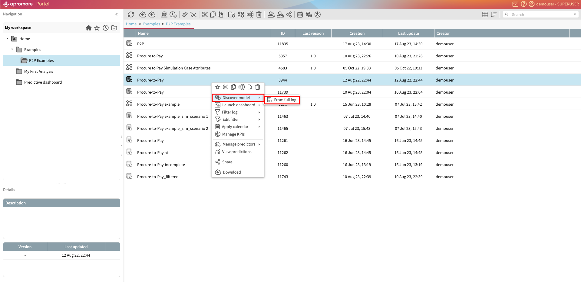
This opens Process discoverer, showing the process map discovered from the log.
We can rearrange an activity by clicking and dragging it accordingly. We can also rearrange multiple activities at once. To select multiple activities, press Ctrl (for Windows) or Command (for Mac) and drag the mouse over multiple activities.
The selected activities can be rearranged by dragging them accordingly.
Process map layout
To better understand a process map, displaying the most frequent activities along a horizontal line may be useful. We can horizontally align and lock the most frequent activities in one specific Y-coordinate when displaying the process map in Process Discoverer.
There are three layout options when configuring the process map layout in Process Discoverer.
Legacy left-to-right: This is the default option where Apromore randomly places activities along the Y-coordinates.
Auto-discovered backbone: When we select this option, Apromore displays the most frequent activities in the process in a specific Y-coordinate (called the backbone line). Less frequent activities are displayed in a Y-coordinate above or below the backbone line.
User-defined backbone: When we select this option, we first will select at least two activities and all their connecting arcs. The selected activities will form the backbone line.
To specify the process map layout in Process Discoverer, click on the layout icon.

This displays a list of options for setting the process map layout.
By default, the process map is opened with Legacy left-to-right.
To display the most frequent activities on the backbone line, select Auto-discovered backbone.
Apromore automatically detects the most frequent activities and aligns them on the backbone line.
Note
When a filter is applied, Apromore displays the most frequent activity of the filtered process map along the backbone line. In the same way, when the abstraction slider is changed, the most frequent activities at their abstraction setting are aligned on the backbone line.
To display a user-defined backbone, first select at least two activities with their connecting arcs.
Note
The first and last element selected must be an activity, not an arc.
Select User-defined backbone.
Apromore now displays the process map with the selected elements forming the backbone line.
Note
Two activities in a short loop cannot be part of the same backbone.
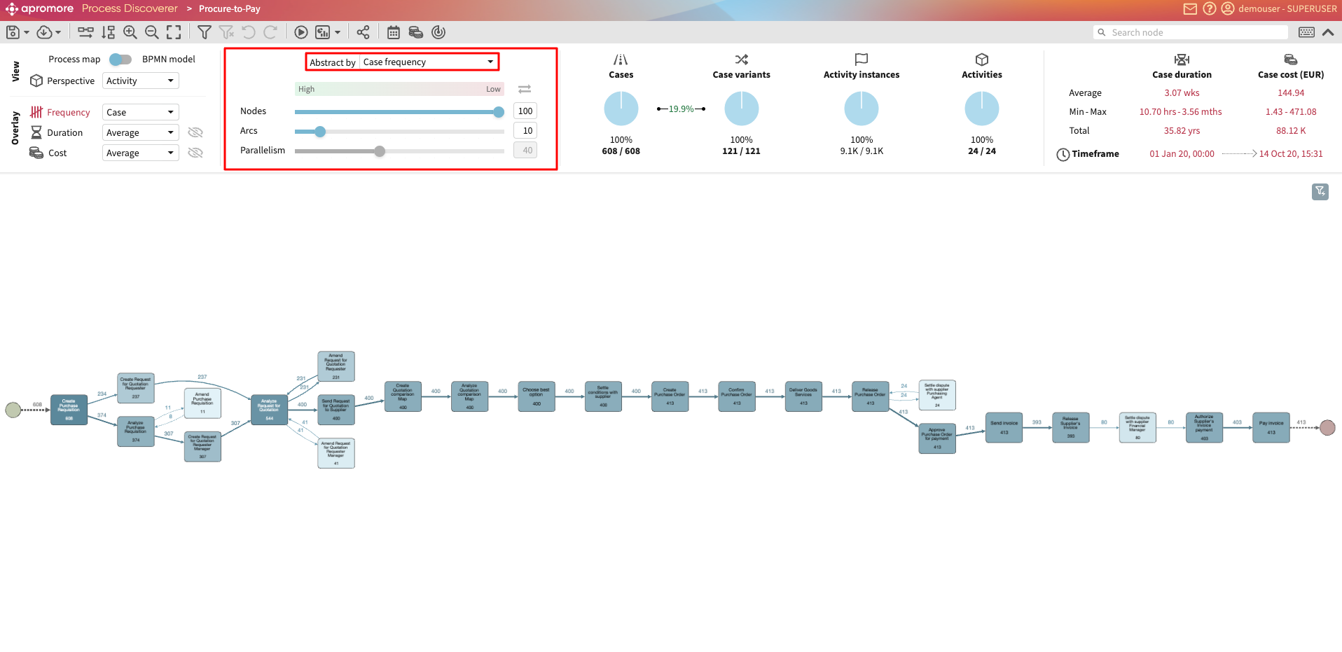
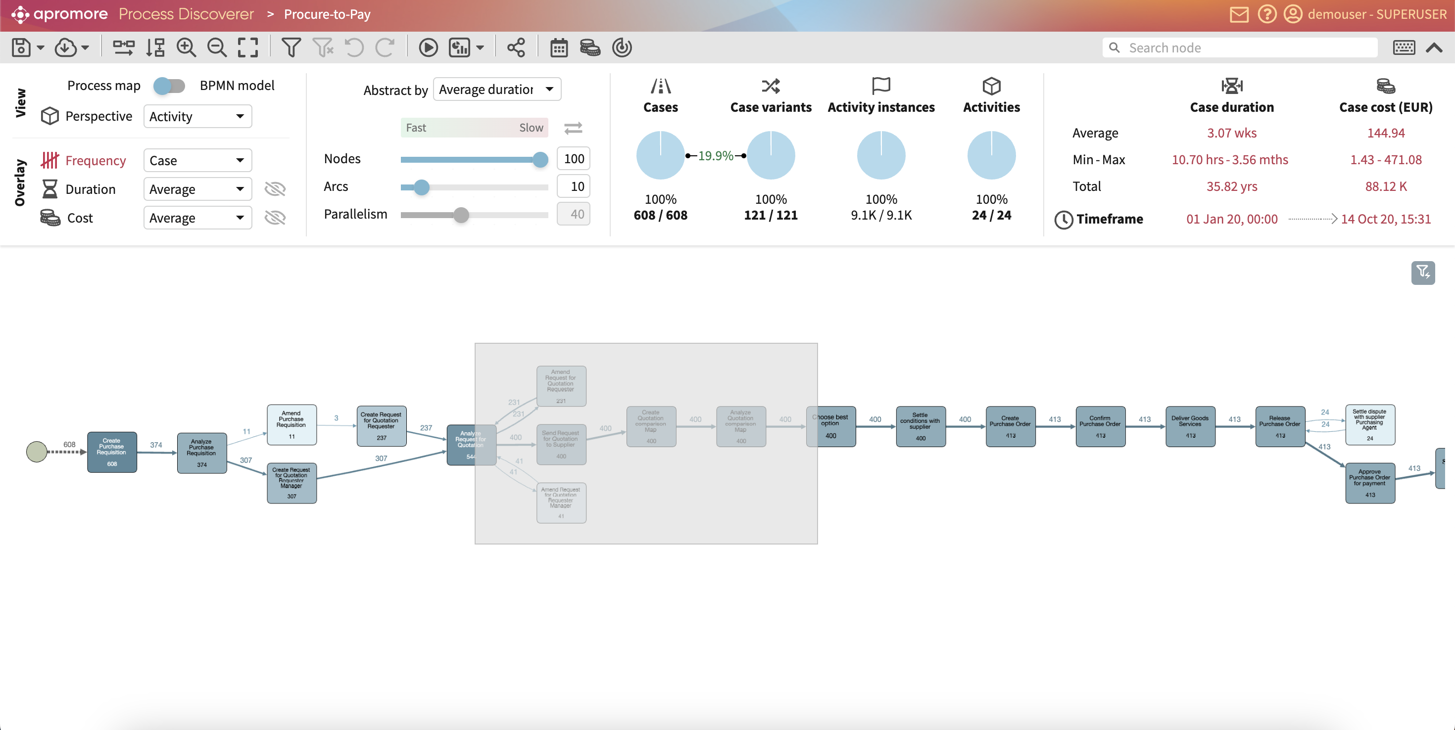
Abstraction settings
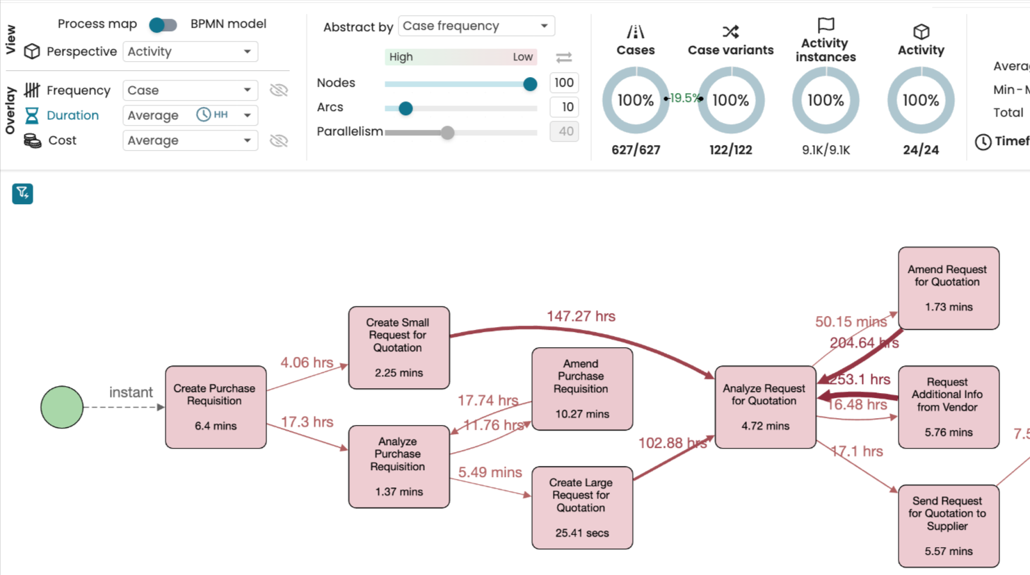
We can adjust the complexity of the discovered map by increasing or decreasing the frequency or duration of nodes and arcs visualized in our process map. The default values for the nodes and arcs sliders are 100% and 10%, respectively.
We can abstract a process map by Case frequency, Average frequency, Average duration, Median duration or Max duration.
For example, if we abstract by case frequency and shift the arcs or nodes slider towards the left, more edges/nodes with low case frequency will be removed from the process map.
Similarly, if we abstract by Average duration and shift the arcs or nodes slider towards the left, more edges/nodes with low average duration will be removed from the process map.
We recommend you use the abstraction sliders as follows.
First, use the Nodes slider to select the percentage of nodes you wish to display in the canvas. For example, if we set the Nodes slider to 80%, Apromore will display only the 80% most frequent nodes and remove the 20% most infrequent.
Next, we may adjust the number of arcs displayed on the canvas. If we set the Arcs slider to 100%, then Apromore will display all the arcs between the current set of nodes. As we move the Arcs slider down from 100% to 0%, Apromore will hide the most frequent arcs. Importantly, when Apromore hides an arc, it will always ensure the following two properties:
The percentage of displayed nodes does not change. In other words, as we move the Arcs slider down from 100 to 0%, no node will be hidden along the way. If the Nodes slider is set to 80%, we will always see the 80% most frequent nodes, regardless of the position of the Arcs slider. For example, if the Nodes slider is set to 80% and the Arcs slider is set to 10%, Apromore will display 80% of the nodes and a small number of arcs between these nodes.
Every node has at least one incoming arc and one outgoing arc. In other words, there will be no disconnected nodes or disconnected fragments. This property is important. It ensures that if we switch the current view to the BPMN view, the BPMN model will be fully connected.
Because of the above two requirements, some arcs cannot be hidden. For example, it may happen that a node has many incoming arcs, each of which is relatively infrequent. As we move the slider from 100% to 0%, these infrequent arcs will be hidden. At some point, it may be that only one of the incoming arcs is displayed. This last remaining arc will not be deleted because otherwise, the node will be disconnected from the rest.
Note
In fact, Apromore’s arcs slider is designed to ensure a stronger property: Every node will always be on a path from the start node to the end node. This property is required to transform the process map into a correct BPMN model.
We can also use the abstraction sliders to remove the most infrequent nodes and the most infrequent arcs instead of removing the most frequent
nodes and arcs.
To remove the most infrequent arcs, we should click the invert order toggle icon 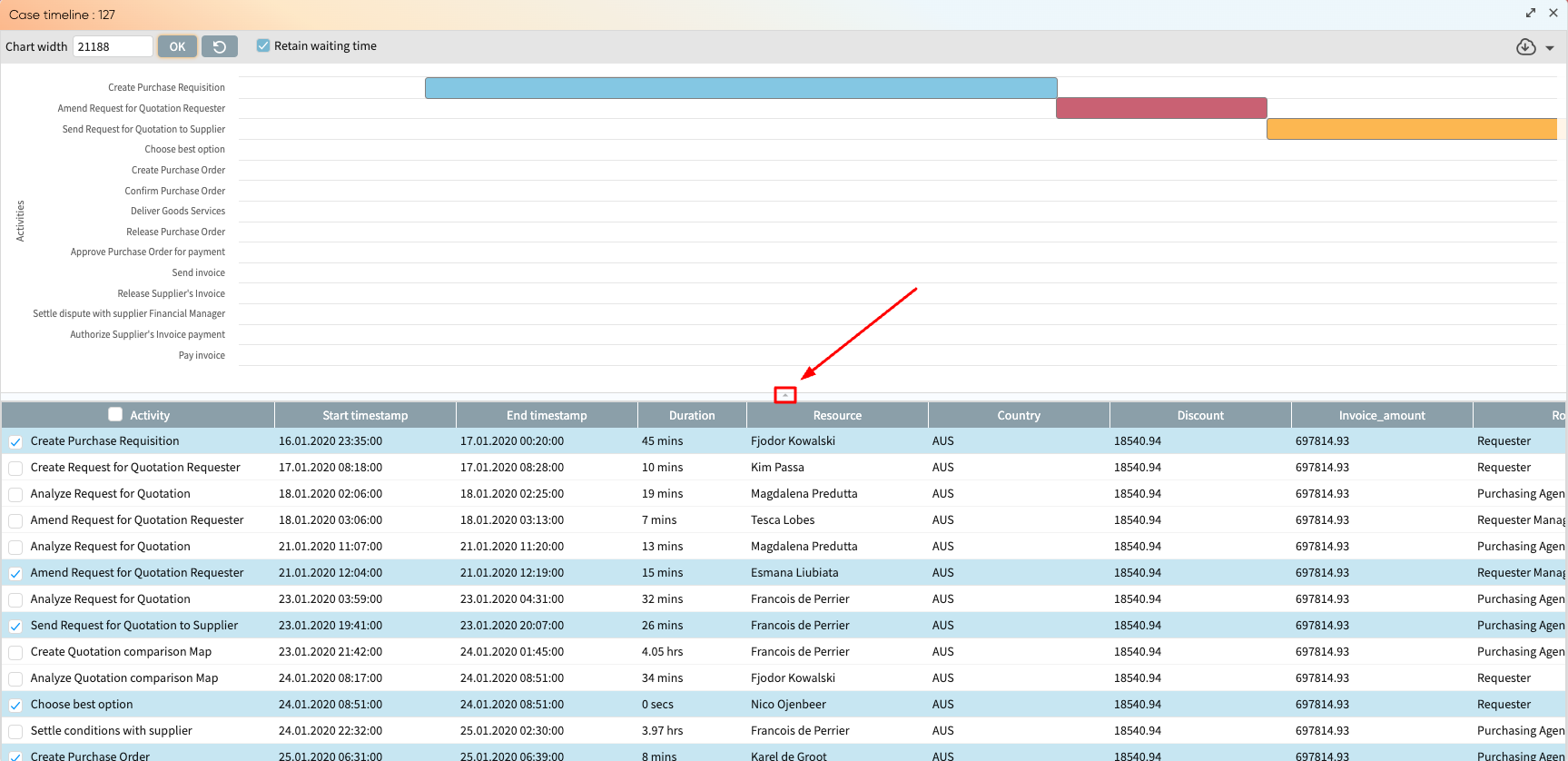 .
When the invert order to toggle is on, Apromore will:
.
When the invert order to toggle is on, Apromore will:
Hide the most infrequent nodes when we move the Nodes slider down from 100% to 0%
Hide the most infrequent arcs when we move the Arcs slider from 100% to 0%
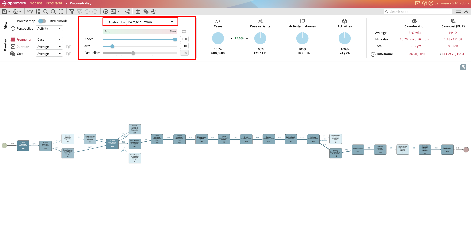
Similarly, we can use the abstraction sliders to remove the nodes or arcs with the highest duration. To achieve this behaviour, select Average duration in the menu Abstract by located above the sliders. When the Average duration option is selected, Apromore will hide the nodes or arcs with the highest average duration (the slowest arcs) when you move the corresponding slider towards 0%. Conversely, if the invert order toggle is in the On state and the option Average duration is selected, Apromore will hide the nodes or arcs with the lowest average duration (the faster arcs) when we move the corresponding slider towards 0%.
Note
Due to limitations in screen sizes and resolution, if a discovered process map or BPMN model contains more than 250 nodes, only the most frequent 250 nodes are displayed in Process Discoverer. Similarly, if the discovered process map or model contains more than 1000 arcs, only the most frequent 1000 arcs are displayed. The remaining ones are not visible and cannot be retrieved using the search box in Process Discoverer.
View log statistics
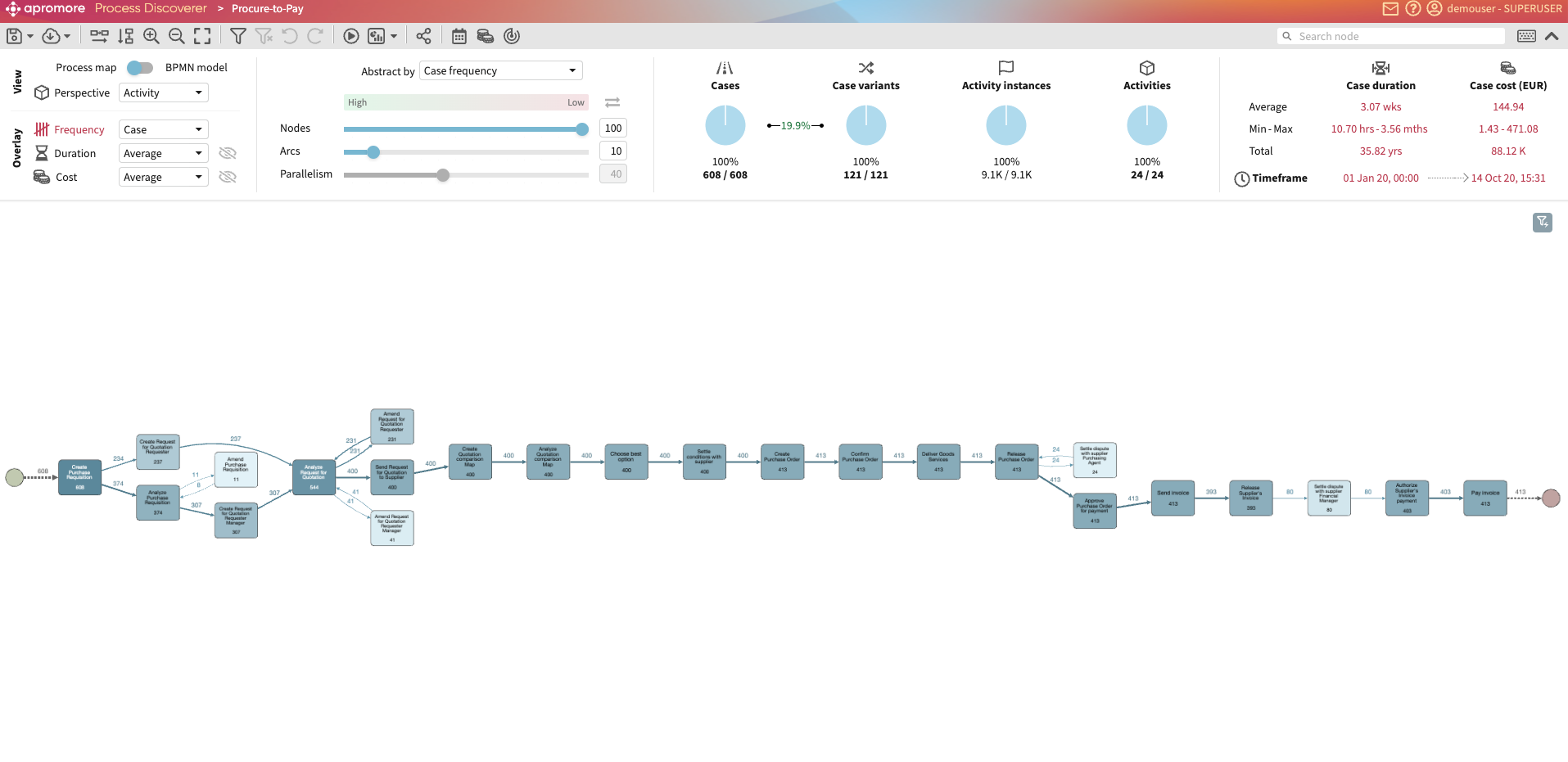
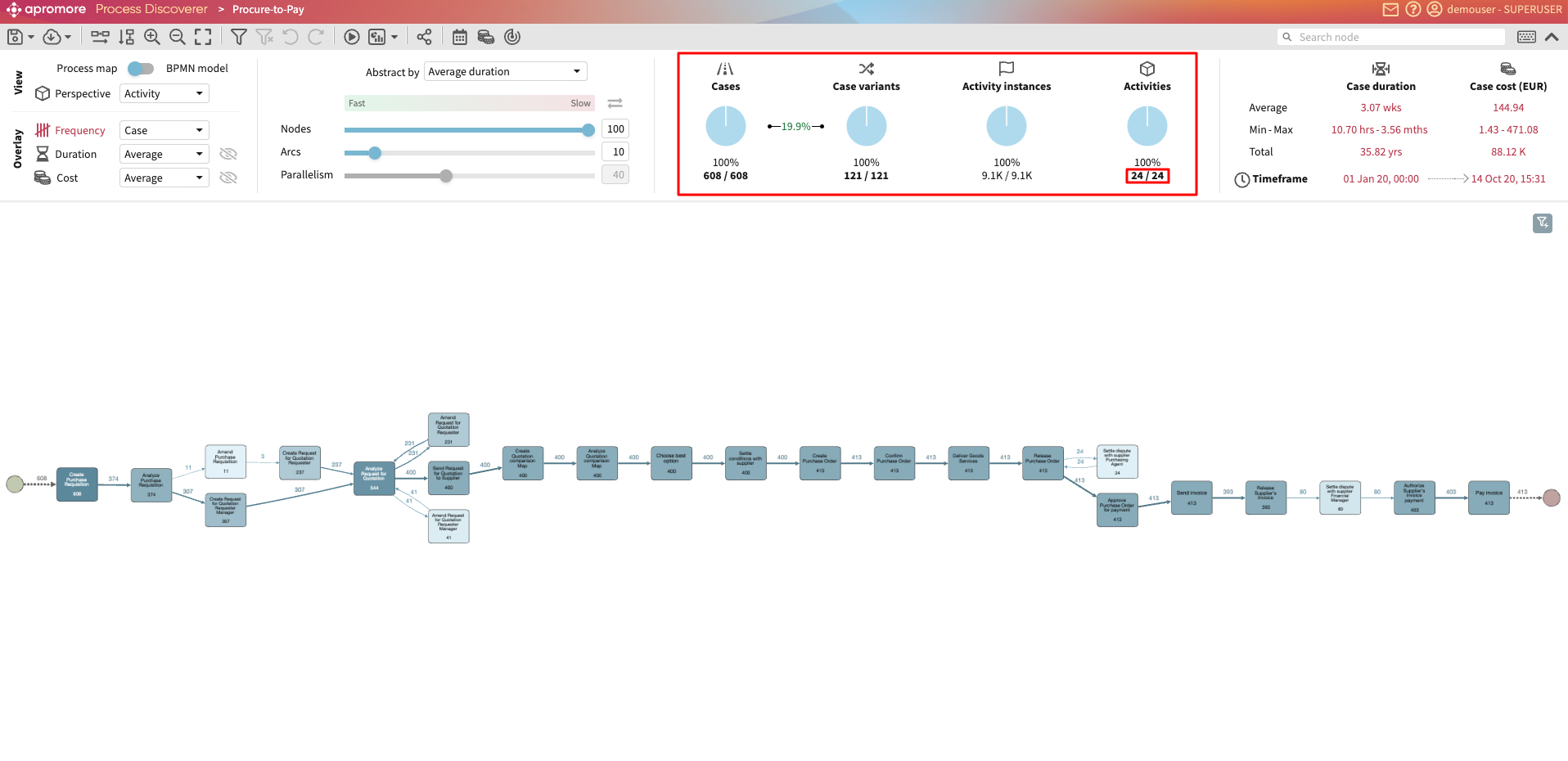
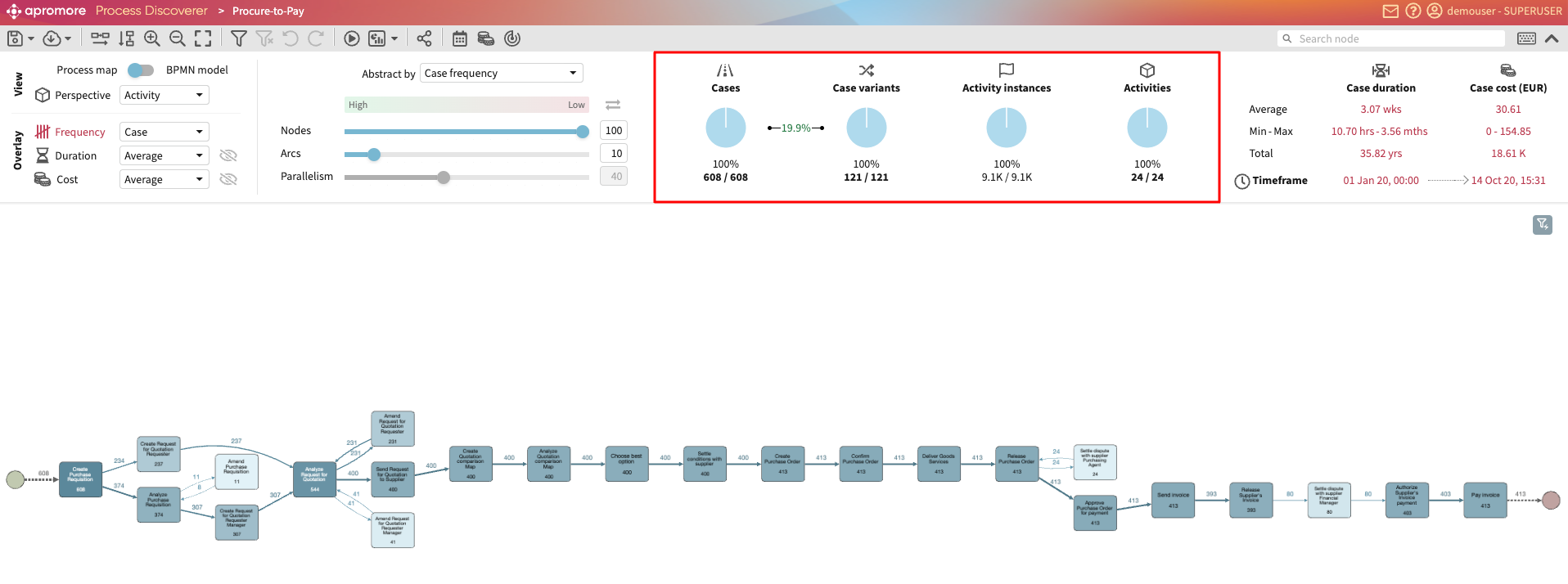
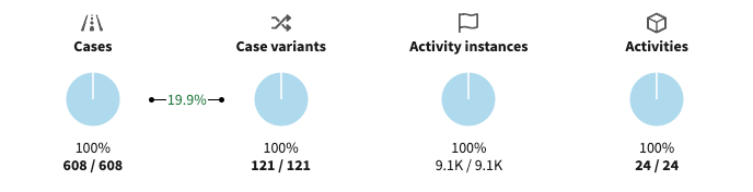
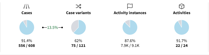
The top bar of Process Discoverer displays the following statistics of the event log:
The number of cases in the log
The number of case variants of the log. A case variant is a distinct pathway in the process. For example, in an insurance process, the sequence of activities [“Create Insurance Claim”, “Review Insurance Claim”, “Approve Insurance Claim”] is a case variant. In an event log, there are usually other cases that follow the same pathway (case variant).
Variance ratio: The variance ratio is a score between 0% and 100%, indicating how “rigid” or “flexible” the process is. A score of 0% means that the process is rigid: All the cases follow exactly the same sequence of activities. A score of 100% means the process is highly unstructured: Every case follows the same sequence of activities. The variance ratio is calculated based on the number of cases and the number of case variants using the following formula: 1 - (number of case variants) / (number of cases)
The number of activity instances in the event log.
The number of activities in the log.
Note
If we select the Resource perspective, instead of displaying the number of activities in the log, the Process Discoverer will display the number of Resources in the log (and the same applies if we select another perspective).
For the number of cases, case variants, activity instances, and activities, Process Discoverer displays the elements in the currently filtered log / the total number of elements in the unfiltered log.
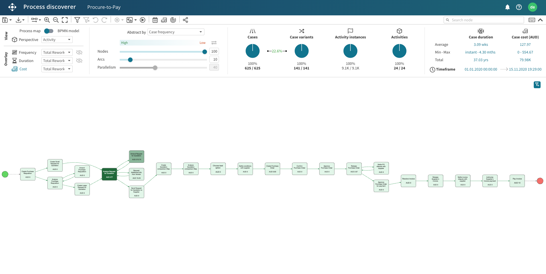
In the screenshot below, no filter is applied. Thus, the number of elements in the filtered and unfiltered log are the same. 22.6% indicates the percentage of cases variants (141) to the total cases (625) is 22.6 percent.
In the screenshot below, a filter was applied. 373/625 in Cases indicates that there are 373 cases of the 625 cases in the currently filtered log. This translates to 59.7% of the cases.
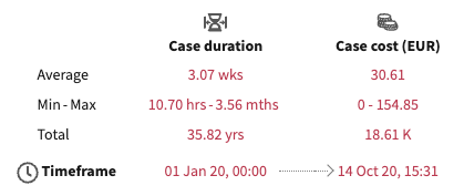
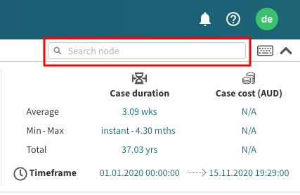
The top bar also displays:
The average, minimum, and maximum case duration
The average, minimum, and maximum case cost.
The log timeframe which goes from the earliest start timestamp in the log to the latest end timestamp in the log.
Note
If no Cost Center has been associated with the log, the average, minimum, and maximum case costs appear as N/A. To learn more on how to associate the cost center to a log, see View by cost.
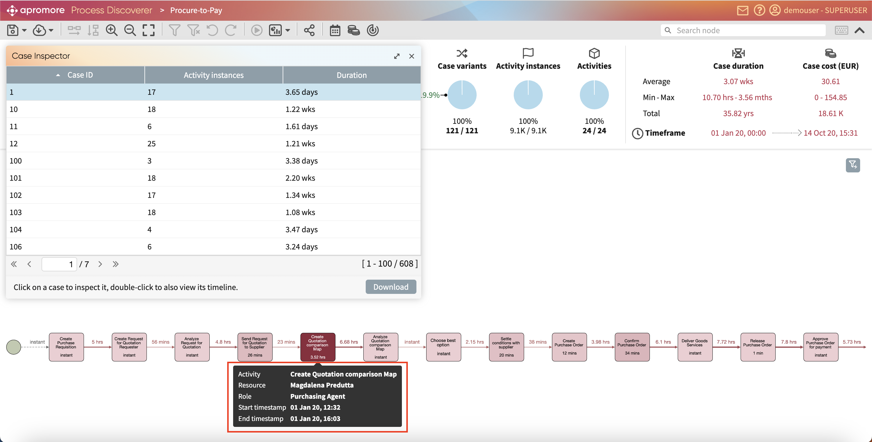
Inspect cases
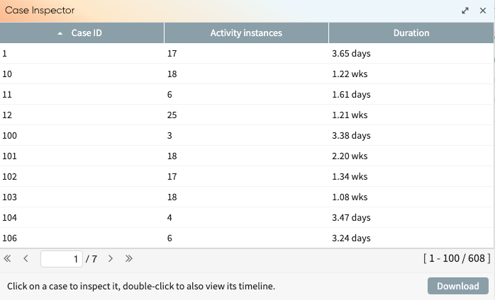
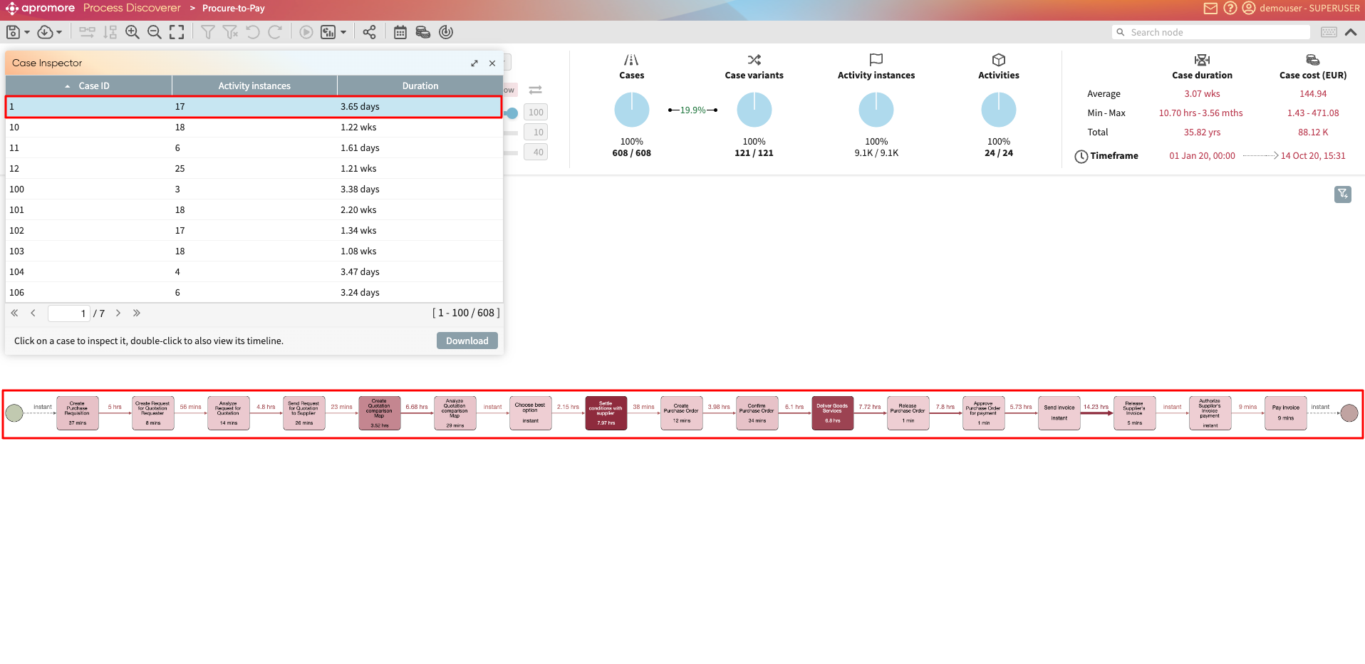
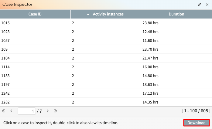
We can inspect individual cases using the Case Inspector. To open the Case Inspector, click on the number of cases under the Log statistics section.
The Case Inspector window opens.
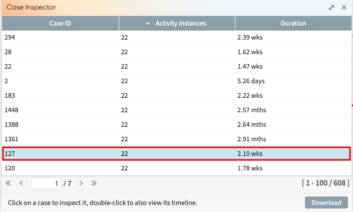
Click on a specific case to visualize it exclusively in the Process Discoverer.
To reveal the statistics of an individual activity, we can hover our mouse on the activity.
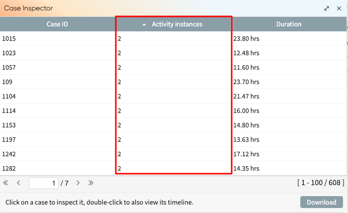
To check the length of the cases, click on the Activity instances column. Cases will be sorted from the shortest to the longest.
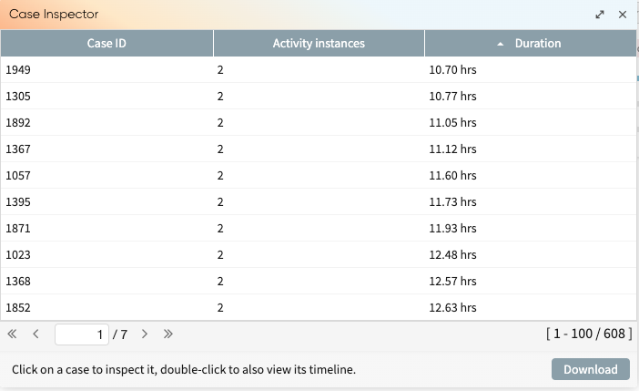
We can also sort them by duration, start timestamp, end timestamp, or cost by clicking the respective column names.
To download the list of cases and their statistics, click on Download.
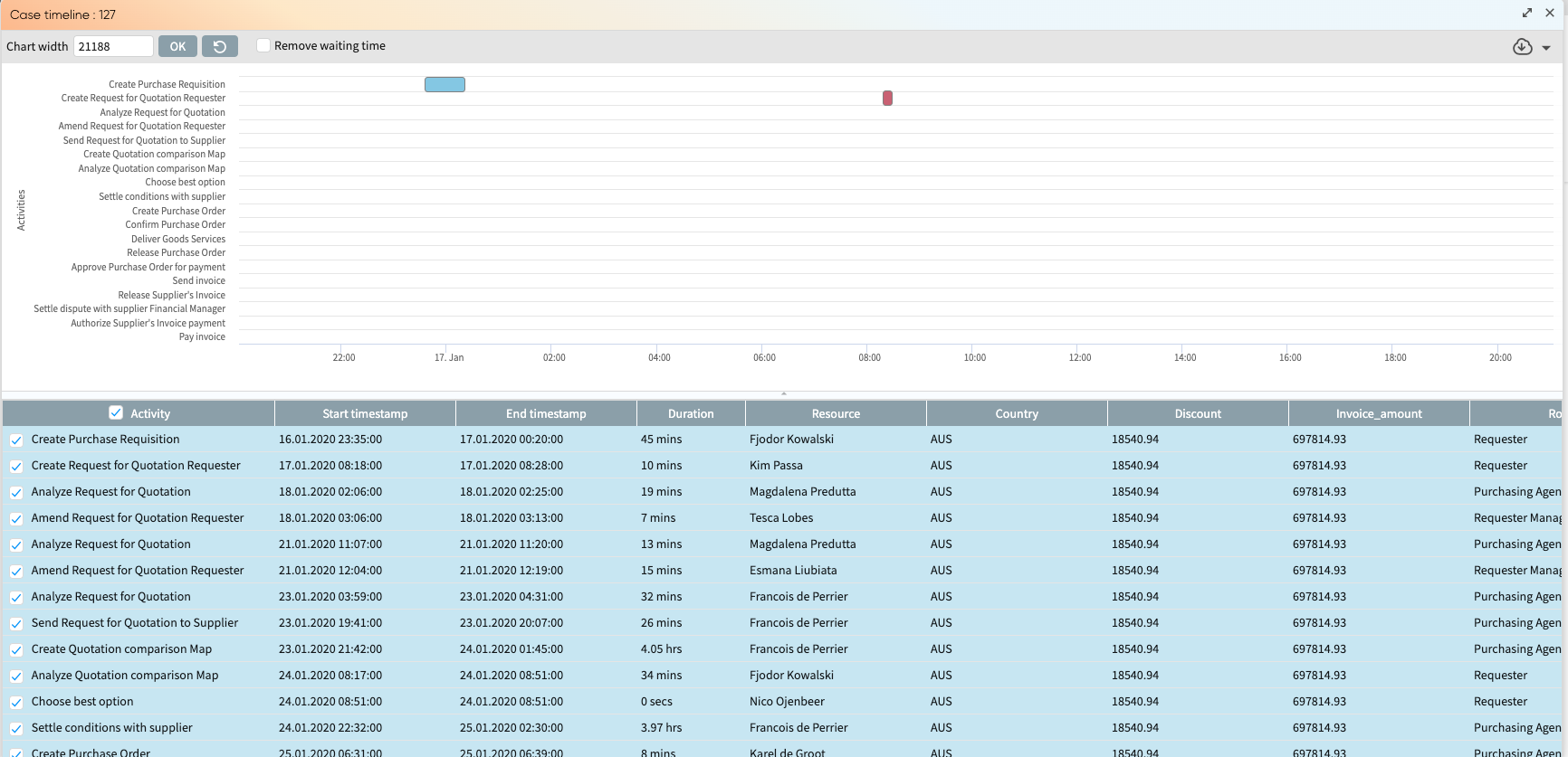
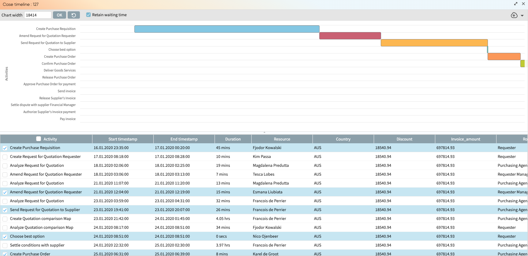
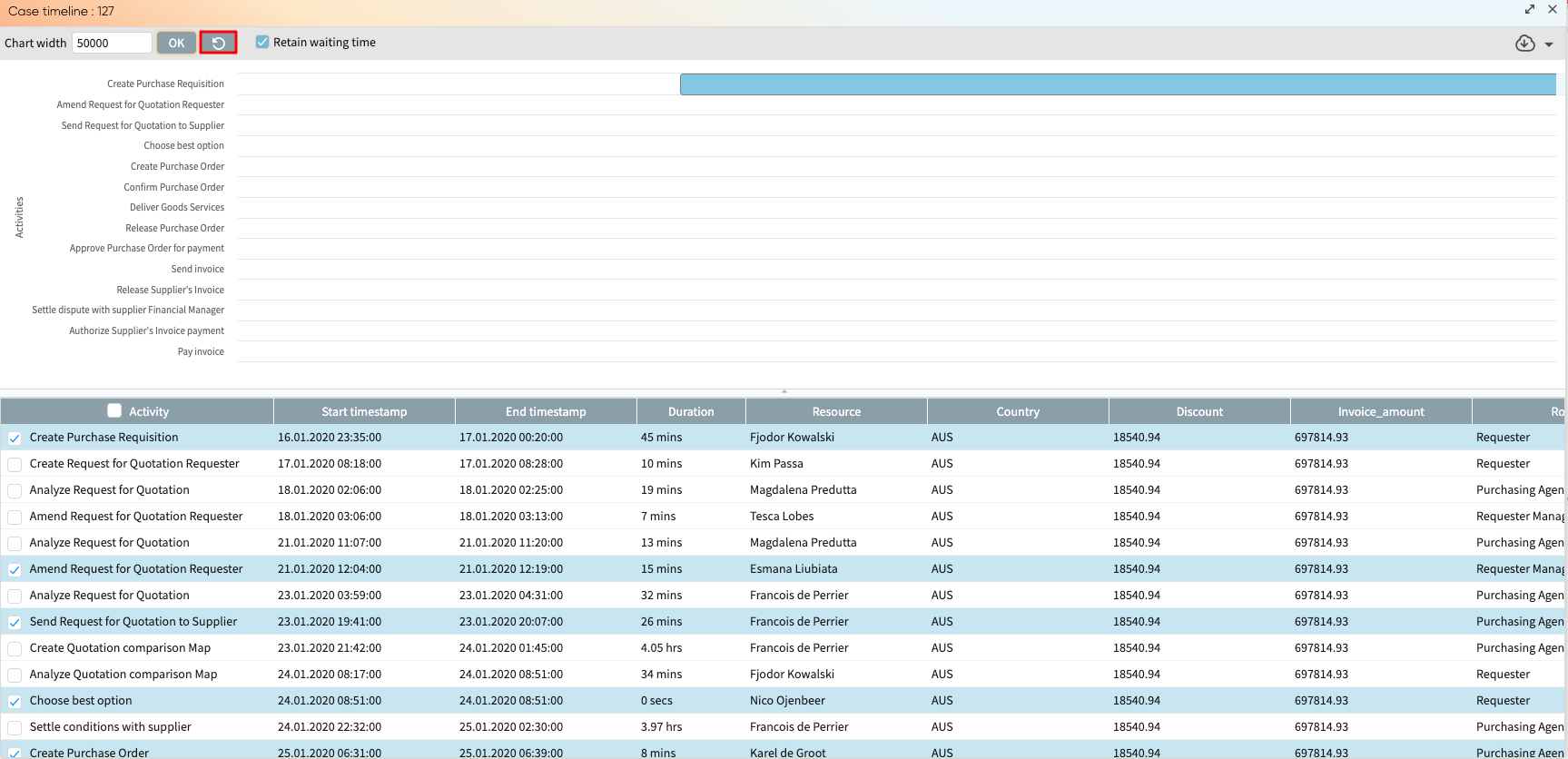
We can also view a case timeline from the Case Inspector. A case timeline is a chart that displays the timeline of activities as a Gantt chart. To display the case timeline, double-click a case in the case inspector.
This displays the case timeline for the selected case containing the case timeline chart (upper part) and the case data from the log (lower part).
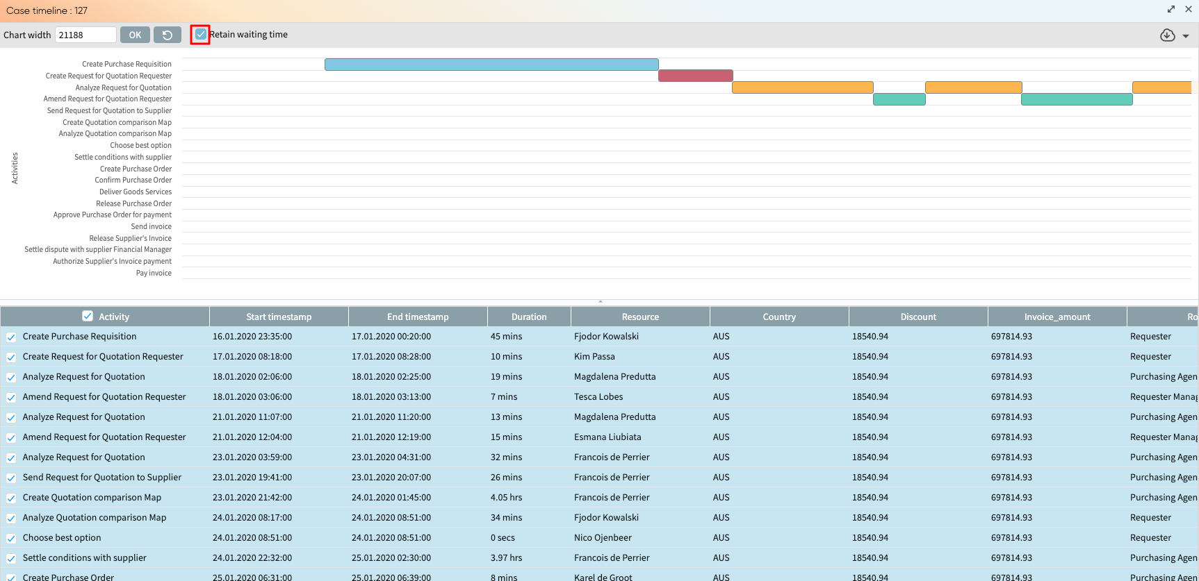
By default, the case timeline includes the waiting times in the case. We can, however, remove the waiting times by checking “Remove waiting time”. Now, the chart is displayed, ignoring waiting times between activities.
In addition, we can display the case timeline for only specific activities. In the case data, select the activities we wish to display.
To display the case data alone, click the inverted triangle button right above the slider. We can also drag it to adjust the height of the case data dynamically.
We can adjust it back to the default view by clicking 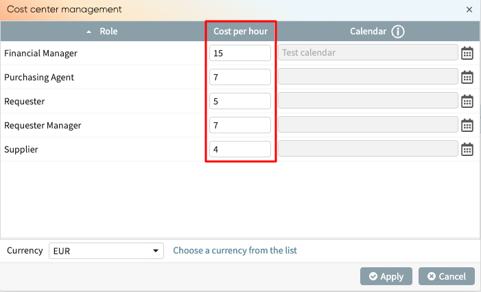 .
.
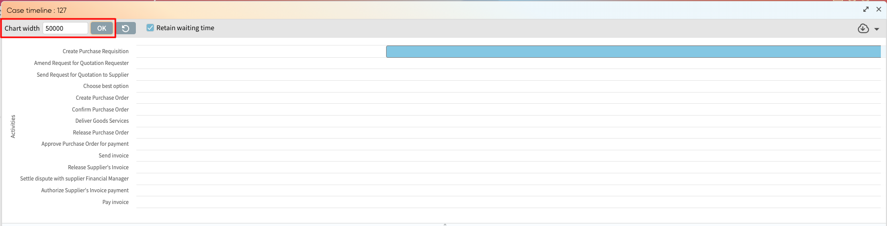
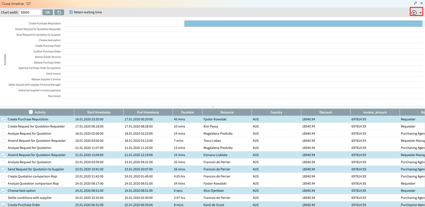
By default, Apromore displays the case timeline chart with the minimum width. We can, however, increase this chart width by entering our preferred width and clicking OK.
 The
timeline now appears wider. We can reset to the default width by
clicking the reset button
The
timeline now appears wider. We can reset to the default width by
clicking the reset button 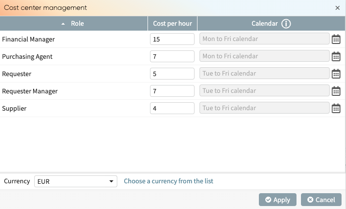 .
.
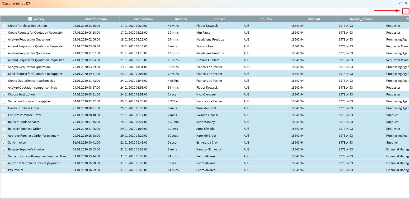
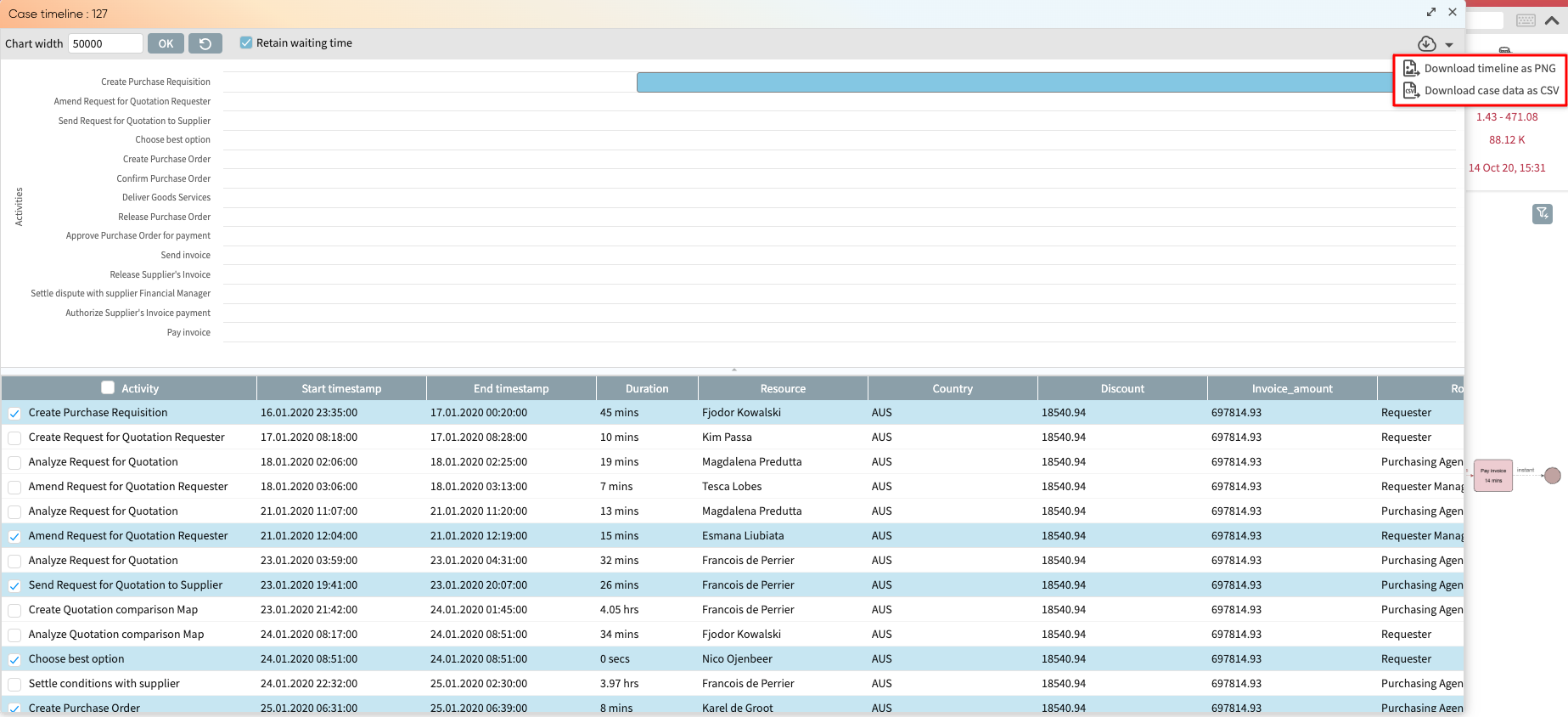
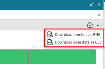
Finally, we can download the case timeline or the case data.
Click the download icon in the top-right corner.
Click Download timeline as PNG to download the chart or Download case data as CSV to download the case data.
The file is zipped and downloaded.
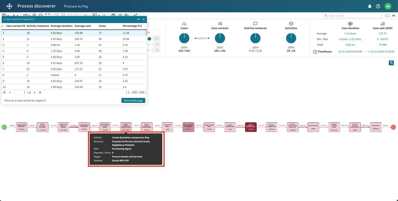
Inspect case variants
Case variants are cases in an event log with a similar sequence of activities. We can inspect the case variants in Apromore with Process Discoverer. To inspect the case variants, click the number of case variants in the log statistics section.

This opens the Case Variant Inspector, which displays the following statistics:
Case variant ID: A unique number assigned to a case variant.
Activity instances: The number of activities in the log.
Average duration: The average duration of all cases in the case variant.
Cases: The number of cases in the case variant.
Percentage: The percentage of cases in the case variant to the total number of cases in the log.
We can click a row to display the process map of that case variant.

We can also hover our mouse on a specific activity to see its attributes.
The case variants in the Case Variant Inspector can also be downloaded locally. To download the case variants, click Download page.
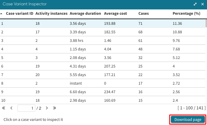
This downloads case variants as a CSV file.
Inspect activities
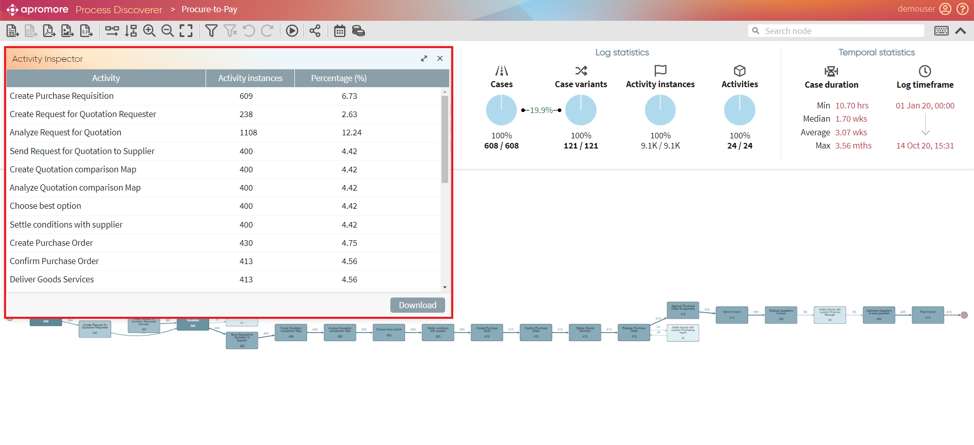
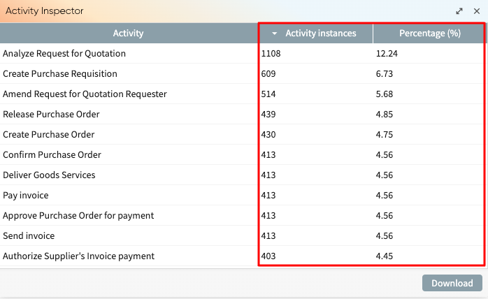
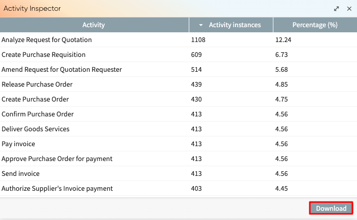
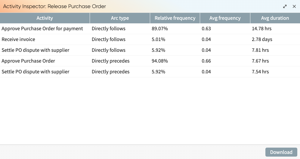
We can inspect an individual activity in Process Discoverer with the Activity Inspector. To open the Activity Inspector, click on the number of activities under the Activities chart in the Log statistics section.
The Activity Inspector window will open.
To check the length of the activity, click on the Activity instances column. To check activity variant frequency, click on the Percentage(%) column.
To download the list of activities and their statistics, click Download.
We can also display the activity inspector for a specific activity. In business process mining, it is useful for stakeholders to have a detailed understanding of each transition between consecutive activities in a process to enhance operational efficiency and decision-making. To analyze the activity transitions in detail, we need to have a way to investigate each incoming and outgoing arc of an activity.
When we double-click an activity in the process map, this displays the activities that directly follow and directly precede the selected activity, as well as relevant metrics: relative frequency, average frequency and average duration. Note that in the activity inspector, all predecessors and all successors of an activity are listed, irrespective of the current setting of the abstraction sliders.
Note that in the activity inspector, all predecessors and all successors of an activity are listed, irrespective of the current setting of the abstraction sliders.
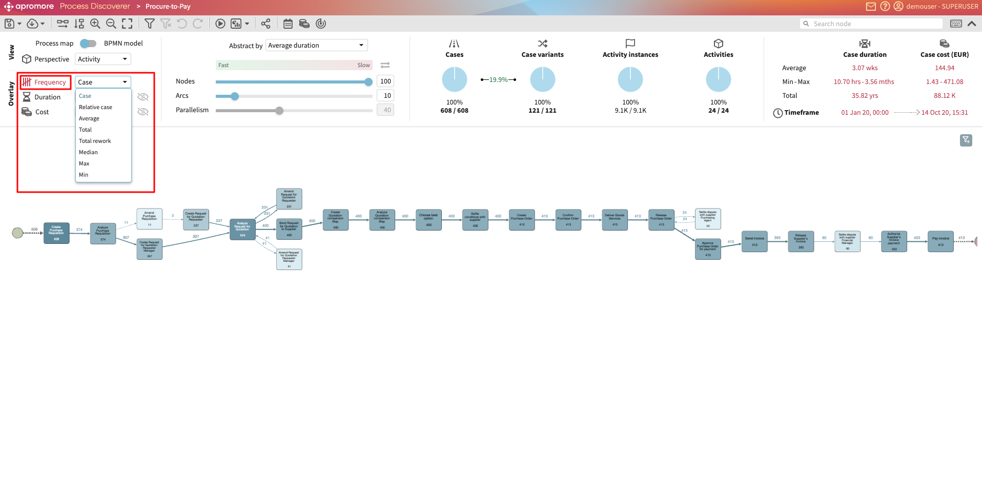
View by frequency
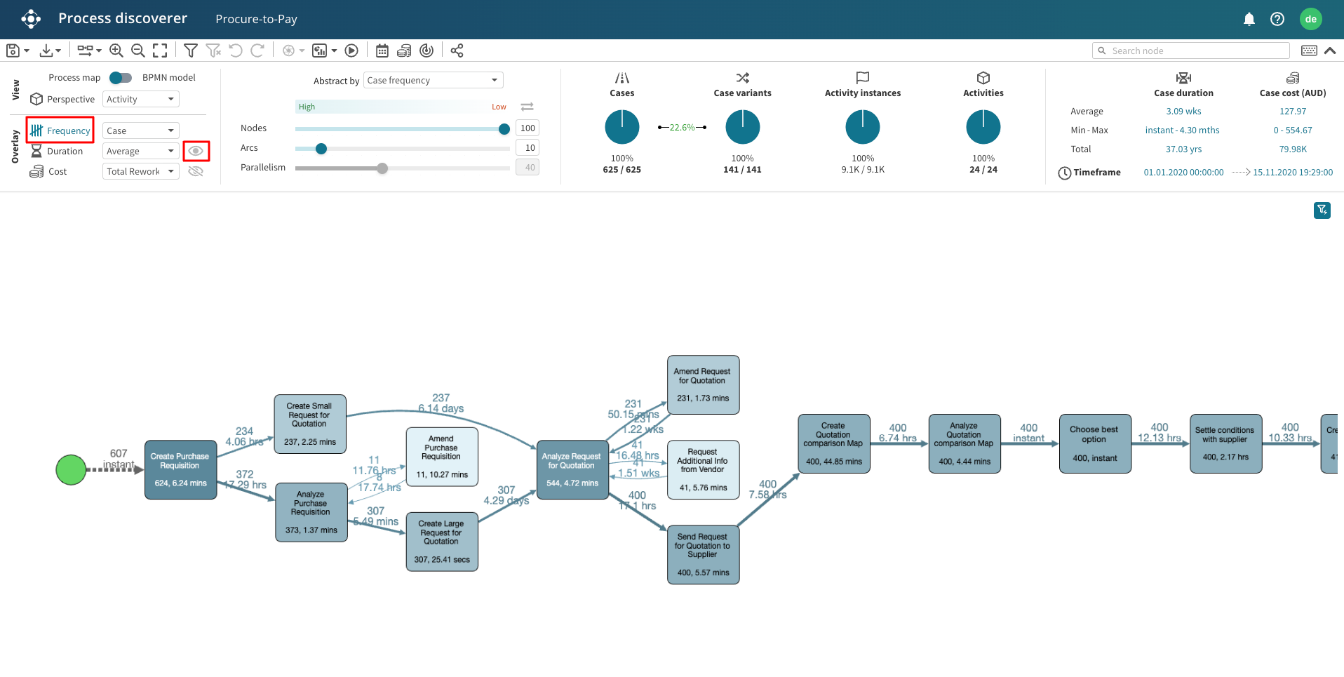
We can also view the event log’s simple statistics, such as the total, median, minimum, maximum, and average number of times an activity is executed. This information is provided as a label on the activities/arcs, the colour of activities, and the arcs’ thickness. The darker the blue colour, the higher the number of times that activity has been observed in the log. The thicker the arc, the higher the frequency of that arc. We can use the Frequency dropdown list in the Visualization settings section to view different statistics.
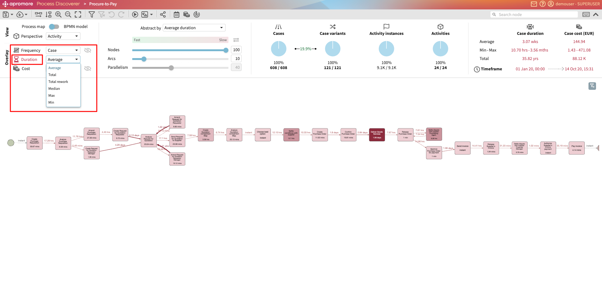
View by duration
Additionally, we can view the statistics on the time performance of the activities and arcs in the process map using the Duration dropdown list in the Visualization settings section. These are the total, mean, median, minimum, maximum, and average duration of each arc (indicating the waiting time before starting a given activity once the previous one has been completed) and total, mean, median, minimum, maximum, and average duration of each arc duration of an activity (a.k.a. the activity’s processing time). We can also display the average duration per-case. To learn more, see Display average duration per-case.
Duration in Apromore is calculated as the difference between the start and end timestamps of an activity or an arc.
Suppose the log only has completion timestamps for each activity and not their start timestamp. In that case, these performance statistics will combine both processing time and waiting time into a single time statistic visualized on the arc. At the same time, activities will be shown as having an instantaneous duration.
Like frequency statistics, we can also visualize time performance statistics via labels on activities and arcs and via colours and line thickness (on a red scale) for activities and arcs.

Display average duration per-case
In task mining logs, activities often occur multiple times within a single case. When using the standard average duration metric, the average is calculated across all activity occurrences in the process. This means the metric reflects the average time per activity occurrence, not how much time a worker spends on that activity per case.
For example, suppose the activity “Enter item details” takes 2 minutes, occurs 5 times in a case, and there are 10 cases in the process.
The total duration is 5 * 2 * 10 = 100 minutes.
The number of activity occurrences is 5 * 10 = 50.
The average duration is 100 / 50 = 2 minutes. This represents the average duration per occurrence.
However, we may wish to see how long an activity spends on average within a case. To do this, use the Average per-case duration metric in Process Discoverer.
The Average per-case duration metric divides the total duration of an activity (across all its occurrences) by the number of cases that contain that activity. This means that repeated occurrences within the same case are counted only once toward the average per case.
In our example, the average time spent on the activity per case is 10 minutes (100 / 10 cases). This is particularly relevant for task mining logs generated by the digital agent, where a change in the active window (e.g., from Excel to Word) is recorded as an activity occurrence. As a result, the same activity may appear multiple times within a single case.
Accordingly, when we open a task mining log (i.e., a log with a Step perspective) in Process Discoverer and switch to the Duration overlay, the Average per-case metric is now selected by default.
For other logs, we can manually select Average per-case from the Duration dropdown in Process Discoverer.
Once selected, the process map displays the average time spent per case for each activity and transition.
Display node duration metric in hours
When analysing a process map in the duration overlay, Apromore selects the “best” unit for each value (for example, 2 weeks instead of 14 days or 3 days instead of 72 hours). We may wish to compare in a unified time unit to streamline comparisons. We can convert durations originally in days, weeks, months, or years into hours.
Imagine we wish to perform bottleneck analysis for a process in hours. To convert durations measured in days, weeks, months, or years into hours, click HH in the duration overlay.
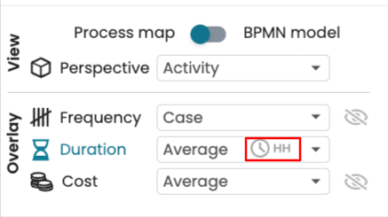
Durations originally measured in days or longer are now displayed in hours, providing a unified time scale for comparison.
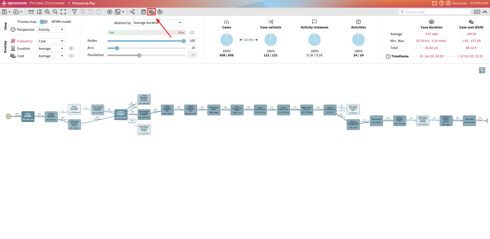
View by cost
Apromore allows cost metrics to be displayed on top of a process map or a BPMN model in the Process Discoverer.
Note
The Cost overlay functionality can be used only with the logs having the Roles column present while uploading the event log to Apromore.
To check the cost metrics, click on the Manage cost centers icon placed right above the Abstraction Settings panel.

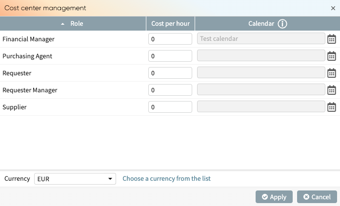
The Cost center management window appears, consisting of Roles, Cost per hour and a Calendar. A Currency can be defined below.

Enter the cost values next to each Role

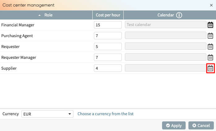
We can also assign calendars to each role. For instance, other roles may work Mondays to Fridays while the “Supplier” works Tuesdays to Fridays. Their working schedule affects the costs, so we can create and assign respective calendars to roles. To assign a calendar, click the assign calendar button.

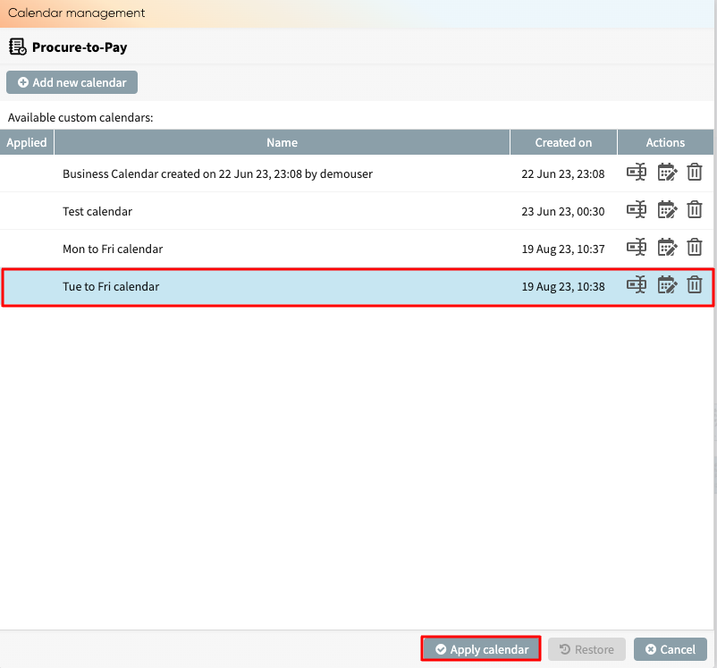
This brings the calendar management window, which displays the list of available calendars. Click on a calendar and click Apply calendar to assign it to the role.
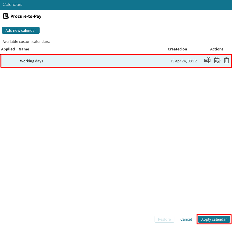
We can do this for all the roles.
Note
Before assigning a calendar to a role, the calendar must first be created. To learn more about creating calendars, see Manage calendars
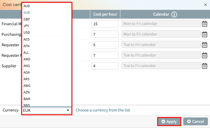
We can also choose a currency from the Currency dropdown and click Apply.
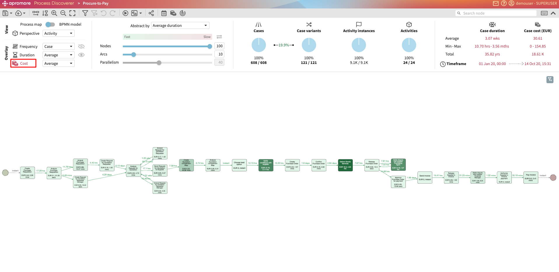
To see how the Resource costs are distributed among different process activities, click on the Cost overlay available under the Visualization settings section, Overlay subsection placed top left in the Process Discoverer.
View rework metrics
Rework is a common type of waste in a business process. The occurrence of rework increases the cycle time and cost of cases in a process.
To help identify and quantify rework in a process, we can display rework metrics in Process Discoverer. There are three kinds of rework metrics in Apromore:
Total rework: Total number of times an activity has been repeated after having been executed once in a case.
Rework duration: Total duration of the reworked activity instances.
Rework cost: Total cost of the reworked activity instances.
To display rework metrics in the Process Discoverer, open an event log from the Portal. In the Overlay section, click Frequency to specify working in the Frequency overlay. Click the dropdown and select Total Rework.
The process map now displays the total rework for each task.
We can also display the total duration the resources spent on the rework. Click Duration to switch to the duration overlay and select Total Rework.
The process map displays the duration of the total rework for each task.
Similarly, we can display the total rework cost for each task. To display the cost of the total rework, the event log must have a Role attribute, and a cost table must be defined for this event log.
In the Overlay section, click Cost to switch to the cost overlay. Select Total Rework from the dropdown.
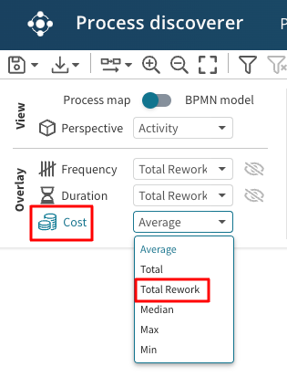
The process map displays the cost of the total rework for each task.
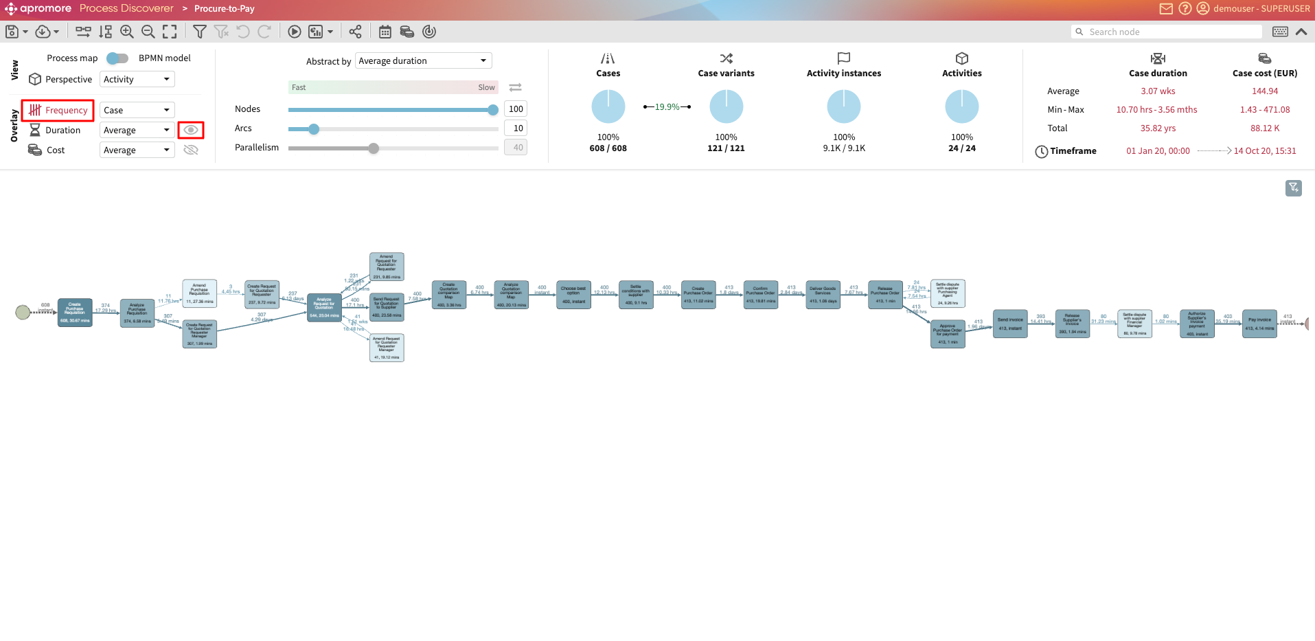
View two metrics simultaneously
We can visualize two metrics of different types simultaneously.
For example, we can view both Frequency and Duration at the same time by clicking the  .
If we are viewing our process map in Frequency mode, we can also view the Duration as a secondary metric by clicking on the .
.
If we are viewing our process map in Frequency mode, we can also view the Duration as a secondary metric by clicking on the .
This can be done for any two metrics.
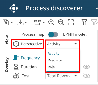
View by different perspectives
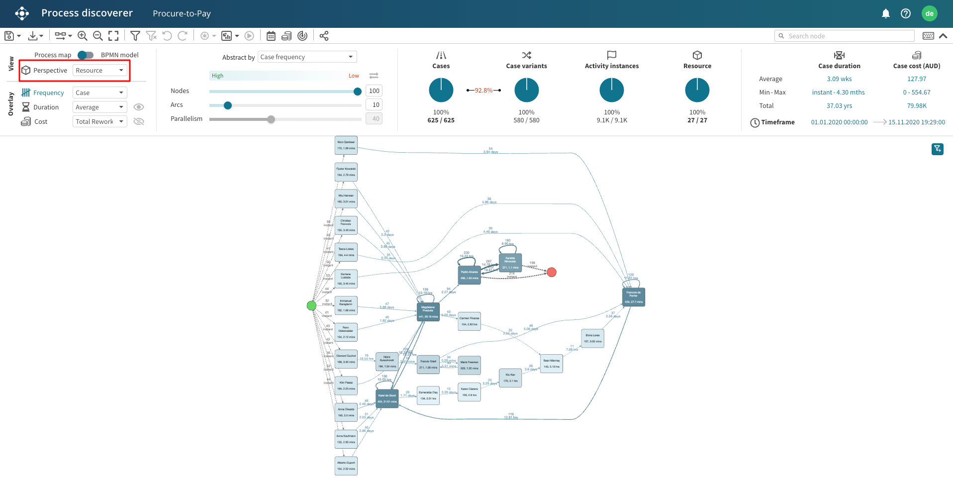
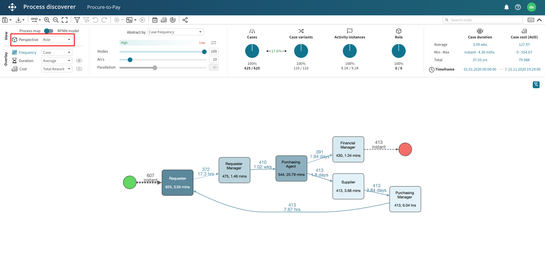
Visualizing the handover between activities is not the only way to analyze a process. We may also be interested in assessing if a specific resource or group of resources are overloaded with work. We can use the Perspective dropdown to determine which log attribute will be displayed as the process map.
For example, we can select the Resource perspective to visualize the handover of work among a group of resources. This option will map each resource in our process to a node and connect two nodes if a handover of work occurs between the two nodes.
We can also visualize the flow of work from one role to another. Select the Role perspective.
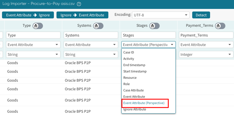
The Activity, Resource, and Role perspectives are the default perspectives in Apromore Process discoverer. However, we can have other attributes appear as perspectives. To make an attribute appear as a perspective, select Event Attribute (Perspective) as the column type when importing the log.
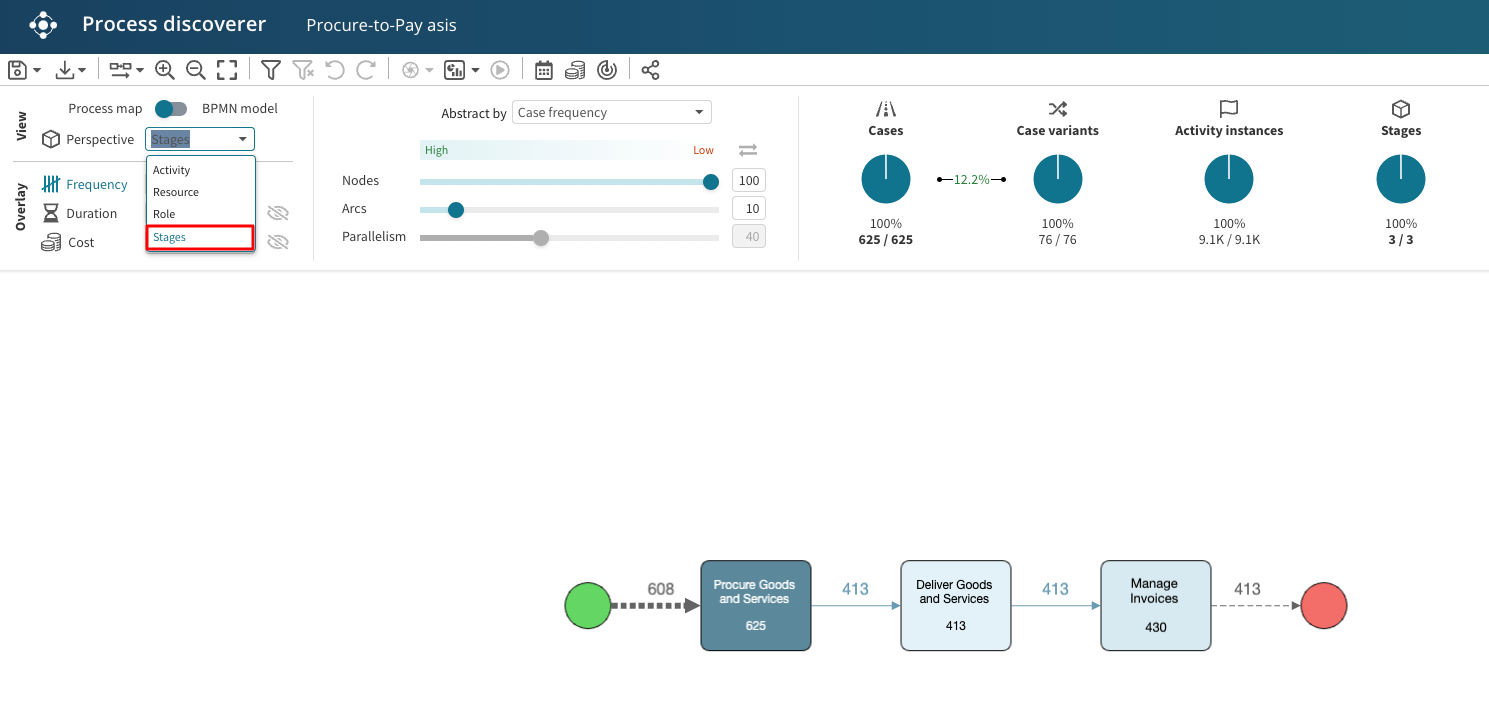
For example, we can tag the “Stages” column as “Event Attribute (Perspective)” during import, allowing us to display how the process moves across stages.
Stages now appear as a perspective, and we can see the process across different stages.
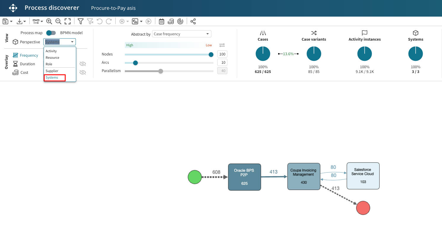
Similarly, suppose the log represents a process performed across multiple software systems, and we have tagged the System column as a perspective attribute during import. We can switch to the System perspective to see the workflow across multiple systems.
Note
When a task mining event log is imported, the step, window, window element, and screenshots columns can be viewed as a perspective. To learn more about perspectives, see Upload an event log.
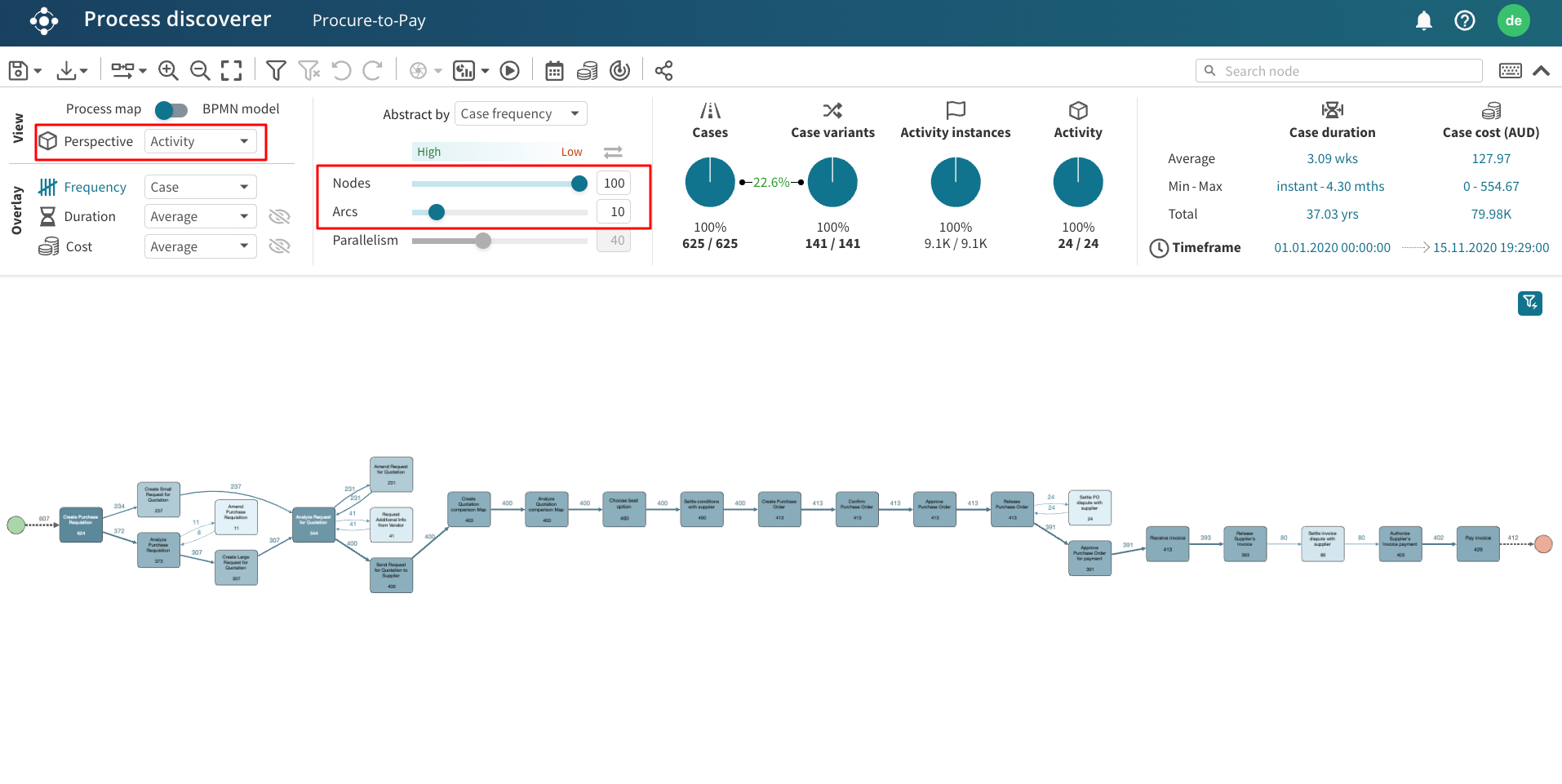
Note that when we can change the abstraction settings in a specific perspective, Apromore will remember these settings exclusively for that perspective. If we switch to another perspective with different abstraction settings, Apromore will apply the last used settings for that perspective. This allows us to seamlessly switch between perspectives without needing to reconfigure the abstraction settings each time.
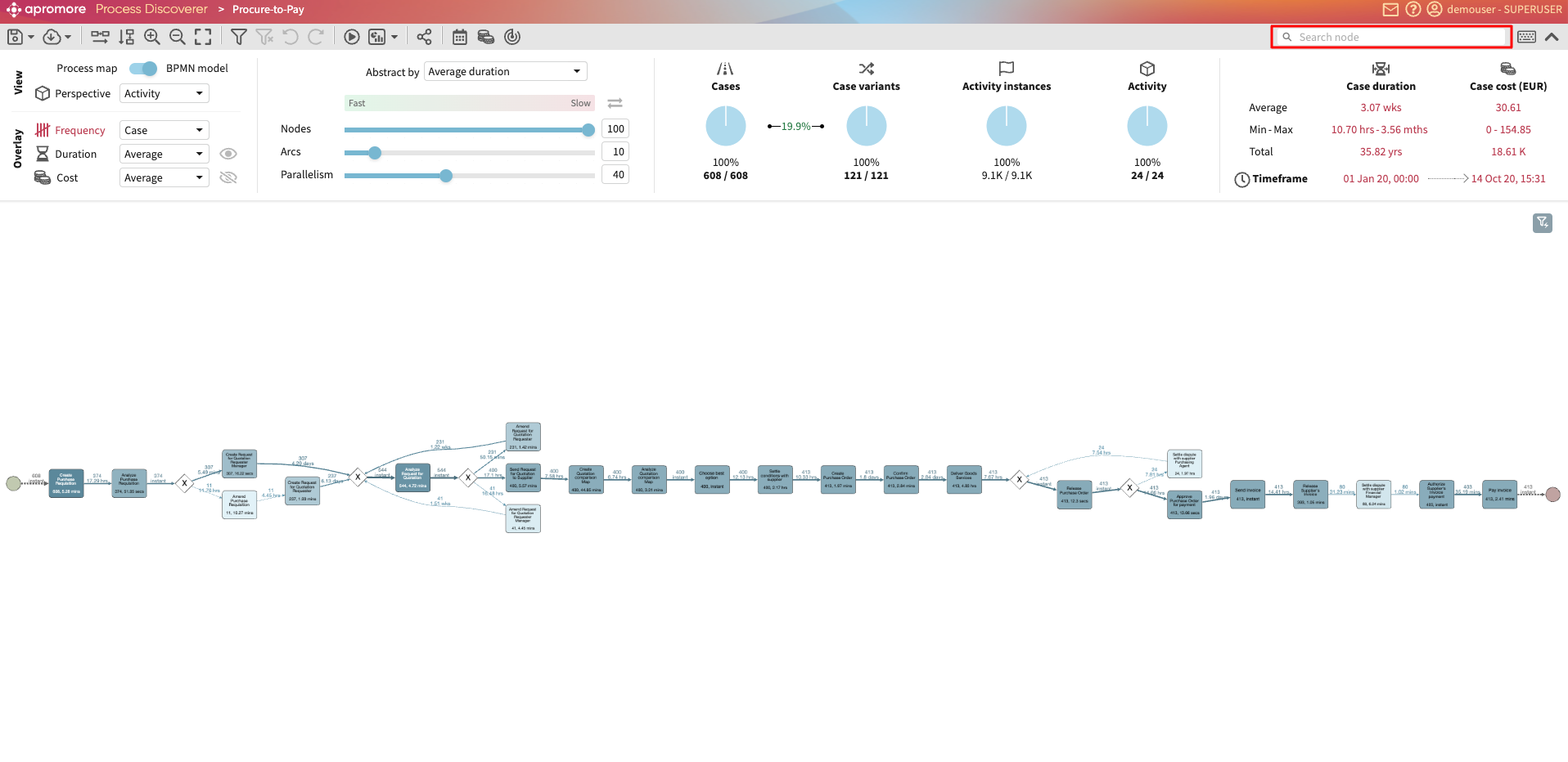
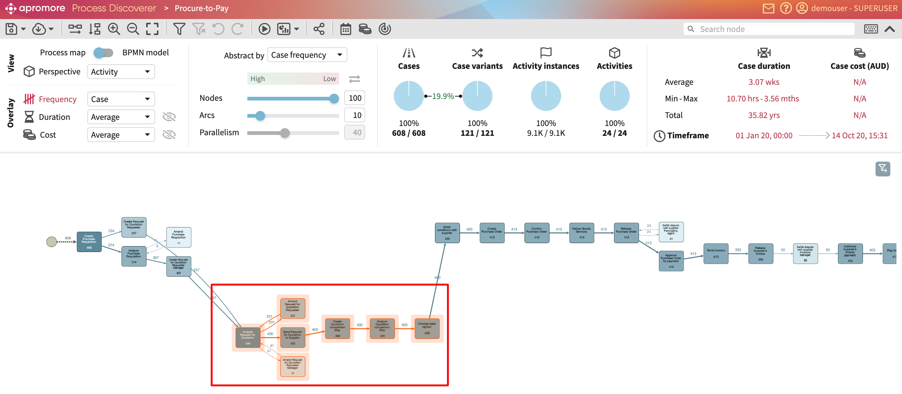
To demonstrate, below is a procure-to-pay process map from the activity perspective. The abstraction setting is set to 100% nodes and 10% arcs.
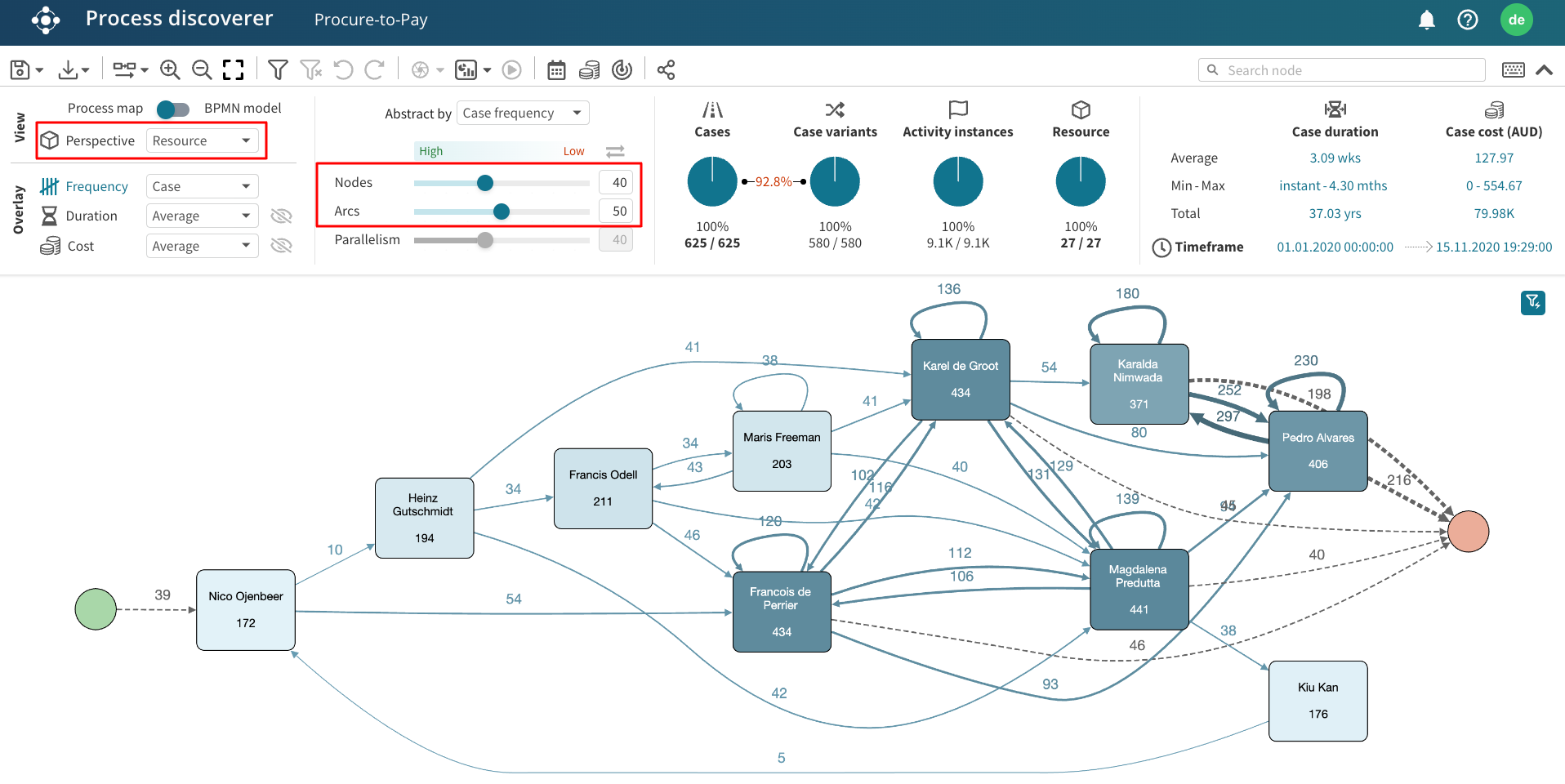
In the resource perspective, we change the abstraction setting to 40% nodes and 50% arcs.
When we return to the activity perspective, the process map is displayed with the 100% nodes 10% arcs abstraction setting, ensuring our initial process map view is retained.

Search activity
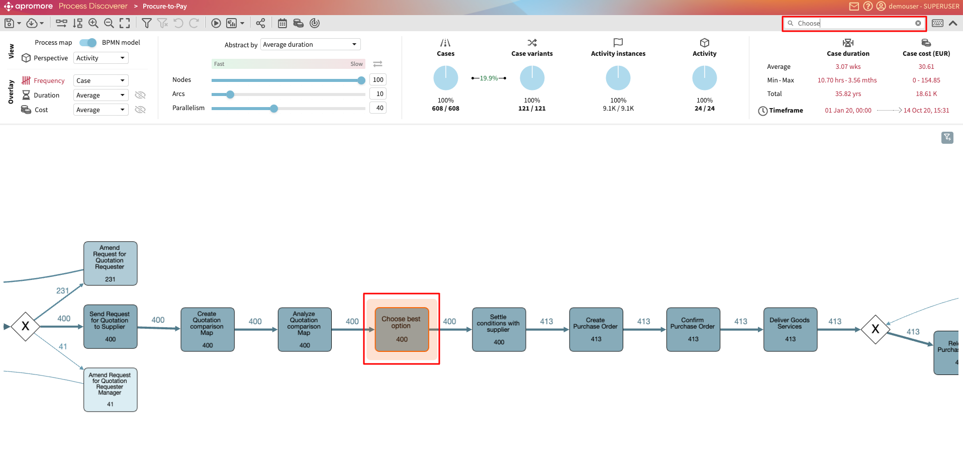
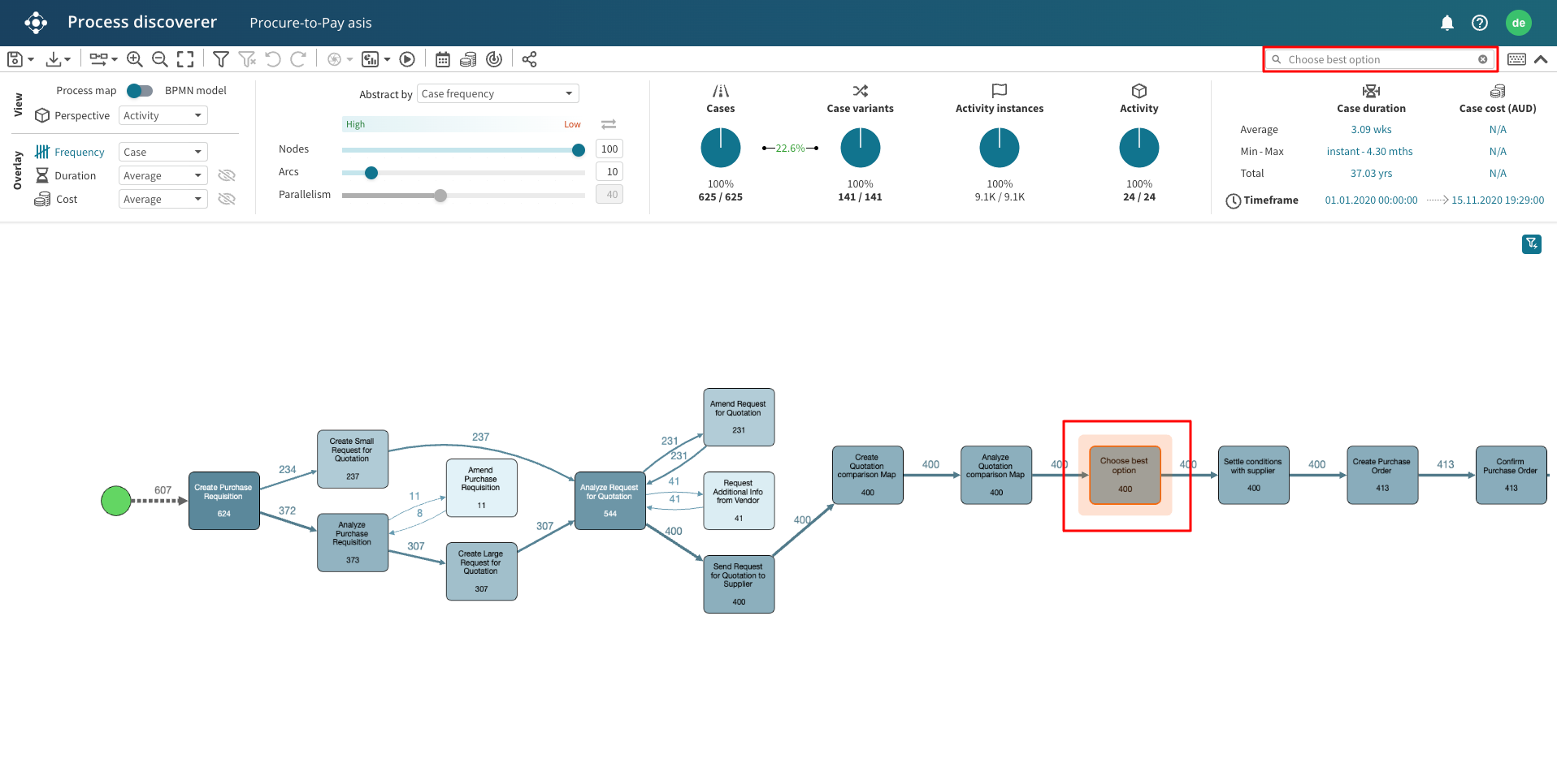
We can also search for an activity by using the search bar in the top-right corner.
For ease of view, the search results get highlighted in the process map.
View BPMN model
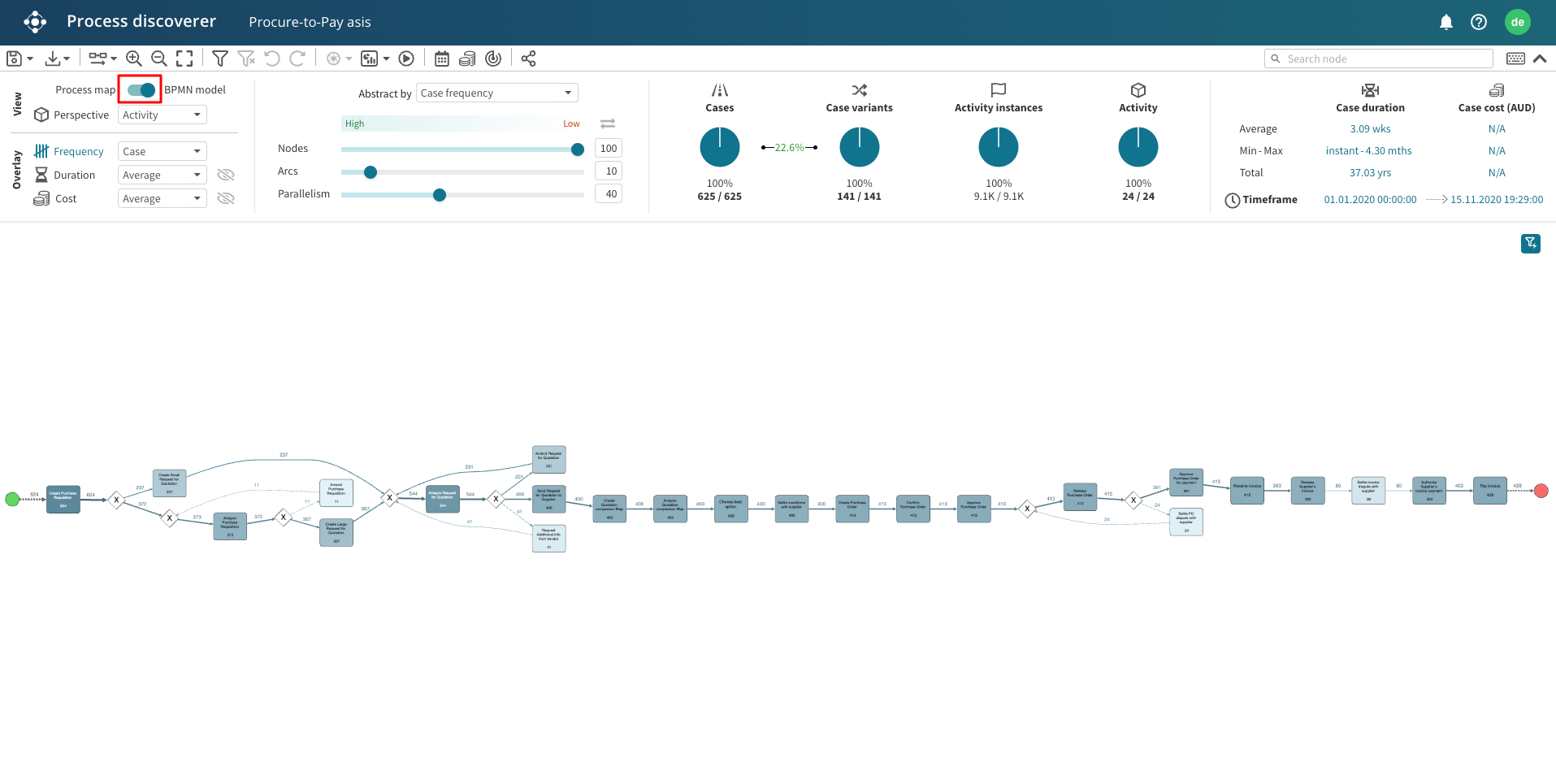
Whenever the insights deriving from the analysis of a process map are not sufficient, the same functionalities are offered on top of a BPMN model. Changing the view from Process Map to BPMN model will automatically discover a BPMN model from an event log. When visualizing a BPMN model, the slider Parallelism offers the possibility to adjust the amount of parallelism (e.g., AND and OR gateways) discovered by the plugin.
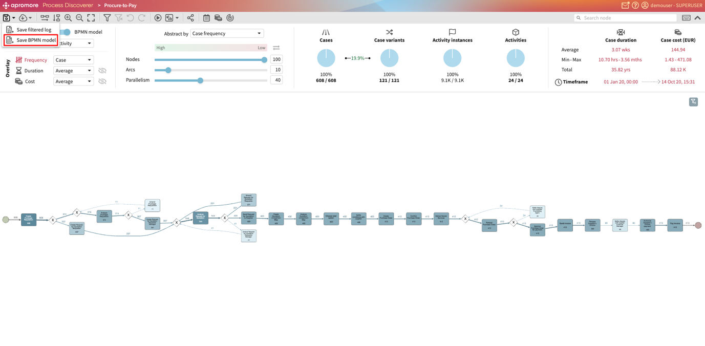
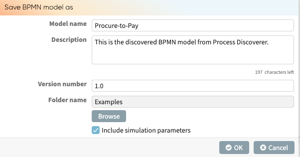
Save BPMN Model
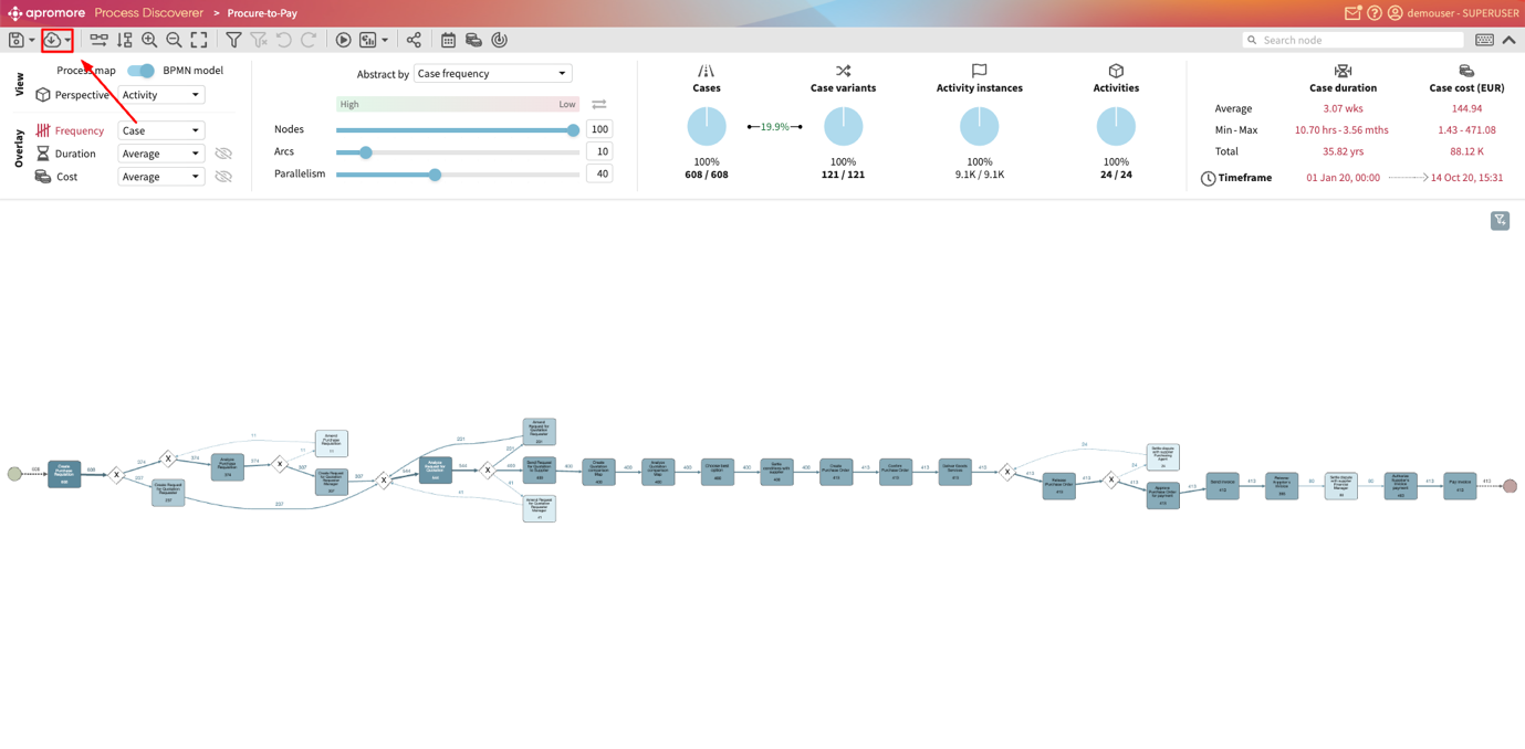
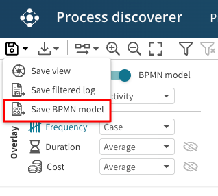
A BPMN model can also be saved from Process Discoverer. Click the save dropdown (first ribbon) in the top left corner. Click Save BPMN model.
Note
To save a BPMN model, the BPMN model view must be toggled on.
We will be prompted to enter the name of the model, a short description and the version number. Additionally, we can specify the folder where the BPMN model will be stored. We can also specify whether the BPMN model should include the simulation parameters.
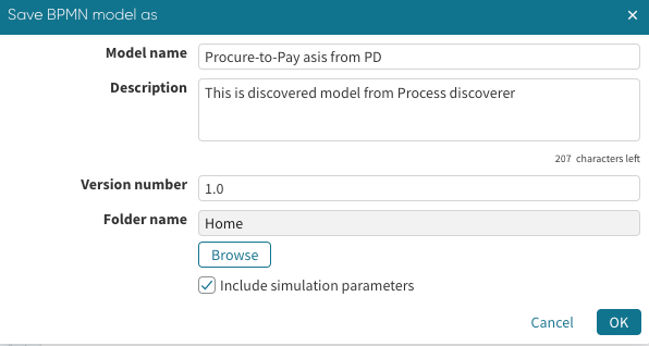
Click OK to save.
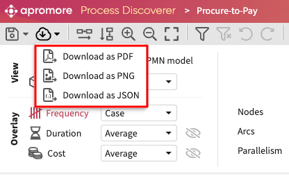
Save PDF, PNG and JSON
Apromore allows us to download a BPMN model or filtered log in different file formats. We can download the model or log in PDF, PNG or JSON formats. To download a model/log, click the download icon in the top left ribbon.
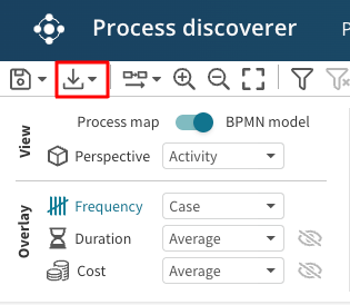
Specify the file format in which the model/log is to be downloaded.
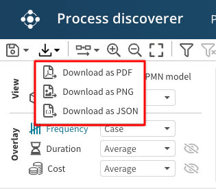
The file is downloaded in the specified format.